December 4, 2004
Posted by Teresa at 10:45 AM * 155 comments
Patrick’s giving me grief again about my type being too small and too tightly leaded, and there not being enough contrast between type and background. “They can’t just hit ‘increase text size’ on their browsers?” I ask, and he says no, that’s not enough.
Foo. To me, Making Light is an inviting page: look how much text you can see at once! On the other hand, I’m aware that I have a better-than-average eye for fine detail and low-contrast grayscale, so maybe what’s comfortable for me is less comfortable for everyone else.
(And now, a message from our id: Cory uses near-zero leading, and about a bazillion people read his weblog, so how come I can’t, huh? It’s not fair! I never get to do anything fun Sulk!)
Seems OK, as in "inviting", to me, but then I have a pretty good pair of glasses. The type is noticeably small, however. I master a web page that needs to pay attention to access issues so I'm particularly sensitive to issues of, um, size. If it was my page, I would make the type larger. Since it is your page, I will say that it looks fine to me.
Looks fine to me, I'd rather read small print than have to do a lot of scrolling.
Well, so far I haven't had a problem with the grey or the type size. But then, I also tend to look forward to your long entries (this is not necessarily true of other web sites) so being able to see many words may, in the case of Making light, be friendly.
I can read it, and I'd have done something locally on my end if I had a hard time. That said, it is a bit small and tight. I shall ask The Spouse, who is an authority on such issues, (wait'll you see his book!) but you might try changing the MT style sheet in this bit here via MT's Template options:
.blogbody {
font-family:verdana,arial,sans-serif;
font-size:11px;
Instead of using 11px, try using 1em
Needless to say, you should copy and save the template elsewhere first.
Lisa
I'm fine with the type size. I wish I didn't have to resize ([F11]) twice to see all the comments though. Is there any way to fix that? I don't have to do that on the Electrolite comments.
(I use IE on windows)
I like the black-on-grey color scheme. Grey is immeasurably easier on my eyes than white, so I find your page easier to read than many. The font size never bothered me, either, but I suppose I can see how it might be tough for some people.
I've never thought it was too small, nor have I had trouble with it.
I think the leading is fine, and I don't have trouble with the contrast. (But I have my monitor tuned up rather bright, for showing the full range of brighntess in photos).
I sometimes find it a little small; I've used size increase on it sometimes, depending on my mood and how much time I'm spending here.
I find it a bit small, and I don't like reading large amounts of text in a sans-serif font. Contrast is OK for me, however.
Why specify a type font family/size at all for the main content? Most folks have their browser set for a font they find readable -- do you know better than they do what they find comfortable?
If you want to control the way people see your pages, publish them as PDF files.
I've never had any problem with the typesize and layout -- but, I may have been subtly conditioned to like this style, in my youth, by reading so many excellent issues of Gambit and Minac.
I think that it's all good - the text is easy to read, and the contrast is good (sometimes more than good - but that's what "reduce brightness" is for).
We-ell, I'm with Patrick on this one. I've been reading intently for almost a year and a half, and have no complaints, but as designs go, this one could certainly be better.
Getting away from the pixel-unit font-size declaration is a great start, because then IE/Windows users will be able to resize the copy. ::grin::
...And I don't know why I feel this way, but by my way of thinking average-words-per-line is more important to control than leading.
Hi! I'm new around here, been following your blog for a few months.
I think the type is fine, myself, but I can see how it might be a problem for others. The coloring, to my mind, is ideal.
There is a simple solution: you can write a simple script to change to a different stylesheet upon command. If you'd like the script and help with implementing it, drop me an email at ben AT prodigal DOT ca.
Hi! I'm new too, been lurking for about six months and just coming out of my little lurker closet recently. I like it! On occasion, late late late at night when I'm bleary, there is trouble. I usually just take it as a sign that it is Time To Go To Sleep.
I'm a lurker-leaning-toward-poster on electrolite too, and I actually find Patrick's font a bit large. But I still like it. I'd probably read it if it were in two point ice pink Times New Roman italics on navy.
I get RSS feeds first anyway, so it's no skin off of my nose.
But I like how Making Light looks.
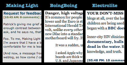
Here's a side-by-side comparison of chunks of text from Making Light, BoingBoing, and Electrolite:
Even though Cory uses near-zero leading, he's also using larger type, with serifs (which some people say improves legibility, though the jury is still out on that with respect to on-screen reading), and with more contrast against the background.
There's also the matter of column width. In Safari, with my window 962 pixels wide (not counting the scrollbar), here are how wide the text columns come out in the three blogs (measuring the longest lines I could find in my screenshots):
- Making Light: 622 pixels, ~107 characters
- BoingBoing: 574 pixels, ~89 characters
- Electrolite: 528 pixels, ~87 characters
Typographic guidelines for ideal number of characters/line vary, but the figures given are somewhere in the ballpark of from 2 to 2.5 alphabets, or 50-70 characters. These guidelines are, of course, based on research from the Age of Dead Trees, and may not be appropriate for the Age of Phosphor and Liquid Crystal.
I would prefer resizable fonts. I read on several different computers and changing my screen size isn't always an option. Not using IE is also only an option on my home one.
I can read it, and yes, having as much text as possible on the page is a good thing, but it's an effort.
The grey on grey isn't half so bad as all those white on black in minuscule fonts that I keep avoiding. Or the fanfic I read the other day with brown on beige and the text only on 1/4 of the screen. Those I cut and paste into notepad to read.
I think it's great. More words per screen make me happy. I don't even have to put on my reading glasses!
Well, I hadn't even thought of it as a problem until you mentioned it. And now, I'm thinking that the font size is a tad small for this pair of eyes. (But I blame Patrick for the entire revelation.)
"I'd probably read it if it were in two point ice pink Times New Roman italics on navy."
*shudders*
I will read a number of things as long as it isn't actively ugly or designed to burn out my retinal cones.
Is fine by me, and I have very bad eyesight. Then again, I would read it if it were Fette Fraktur pea green on a background of revolving purple and black dots, so I'm probably not a fair benchmark.
I was just relieved when it started to provide barfy old Netscape users with a box to type in.
It shows up just fine to me, though I mildly preferred the black on grey it used to show up as.
Why aren't you allowed to cluster balloon?
Just as an experiment, I fired up IE on my Windows machine and took a quick peek at how the rest of the world sees Making Light.
The default (and apparently unchangable) text size is actually larger than the size I use in Firefox, my default browser.
I think that overall Teresa's layout, color scheme and typeface choices are just fine. Even the default text size is just fine, but you should consider changing the template as suggested above so that IE users can use the text size options.
For what you've got right now, it's fine: you might oomph the leading up just a tad, but the font size is peachy to my eye, and I have no problem with black-on-grey. (My own suggestion: give the blogbody div a maximum width, so that when the window is increased, the line-length doesn't stretch to the point that the eye can't track easily from the end of one to the beginning of the next. I know: their own damn fault for browsing with a window open so wide. Still.)
The CW on screen fonts is that sans-serif is easier to read in blocks than serif, going against the grain of print; and certainly the Verdana and Lucida Grande fonts are nice and easy on the eye. But they work better in smaller sizes (I think), starting to look too emaciated at larger sizes for easy reading: scraped thin, over too much bread, say. Which is why Making Light as it is looks as good as it does. A serif'd font, like that old web workhorse, Georgia, works better in larger sizes: it bulks up more nicely, and the larger size lets the pixels do some little justice to the serifs, which lets them do what they do for comprehension on paper. Which is why, then, Electrolite as it is looks as good as it does.
But: ease of reading notwithstanding: blocks of small sans-serif, to me at least, suggests quick, nibbly bites; blocks of larger serif suggests longer, meatier stuff. So, in a world keyed strictly towards what I want, you and Patrick would seriously consider swapping out your font stylesheets.
After, mind you, a whole lot of other shit had changed for the better. It'd be pretty far down on my list of things to see to.
I'd also have to agree with Patrick and the comment that the text is too small, and I also don't like reading large amounts of text in a sans-serif font. As someone with relatively bad eyesight, but better than 20/20 with glasses, who reads a lot of onscreen text, I generally prefer slightly larger type. The black type on a grey background doesn't bother me, though.
The content is so good, though, I put up with reading smaller-than-usual type when I might not regularly.
I think it's just nifty as it is. I'm in the "more text/less scrolling" camp.
The one nielsenhayden.com comment I have is actually that the navy links on Electrolite don't contrast enough for with the gray "already clicked" links (for my eyes at least).
�They can�t just hit �increase text size� on their browsers?� I ask, and he says no, that�s not enough."
Loath though I be to agree with Mr. Nielsen Hayden, yet I am inclined to agree that to "just hit 'increase text size' on their browsers...." is "not enough' given that few browsers have an increase leading button.
I mostly use IE6 (mandatory for work) and my default is to use largest text size with Georgia and Verdana.
For Making Light I have to reduce text size and go with the site defaults rather than my preferences (I could suck up the text and apply all my own styles but I'm not going to do that either).
Finally, reviewing Gould on details and Scalzi on fair leaves me with Ricky Nelson's Garden Party.
Incidentally some of the people here are talking past each other apparently assuming Ceteris Paribus when in fact lots of variables are all over the place.
Screen resolutions in particular (I run 1600x1200, even on my laptop, what do you run?) are not being mentioned much at all but might be when saying the displayed size is peachy keen.
I think the type is too small.
For preference, I'd like someone with HTML and CSS foo to figure out the IE/Opera bug on very long comment threads.
Gee, my first comment here and it's on the font and layout. I can read it. It's a bit tough for the longer posts. I work with visually impaired (and blind) library patrons, so I'm a bit senstivet to the issue. I would prefer the font upped a point size or two, and more contrast between text and background. But your blog is worth a bit of eyestrain to read. I just sometimes don't catch all the words.
I think Ben Trafford's idea sounds like a good solution. Why not have it both ways?
What Clark just said; an 11px font naturally looks larger on my iBook's built-in 14" screen than when I read it at work on a 20" 1600x1200 monitor, because the two monitors have different values of dots per inch (dpi), and a pixel is bigger on the former. Note that is not just the resolution; it is the resolution relative to the monitor size.
Unfortunately, there's no easy solution to that problem, at least as far as web publishing is concerned. One might think that specifying font sizes in points is a solution, because 1 point is 1/72 of an inch these days and would scale up accordingly. Unfortunately, neither Microsoft's nor Apple's OS offerings provide good support for that approach. If I recall correctly, Microsoft either believes your display to be 96 dpi or 72 dpi, following some arcane rules and settings. In Apple's case, one inch is equal to 72 pixels, regardless of what the actual size of the display is. This seems to be an ironclad rule, inherited from the time of the original Mac. As a result, it is all but impossible to set font sizes to a value that works well on all displays and operating systems, simply because the OS does not provide accurate information on how large a pixel actually is on screen.
Kip, Verdana looks good at certain pixel sizes, because Monotype spent months optimizing the hinting for those pixel sizes and making sure that they perfectly matched Matthew Carter's bitmapped specimens. Naturally, as you increase the size, it becomes less likely to hit one of those optimized resolutions.
Since you asked . . . count me in with the "ML's type is a bit too small and the leading's a bit too tight" party.
On the other hand, the color scheme is fine by me.
Your type is too small but I can bump it up. The greater problem is that your leading is constrained to a certain pixel size, so that when I bump the type size up the letters from one line overlay the letters from another.
For those of us who can't see so well as we once did, it's really important that web sites use relative sizes for fonts and leading, and not specify pixel sizes.
I rarely actually hit the front page; new posts I spot via RSS, and new comments I find directly from the backthreads page. (Hey, an RSS feed for comments would be nice; either per-thread or whole-site, or both for flexibility.)
On Safari on my Mac, the type is fine (though I'm one of those folks who never has enough pixels and uses small type by preference); a little more contrast might not hurt, but since I'm spending more time reading the (black on white) comments than the (black on gray) posts, I don't notice it as much--and having the comment boxes "pop out" the way they do is great.
I guess my summary would be "it works for me, but I can see why others may like some tweaks to the stylesheet".
For the record, I use Firefox for Windows at work and Firefox for OS X at home, and I have no problem resizing Teresa's fonts, nor do "the letters from one line overlay the letters from another".
When I said bumping the size up doesn't entirely solve the problem, I was talking about the ratio of leading to x-height, combined with what I've always found to be a difficult-to-read set of color combinations. But all this complaining about unresizable type and broken scaling simply leaves me shaking my head. Cripes, people, get Firefox, already. It's free, it runs on every platform, it supports tabbed browsing, it handles issues like text resizing correctly, and for the 0.5% of all sites that insist on MSIE you can still use MSIE. Sheesh.
(Indeed, on OS X, I'm using one of these versions optimized for my particular CPU, and it's the fastest browser I've ever run on a Mac.)
(RSS feeds for the comments are on the Things To Do list.)
The alternate-stylesheet approach might be a solution. Here's a blog that does that.
Patrick - The simple fact is that at many companies, employees are not allowed to install software on their own workstations. Using a different browser isn't on the option list for these folks.
In a former life, I was an IT manager for a large law firm. If anybody installed unapproved software on a firm machine, there were consequences. If a company even makes an effort to support their users, there needs to be some standardization. (FWIW, I made it hard for users to install software on their own and was generally helpful with regard to testing and implementing new things.)
That said, if I was running an IT shop today, I'd give my users a choice of two browsers, IE and something else, probably Firefox.
I keep seeing the word "leading" here, and I'm not clear on the definition. If I try Google I'll probably get four zillion sports/elections results with that word, so I'll just ask. What precisely does that mean in relation to types/fonts? Anyone got a link to a good definition?
The Spouse will, doubtless explain this better than I can; it's his field.
But the virtue of using em instead of px in a stylesheet is that the specific width of an em is going to be determined on your readers' side of the blog, thus taking into account their preferences and needs. Stipulating px for font sizes is not really kind since it's absolute, no matter what a user wants (and I.E. won't let a user change, so like PNH says, get Firefox!). If you're designing a site in terms of accessibility, you always use em instead of an absolute px size, at least for body text.
That said, sure you could use javascript and a separate css (see Dori Smith, javascript expert and author's site here, but I'm pretty sure just changing the 11px to 1em will work; you can increase the leading a point or two as well, should you wish.
Linkmeister, leading in typography is what you'd probably call linespacing. It is the distance between the baselines of two successive lines of text. See, for instance, here for more details on how to choose leading.
Lisa, one problem with expressing sizes in terms of an em or as a percentage is that browser settings vary so much. With IE in particular, the default font size is not the user's preference, but an inane factory default. As a result, the layout that you pick so that you yourself can easily read your own blog looks rather poor by default on most people's screens. Thus, many layouts choose to force specific font sizes in order to avoid that particular mess.
Leading is space between lines, cerning is space between letters.
I was taught typesetting by someone who had started doing it used actual physical hot lead. "Leading" wasn't a metaphor for him.
He thought scalable fonts were the best thing since, oh, probably the relief of Mafeking.
Gah. Previewed several times, and still overlooked something. Make that: "With IE, the default font size seems to be ...". Obviously, IE users can and do set their font sizes just as easily as users of any other brower.
I do all right with the smaller type, I like the amount of information you get into a page, and my browser (Camino) provides adequate leading. However, having just hit Command-+, I'd say larger type is, in fact, more comfortable for me to read.
Want a monitor the size of a newspaper page, grump, grump, grump.
Well, I know I need to start thinking about gradient/bifocal or computer glasses, but yeah, since I pigheadedly insist on using IE, and therefore cannot upsize the text myself, I catch myself leaning in to the screen to read. Bad for the neck, and I know I don't always read to the end of longer pieces because of that. I like the gray on gray contrast levels just fine, but if there were a way to let me adjust the type size myself, that would be awfully nice. Visually, yes, it's a friendly and inviting site, but I'm hitting the age where the mind is willing but the flesh failures are getting annoying.
So, I guess I half-agree with Patrick.
Mr. Behrends and Ms. Walton, I'm suitably enlightened. Thank you.
Font size and leading look fine to me, but I'd like to chime in and say that 'the F11 thing' is pretty darn annoying.
There's a nifty CSS trick you can do (although I don't know off the top of my head how to do it) where you have two style sheets - a 'larger' one and a 'regular' one, and you can put links at the top of the page to switch between them, which might work for people who want to see the site in a larger font.
Ulrika: hunh? Internet Explorer has a "text zoom" feature. Look under the "view" menu.
I like seeing a lot of text on one page, but I'm happy so long as it's dark text on a light background and nothing blinks or animates.
Regarding the F11 bug, I actually sat down several months ago and worked out a fix for the Making Light stylesheets (I have no life), but I haven't tested it outside of IE6. Teresa, let me know if you'd like me to send it to you; it involves minor additions to your stylesheet and post template.
For the curious, googling for "IE float bug" turns up a bunch of information about wacky CSS behavior in IE.
The color and contrast don't bother me, but I'm with Patrick otherwise. I have my preferences set for large type because even with glasses I'm not 20/20 and though I frequently have trouble with lines overlaying each other on other pages, it hasn't been a problem here. I didn't realize it was caused by bad design choices re pixel vs uh, whatever the other choice was. I personally think teeny type, teeny italicized type, and animations ought to be outlawed on blogs, but I am Old and Grumpy.
MKK
I usually increase the text size several times, although to be honest the last increase is because I then get nice thick letters - the actual *size* is fine at the third step, but I find the font a bit spidery. (1280x1024/1024x768, Linux Firefox with anti-aliasing and all that good stuff.)
From Avram's useful GIF, I must admit I find Electrolite the most readable, then BoingBoing, then Making Light. However, as long as I can resize the text to read it, then I will. <grin>l;
Disclaimer - I've noticed I seem to be increasing size on quite a few sites, so take that for what you will.
The font is a bit small on my screen (19", 1600x1200). It's perfectly readable as long as you use sansserif fonts, but the little note above the comment page (serif, dark grey on light grey) is not.
On the other hand I use Opera, which means that it's pretty easy to increase the text size =)
I'm ok with the text size but the leading has the ascenders and descenders in contact at the default type size. (I'm using Luxi Sans instead of one of the MS sans-serif fonts, on a 1600x1200 112 dpi screen.)
Colour's fine. ( I would prefer a black background and cyan text, but I have a fair idea how many other people would approve. :)
Text resizing gets the commerical airspace as well as the main body text and starts to slide the screen around well before it produces really noticable size changes on the pixel-defined main text -- very likely a side effect of the ads using font size progression styles, which grow quickly, instead of pixel specifications.
The commercial airspace also has a double width space to run in -- one twice as wide as the actual ads -- which is probably a side effect of the blogads style sheet, but blogads won't cough it up for me to look at.
I'm using Konqueror. (No, I am not going to stop using Konqueror. :)
I've only skimmed the other comments, so I hope I'm not repeating what others have said.
My eyesight is not the best, but I find the sight perfectly readable. Also, the smallish text makes me read carefully. Like in a credit card offer, the small text is where all the important stuff is.
While I have the chance, let me casually mention that I have a problem with the format of Electrolite--links that I've clicked on are the same color as links I have not. When I'm revisiting long threads, it takes a while to find the spot where new (to me) comments begin.
I find your original text to be readable enough as far as text size, but the other day you have a large chunk of quotation that was considerably more difficult to read.
A slight increase in type size would be nice. I don't have a problem with the leading. Contrast is a little low, but not a problem.
There's an interaction with the monitor size and settings. I find there are critical points in the scaling, places where the rendering of the font gains or loses a pixel of stroke-width, but they are monitor-dependent. And it depends on the font design as well.
On this monitor, with Times New Roman, there's such a jump between 12-point and 14-point. It almost looks like switching to bold.
I find your page eminently readable on the Opera browser - v 7.54 FWIW - and I mean that in both senses of the word, both visually and in comprehension.
Plus the comments invariably become rasff threads.
Or something.
A bit on the small size, but within acceptable parameters.
A problem I have when I use dial-up (which I do less these days but still do sometimes) is that lots of comments (e.g., this comments page) will take a long, long time to load or even occasionally crash IE. I imagine there's some way to put, say, a link to "Comments 1-50," "Comments 51-100," etc. for older comments, so all the comments in a large section wouldn't have to load in order to get the latest ones. Conceivably this could even help somehow with the evil comment spammers.
Well, I just pressed [cntl] and turned the wheel on my mouse toward me and it made the type huge. What's to cry about??
I've heard other complaints about Electrolite's visited-link color being insufficiently different from the standard link color. I've just modified that; hope it helps.
Note that so far, the only change made to any blog's style sheet as a result of all this useful feedback has been, cough cough, a change to Electrolite. You know, "The Blog That Listens." Cough. Cough.
I like the colours, and the grey background is restful. But the text size could be a little bigger, for me. I can certainly resize it, but the resize feels a bit big.
Graydon's suggestion of cyan text on a black background makes me shudder. I don't think I could read large amounts of text printed in that sort of colour scheme.
Sally --
I've written something in excess of a million words that way.
And I was using vi, too. :)
I don't think there's anything wrong with either the font size or the colors, myself. I will admit to having a liking for small type that is probably unhealthy, given my terrible eyesight. That said, I actually find the black on grey to be easier on my eyes than white backgrounds at other sites (like Electrolite, not that it would stop me from reading either one).
Type-designer's child here. I have no problem with the type size or leading. In my own universe I prefer serif type--especially for longer posts. Years and years ago I remember reading an article which said that serif type somehow aided in retention of information, but I've never been sure I really believed that.
As for never getting to have any fun, balderdash, woman. I've seen you with fireworks. (Hell, I've seen you, Mike Ford, and my husband with fireworks!)
Graydon: Eeek! Black background with any colour of text makes me see even more weird colours between the lines than I get in most other computer screen colours. (*Dark* doesn't necessarily have this problem: once Tobias S. Buckell switched to a more brownish, I was fine)
Lenora -
The darkness is a friend of mine. I realize this doesn't apply to everyone, and besides, it's not that hard to set up a user-defined style sheet to produce those colours. (I quite like what Making Light looks like if I do, too. But I'm pretty sure hardly anyone else will. :)
Dual-USB non-14" iBook running OmniWeb 5.somethingorother at 1028x764. Can read fine--would prefer slightly slightly larger type, but I'll get around to noodling with the font preferences at some point.
Patrick, if I may ask a silly question whose answer I haven't turned up on the Firefox webpage, does Firefox allow you to do cookie/security settings per website/domain? This is the main reason I do most of my browsing on OmniWeb. On the other hand, after I clear off some hard drive space, I'm never averse to test-driving yet another browser...:-)
Hi Teresa
I'm with Patrick, and even more so with Avram. To my mind serif typefaces are easier to read than sanserif. The type size is pretty small. But to me the thing that makes ML difficult to read is the line length. Avram says the line length is ~107 characters. It is ~112 on my screen. I was taught that 65-75 is optimal, and over 80 is a problem.
Cory's site actually uses considerably wider leading (the distance between lines) than ML. I find his site difficult to read because he has the kerning (distance betwen characters) set really tight.
I dislike the use of grey in any context, so won't comment on your colour scheme. (It is really too bad you pointed out how grey the site it. Now, of course, the grey will chew away at my insides every time I visit.)
Not that the design really matters much, of course. I love ML. Even when I disagree with you. Well, mostly.
I think it looks fine, but I personally have a bias toward smaller type and dense text -- it may be because my own handwriting looks like a particularly unreadable version of agate type.
Yoon, no, Firefox doesn't have that particular feature of Omniweb.
I actually love Omniweb, and am a paid-up user of version 5; if they ever get the speed up from "sluggish" I will switch in a heartbeat. However, I hate the fact that their "per website" settings aren't, really; you cannot, in fact, set up separate settings for Electrolite and Making Light, because it keys (for whatever reason) to the root domain. This seems, frankly, lame.
Randolph-
Yes, IE has the feature. It does not, however affect the type size on this site. Teresa's posts view as 8 pt. regardless of whether I have the browser set for largest font, smallest, or anywhere in between.
You said:
> To me, Making Light is an inviting page: look how much text you can see at once!
Not exactly. A more accurate, honest description is: "Look how many tiny marks fill the space where one might expect readable text."
and:
> “They can’t just hit ‘increase text size’ on their browsers?”
Yes we could. We also could use binoculars. Or we could hire a college student to read it to us.
OR you *could* give up your personal denial that the normal effects of aging won't ever get you and use a font size that most everybody can read - not just those of you under 40.
kosmo
(who hopes to be excused for his crankiness which is clearly due to his advanced age)
I've heard other complaints about Electrolite's visited-link color being insufficiently different from the standard link color. I've just modified that; hope it helps.
It does. Thanks very much.
Patrick: I actually love Omniweb, and am a paid-up user of version 5; if they ever get the speed up from "sluggish" I will switch in a heartbeat. However, I hate the fact that their "per website" settings aren't, really; you cannot, in fact, set up separate settings for Electrolite and Making Light, because it keys (for whatever reason) to the root domain. This seems, frankly, lame.
Yeah, I paid up for it too. I'm not overwhelmed by the speed, but...tabbed browsing. Also the fact that I multitask and/or am called away from the computer at regular intervals by the almost-one-year-old means that things get more time to load than I would naturally *give* them. ^_^
I dislike the "per website" thing too, but I'll take what I can get, and it serves my really basic needs in that area. In the meantime, I think I shall burn backups tomorrow and install Firefox! :-) Thank you for the answer.
--okay, must stop noodling about blogs and write...:-)
Greg, you've got me saying something I didn't say. It's generally held that serif type make for more legible body copy in print. I think the jury's still out when it comes to reading off a monitor. I vaguely recall reading something a few years back about a study claiming that sans-serif was actually more legible onscreen, but I can't find it now. I did find a study claiming (according to the abstract; I haven't read the actual thing) that there's little difference between the two except at small sizes (ten points), where sans-serif was better.
I find Making Light quite readable on my home low-res compaq 140, and a bit small on a high-res monitor -- and I find reading it is always a pleasure.
Charles Babbage printed up a series of tables in different colors of ink on different colors of paper in order to really determine what was most legible. It would be interesting to try the same sort of experiment on screen, where things are indeed very different.
Actually, I recently read a study that indicated that sites with smaller typefaces were MORE read than those with larger typefaces.
If I can track down the link, I'll supply it.
-l.
Yoon drooled over:
Yeah, I paid up for it too. I'm not overwhelmed by the speed, but...tabbed browsing.
Well - firefox and safari both cheerfully support tabs - and at better speeds :)
That said, I actually have -three- browsers that I use somewhat regularly - Safari (in which I'm currently typing), Firefox (for javascript), and IE (for those sites that don't work any other way).
Graydon - Cyan? You're crazy :) What's wrong with a nice #00FF00 ?
Sorry, Avram. Didn't mean to misrepresent you. It wasn't your bit on serif fonts I was agreeing with so enthusiastically, it was the "typographic guidelines for ideal number of characters/line vary, but the figures given are somewhere in the ballpark of from 2 to 2.5 alphabets, or 50-70 characters." (Though I usually use slightly higher numbers.)
You go on to say, "These guidelines are, of course, based on research from the Age of Dead Trees, and may not be appropriate for the Age of Phosphor and Liquid Crystal." I don't believe that's the case. In such places as the Web Style Guide, you'll find the 50-70 character thing applied to websites, and transmogrified into a text cell width limit of "about 365 pixels." The lowest cell width in the three you looked at was 528.
The characters-per-line thing is more a matter of how people's eyes move when they read a line of text, and the ease with which the eye falls on the beginning of the next line. Longer lines are harder to track. Oddly, most of the research I was able to find on screen legibility and line length is more than 10 years old, and profoundly irrelevant. This page from a University of Saskatchewan course made me chuckle. That is surely the most illegible page you'll ever find on legibility. Check out the dates on the research they are quoting.
The Software Usability Research Laboratory had the best discussion of these issues I could find. But again, look how ancient their references are.
The Web Style Guide makes a point I was searching around for and didn't put into words. "One of the fundamental principles of the Web, however, is that users should be able to structure their own view." By "users" it means, in this case, readers. Whether or not ML is readily legible, it would be really useful to have the font size customizable. It isn't for people using IE. (And Firefox refuses to run on this computer -- the computer freezes whenever I try to use it.)
I do think it charming that you make the comments more legible than your posts by putting them on white instead of grey. How gracious.
(I just realised i do a similar thing with blockquotes on my blog).
I find Making Light very readable on Mozilla on an old iMac running OS 9, and also on Safari on a gooseneck iMac running Mac OS X. My partner, having heard me sing your praises ad nauseam, found it so difficult to read -- both the size and the black on grey are factors -- that she gave up after half a paragraph.
Yoon - Firefox does have per site settings for cookies. It doesn't have per site settings for Java/Javascript, which I assume is what you mean by security.
As with Omniweb, I suspect "per site" actually means "per domain". Unlike Omniweb, if you submit an enhancement request to the Firefox bugtracker, you might find you get lucky. ;-)
I loathe ALL the font setting stuff here. This stuff I'm typing is ridiculously huge because I had to bump up the main size so I can read the body. It's just crazy for web pages (for all-text material, such as the body of Making Light) to set font size or style at all. The reader knows what fonts look legible at what size in her choice of browser and screen; leave it to them. On one of my systems, this looks better in sans-serif, on another it looks better in a serif font; and size is really impossible to set for other people.
I'm fine with the size, etc. of ML, but I prefer smaller font sizes, which may account for it. (I'm certainly fine with the colours, because I find greys very soothing onscreen, whereas I find white harsh.)
On comments above:
If your browser is re-rendering absolute font sizes based on your preferences, it is, in fact, a broken implementation of CSS2. If the page's style specifies 11pt type, your browser should render it as 11pt type, period, the end, full stop.
On the other end (that'd be the style-sheet maker's end), if you want variable font sizes based on user preferences for default sizing, use keywords or percentages or the like to specify element sizes for relative sizing, and leave body and p alone.
Also, apropos of little else, I despise tabbed browsing.
I'm using IE 5.1 on an OS9 Mac G3, with a (second-hand) 19" monitor set to 1152 x 870 pixels. Since I'm in the graphics trade, I irregularly calibrate the monitor using the Adobe Gamma control panel, so the contrast is always at maximum, and the brightness set to suit. At work, I use an OSX G5 with an Apple LCD screen and IE 5.2.
Oh, and I'm over 40, and slightly short-sighted.
Having said all that, I like ML just the way it is. I find Patrick's comment about the leading deeply mysterious; it looks just about perfect to me for the given typesize. The typesize is also just peachy: big enough to read without discomfort, small enough to get a comfortable line length. Obviously a lot of thought and experience went into the design, and if it was my site I'd be loath to tinker about with it if I was happy with it.
If it was my site, I might let myself be bullied into making the background just a shade lighter; say, a sixteenth or a thirty-secondth. But I don't have a problem with it myself. It's light enough for me to read the actual blog entry, and that's what matters. The grey type is reserved for not very interesting heads, subheads and whatnot which are short and only read once in a blue moon. They're readable enough for their purpose I think, and easily ignorable.
For my own blog (which I won't blogwhore here) I went for pastel type against dark grey (#111111, IIRC). I haven't had any complaints, but then I've no evidence that I have any readers whatsoever.
Wow, of all the things in the world to "despise", I would have to say tabbed browsing is pretty low on the list. Is there something about the existence of browsers that use tabs that impinges on anyone other than their users?
"It's just crazy for web pages (for all-text material, such as the body of Making Light) to set font size or style at all. The reader knows what fonts look legible at what size in her choice of browser and screen; leave it to them."
This attitude has come up a couple of times in this thread. It's certainly true that this was how the web was originally conceived; it's also true that writers and readers of the web have pretty conclusively rejected it as an operating principle. Continuing to push this notion in 1997 made a certain amount of sense. Keeping it going in 2004 kind of marks you as a crank.
Notwithstanding my cavils about Omniweb's performance, above, I do think enabling the user to optionally set visual preferences on a per-site basis is a good idea, and should be built into more browsers.
I don't have a problem with legibility. Given my druthers, I'd like a little color--I find all that gray dispiriting.
What I find entertaining about this whole thing is that my own blog's black-on-grey color scheme was largely due to a number of comments by people complaining that black-on-white was hard on the eyes, back when I was setting up. (It wasn't the only reason, but it figured into the decision. Likewise, the black-on-yellow/beige of my re-launched booklog.)
I had a conversation with a colleague once about homework grading, in which he pointed out that every term, he gets comment-sheet complaints that he doesn't hand graded homework back fast enough-- not hordes of them, just a handful of students in each class. After years of this, he decided to deal with it, and really knocked himself out to ensure that every assignment was graded and handed back by the next class meeting. He still got two complaints that he didn't hand homework back soon enough.
I think page style arguments are sort of like that: nothing you do is going to satisfy everyone, so do whatever you like, within reason. Hell, without reason, if you like-- I use Opera, so even if you adopt Graydon's hideous light-blue-on-black scheme, it's one mouse click for me to read it in sweet, clear, black-on-white.
(In fact, I have to do that sometimes, since long comment threads are broken in Opera...)
I use Mozilla, and I have no problems with the text size or the colors. And I LOVE the fact that the columns/sections are wide and so the words per line are long. I dislike pages where there's a tiny column in the middle of the page, and you have to scroll constantly to keep reading.
That said, I should mention that I have 15/20 eyesight, although I do much of my reading on a laptop monitor, which might offset that advantage.
I am curious as to whether reversing the columns where the ads/misc versus the text are would solve the problems that I have where halfway through loading that page freaks out and I get nothing but ads on the screen, and have to go back to get the text back.
If there is an issue with the left side of the page, is it possible that switching the columns so that text side showed up first (since it would be on the right side of the screen) would solve that? Since the text would load before the hyperlinks.
I'm wondering if that would also increase the load time for those of us reading along at home over a modem. I usually have to click on a comment, and then go read something else for awhile while all the text loads.
Just a thought that basically comes down to: I wonder if switching the side of the page the text is on would fix some problems.
And I LOVE tabbed browsing. It drastically cuts down on the number of programs on the taskbar in Windows. Since I usually am running four to six programs at a time, that's a lovely thing.
And I really do like the gray. I'm not a big fan of lots of color in a webpage.
Chad --
It's not light blue, it's #00c0c0. And both Making Light and Electrolite get kudos for not using HTML that puts large blocks of text not belonging to any block level element (= very hard to apply a style to) on the screen.
Xerger --
I'm not actually a traditionalist, and besides, the VT family terminals I used had amber or gray (= faded Cherenkov hellfire blue ) screens.
Yoon --
Konqueror has per-host-or-domain name java and javascript settings that are independent of each other, per-host-or-domain cookie settings, 'treat all cookies as session cookies', and a quite good 'smart' popup control setting. (Plus the option of opening popups in a new window or a new tab.)
You'd have to run linux, which is probably a disadvantage from your point of view, but Konqueror's fast, too.
I wasn't aware my personal feelings about something had anything to do with wanting to get rid of it for other people, Patrick. Or is one of us misunderstanding the other here?
Would you have preferred I said 'loathe'?
I brought it up because people keep quoting tabbed browsing as a reason to switch browsers. For me, it's a reason not to.
One more vote for liking it the way it is -- the more text on the screen at once the better. And I agree with whoever said that while sansserif fonts are less legible on paper, they aren't necessarily so on screen -- I work for a firm that puts out legal documents in Arial, a fact that fills me with rage and shame every time I have to sign one of them. Reading sansserif fonts on screen doesn't bother me at all, on the other hand.
Tina: you can use a browser which has tabs and not use them, y'know. :) Firefox has plenty of other goodies.
Oh - and for this bit:
If the page's style specifies 11pt type, your browser should render it as 11pt type, period, the end, full stop.
You forgot to add "unless I tell it not to". How the content is rendered is - ultimately - up to the viewer. The browser can do nice little tricks such as scaling everything else up to match, but a good browser should allow the user to over-ride what a page designer says, to allow for insane web designers.
(In this particular case, Firefox has a 'minimum type size' setting which I have set to 12, so your 11-pt type won't be.)
Patrick said:
This attitude has come up a couple of times in this thread. It's certainly true that this was how the web was originally conceived; it's also true that writers and readers of the web have pretty conclusively rejected it as an operating principle. Continuing to push this notion in 1997 made a certain amount of sense. Keeping it going in 2004 kind of marks you as a crank.
Patrick, you're just wrong here. That is the attitude of a a professional, not a crank. A large part of the point behind CSS design is to support user needs, separating appearance from content, and creating a flexible layout and design. If a designer uses HTML and CSS correctly, changes to font size are done proportionately. Really. And you don't know what your reader's needs are--they may be using a screen reader, and so not "seeing" the text at all. They may have difficulty reading san-serif type, or any small text. I know you're not a professional web designer, but this is very much the attitude of a professional using CSS. If you look at w3.org's standards you'll note that they suggest using either percentages or ems, that is, relative units and not fixed pixel or px units.
As a basic principle of design, both in software and in web pages, the user's needs and comfort come first. That's the whole point of "elastic design" in web page design, and of usability design. If you look at sites on usability and accessability, you'll note they all caution against fixed font sizes.
I've gone ahead and changed from 11px in my MovableType blog (it's a geek blog, so I don't usually mention it here) linked above. I only changed the body style, to 1em. It didn't ruin the whole design, though I'm not a designer--I follow their specifications, rather than creating them.
You know, in the same post I said I was in favor of the user being able to override the visual settings of any web page.
The position I was arguing against is not the position that you are yelling at me about. The position I was arguing against is the assertion that "it's just crazy for web pages (for all-text material, such as the body of Making Light) to set font size or style at all." I.e., the idea that web pages should be nothing more than marginless chunks of text separated by simple H[n] headers, the way everything looked in Mosaic in 1993.
I'm all for the idea that web content should yield gracefully to the user's preferences. I don't implement this perfectly because I'm not a web design professional and have only so much energy to spare on getting everything just exactly right.
I'm also, frankly, a bit put off on the subject because I've found in previous discussions of this that no matter what you do, somebody will show up in the discussion with a big head of steam built up from previous arguments with someone else, and light into you at peak emotional pitch. When it comes to web stuff, like a lot of amateurs, I'm tired of being WRONG WRONG WRONG no matter how hard I try.
I find it a little small, but my glasses are an old perscription. For some reason I can't find where to adjust the font size in Safari.
Also, regarding the claim that "That is the attitude of a a professional"--as a categorical claim, I think this is false.
It happens that I agree with the ideas about CSS and flexibility that Lisa is espousing, but the claim that they are beliefs shared by a solid majority of people making money at web design is certainly not born out by my experience with actual web designers. Quite the contrary, most web designers are as cranky, contrary, and inclined to disempower the user as any other kind of designer. The whole A List Apart CSS ideology is probably, on balance, correct, but it's not dominant in the marketplace of actual commercial design. Alas.
Irrelevantly, I'm also baffled by the reluctance to link to your own blog, which I've recently seen from others in these comment pages. What is this silly bashfulness? You're making salient points about web design; so let us see some examples. You think Teresa and I never look at "geek blogs"?
Marc, the Safari command is command-plussign and command-minussign, just as you'd expect. It's under the View menu, and it works fine on Making Light.
Paul:
Well, that's a grey area, where you get into the "what should a browser do" vs "what should a human be able to tell a browser to do" vs "what does my style sheet say" thing. Certainly, ultimately all style sheet choices should be overridable -- I'm all in favor, for instance, of being able to globally turn style sheets off, or provide user settings to make user-defined default styles (or override styles). But if I declare "11 pt" in my style sheet, it should display at 11 pt barring that sort of intervention.
I guess it's a question of what parts of the browser behavior are modified by what settings. I'm thinking specifically of something like the 'view->text size' in IE, which I do not think should reset that 11 pt size, because I don't want my browser guessing what's the right sizes for all the stuff relative to it. I'd rather whip up my own style sheet or turn off style sheets altogether than have my browser try to think. Even if it weren't IE.
But this is more or less a UI discussion rather than a CSS discussion. I think the best way to handle the CSS -- meaning viewer and style-sheet creator desires and conflicts -- is to code the style sheets in a way that is meant to reflect both, that is, using things like percentages or keywords instead of absolutes. YMMV.
Regarding browsers: There may well be other reasons to pick up Firefox, but what I seem to see a lot of is "and it's got tabbed browsing!" like it were the chocolate syrup of browsing experiences, instead of, say, the syrup of ipecac.
Patrick, two points:
1. Yes, someone will always hate your aesthetics, no matter what you do. De gustibus and all that.... In such cases, ignore the whine and enjoy the cheese.
2. In Web page design, pixel measurements for fonts really should be avoided. Period. Why? Because a pixel varies in size based upon the monitor settings. On my long-decommissioned Mac IIcx a pixel was 1/72 of an inch (more or less one point). On my iBook, a pixel is 1/106 (more or less) of an inch. Improvements in display technology may soon get us 150 pixel per inch resolutions or better, at which point an 11px font setting will be itsy-bitsy.
Note that in CSS, a 1em font size simply means that the font will be displayed at the default size for text fonts, as decided by the client system software or the user. As a user, I can specify that the default browser font size on my machine is 16pt (maybe because my system software is stupid and assumes that a pixel = a point [it usually doesn't] and that, say, 12 pt text, as measured with a real physical type ruler, is really more like 10pt, so that 16pt type, on my screen, comes out to be more like 12pt when measured with the ruler).
As a designer, you can use fractional ems when you design a page; e.g., if you want slightly tighter and smaller text, instead of 11px you might specify 0.8em as your text size. This will result in a slightly smaller than default font size on nearly ALL user machines, regardless of system settings and user preferences. Try it: you'll probably like it. It's easy to do and doesn't force you to bend your mind into moebius pretzels trying to second-guess the relation between pixels and points on the user's machine.
That said, you should still use pixel measurements for bit-mapped graphics and the like, because in a picture (as opposed to rendered text) a pixel IS a pixel.
By the way: here's the Making Light page as seen on my iMac in both Virtual PC running IE 6 (on the left) and Safari (on the right). I have no point to make regarding the picture...just thought it would be fun to compare the two.
Tina: I brought it up because people keep quoting tabbed browsing as a reason to switch browsers. For me, it's a reason not to.
Just because a browser has tabs doesn't mean you have to use them. You can configure Firefox so that you only see the tabs if there is more than one open. Or it can leave up the single tab, your choice.
I don't mean to be too critical on a pretty minor point, but it's kind of like not wanting a car because it has cruise control.
When the router was down last month, and I had to browse the internet with our housemate's computer, there was a BIG difference in the appearance of Making Light and other pages. The type was a lot smaller on Kay's machine. Quite readable, but different.
I also found out that the title on Gary Farber's Amygdala -isn't- necessarily set in the same type size as the rest of the blog, and that even my own blog, Undulant Fever, looks different (*koff*, better) than on my regular machine.
I'd actually tried fiddling with UF's template to see if I could get the overly-large type I usually see to shrink down to normal, but without any change when I tried republishing with the changed template. At this point, I figure that my computer probably has a combination of old software (Win 98) and hardware that keeps the monitor from displaying full HTML settings on a lot of pages.
Which probably means I'll have to -- ackk! -- learn more about upgrading and customizing the computer. Usually, after the fact, I don't mind learning new tech stuff, but for some reason, the actual learning process feels like the info has been engraved on ten-penny nails which I then have to pound into my own head.
(I didn't start to get a handle on HTML until I realized I could think of it as a command-driven word-processor like the ones I used when I first started using a computer.) (Anyone else remember Final Word?)
Graydon: Konqueror has per-host-or-domain name java and javascript settings that are independent of each other, per-host-or-domain cookie settings, 'treat all cookies as session cookies', and a quite good 'smart' popup control setting. (Plus the option of opening popups in a new window or a new tab.)
You'd have to run linux, which is probably a disadvantage from your point of view, but Konqueror's fast, too.
That does sound lovely. Linux would indeed be a "disadvantage," but only because I don't have the technical savvy to reorganize my actual productive workflow into a different, less familiar OS. (Learning Linux will probably remain on my to-do list for some more time.) If I had a second computer kicking around, I'd give it a go--and if that becomes the case, I'll look into it. Thanks!
Firefox does cookies-per-site/domain? Okay, that's pretty good, too. Thanks, Paul!
Of course, this is the person who obsessively tried out iCab, OmniWeb, IE, Netscape, Opera, Safari, and some text-only browser via Terminal (Mac OS X--Links? Something that sounded similar to Lynx?) before realizing she was spending too much time noodling around with browser preference settings. :-)
--right. Must...burn...backups...download...Firefox...
Michael Cohen posted:
By the way: here's the Making Light page as seen on my iMac in both Virtual PC running IE 6 (on the left) and Safari (on the right). I have no point to make regarding the picture...just thought it would be fun to compare the two.
That's interesting - my Mac in Safari is noticeably clearer than yours.
Patrick:
I'm sorry if you felt I was yelling at you; I didn't mean to.
At the same time, it really is the attitude of a web professional designer/producer. Look at it this way. If someone is designing a site as a professional, with all that "professional" implies (to me that suggests employment as a designer/producer, training in the field, and an understanding of standards) then one follows as much as possible (yes, I am realistic--the standards manage to contradict themselves) the w3 standards. A professional also must have at least some familiarity with Section 508, which has some pretty specific accessibility legal requirements for federally funded and certain other kinds of sites regarding usability and accessibility, including textual considerations. Both lean towards the end user/reader controlling the text size, though they differ in terms of extent of control.
I'm emphatically not a designer. I suspect I'd go with Teresa's aesthetic over mine 99,9% of the time. My reactions to text display are idiosyncratic in the extreme. But I work with them, and with programmers, and am very much accustomed to hiring both. My experience is doubtless skewed because I've done a lot of work at places required to meet 508 standards, but given the fact that in the end, there's really not a lot designers or content providers can do in terms of CSS/html to control a user's own browser, this is, as you know, to some extent a useless discussion. Users can (and do) subvert the data stream before it reaches the browser, imposing their own aesthetics, not only through a browsers UI, but through local style sheets, and javascripts. Dori Smith's site uses CSS and javascript (look at the top right of her page) to allow users to change the font display. She also has a bookmarklet for Safari to deal with sites that have black backgrounds, thereby allowing a reader to thwart the designer's intentions (for which I am grateful).
To be brutally honest, as others have said, I'd read Making Light and Electrolite in 6 pt chartreuse text on a black background, if I had to. And I also suspect that your initial comment to Teresa was inspired by a desire to be user-friendly.
As to the "other" blog, I simply forgot to change the URL in the posting field; it's not a secret, and it's pretty boring. But the 1em change worked, and it's worked on the others I've tried it on as well. I now have to do the same kind of relative text size change to the rest of the stylesheet.
Xeger...which one is the Safari shot in your image? On my image, Safari is on the right. And it looks pretty much like the page shown on the left in your image, at least to me.
"Clearer"? Well, my IE 6 is not anti-aliasing the fonts, and Safari is. IE 6 looks "clearer" on my machine in that you can see each pixel of the typeface; Safari looks smoother on my machine because the jaggies have been anti-aliased. Which is better? Beats me--better is whichever one you like. I like my Safari version, myself.
Also, since the images are jpegs, "clearer" also depends on the quality of the jpeg compression, so it's really hard to use these pictures for making fine distinctions. Besides, I was more interested in looking at relative font sizes, not font rendering technologies, when I took the picture.
Michael Cohen wrote:
Xeger...which one is the Safari shot in your image? On my image, Safari is on the right. And it looks pretty much like the page shown on the left in your image, at least to me.
Nrghhh. That's what I get for posting before I've woken up enough to drive :) The Safari shot in mine is far left, and yes - it's much like yours at the far right.
For my preference, the anti-aliased fonts seem clearer - the pixels always read to me as 'blur'.
Larry (and anyone else who wants to keep talking about my browsing preferences):
That's not the point. The point has nothing to do with whether or not I can choose to turn tabbed browsing off. It was a throw-away comment (hence labeled 'apropos of little else') based on the number of times I have seen "and it's a tabbed browser!" as a selling point to a browser, which since I loathe tabbed browsing is not a selling point to me. More or less, my point -- such as it was -- was that it was like saying "you should get this because f00, bar, bleh, AND you get a free enema!" from my point of view. Because I hate tabbed browsing it's not a selling point to me, and I just find it therefore oddly amusing that people have this tendency (not just here) to throw it in whenever they recommend Firefox. It's sort of like the Ginsu ad of browser choice. NOW how much would you pay?
Why are we even still talking about this? For Heaven's sake, go criticize my CSS choices or something.
<delurk>
The philosophical conflict between meeting user needs and preserving the artist's vision is a red state / blue state thing, I think. Resolution is not likely. (*election year joke*) I tend to side with the artist / web designer. If it were my blog, I'd of course want it to be usable and readable by the maximum number of readers. However, I'd give greater weight to ensuring the blog reflects my personal vision of aesthetics and design. For me, it's all about the art.
I just wanted to put in my vote, saying that I think the current design is just fine -- wonderful, actually. I very much appreciate the fact that Making Light is able to squeeze so much text into a small space -- particularly when any given post is likely to draw hundreds of not-very-compact comments from articulate, passionate, analytical readers.
The font size and leading seems perfect to me on all the browsers I use: Netscape 7.2 on a PC w/20" CRT at work (I have a Firefox migration issue yet to address), Safari (and Firefox) on a Mac w/20" Cinema display at home -- and also on a 12" PowerBook. I don't mind the low contrast on Teresa's posts, and I think the moderate contrast on the comments is nearly ideal. I can zip through the n-hundred comments pretty quickly and efficiently (having to slow only because my brain can't handle the flood of intense analyses all at once, forcing me to fork threads onto background processes in the back of my mind). Thanks, Teresa.
</delurk>
For the font being used I find nothing wrong with the type size. I would only make the grey background a touch lighter and a slight hint of blue for contrast. White background would need a larger type.Just never use a yellow tone background(like motle parchment),makes the eyes swirl. Funny because when it's ink on paper it reads well.
Amy/Tina - the artist's vision is all very well, but (obviously IMO) it should take second place to the desires of the person reading the thing. :) So if I tell my browser to make your page bigger, or to change the font, that's what it should do, period, without arguing with me.
(Default rendering is a whole other matter - the first time you visit a page, or unless instructed otherwise, sure, render how the author wanted.)
</lurk>
Tina: One the reasons that people keep bringing up your "loathing" of tabbed browsing is because you keep disparaging it without giving any real reasons for disliking it. For many with faster internet connections, tabbed browsing is an aide to multitasking and/or blogging, and is reguarded as the best thing since the transistor. We can't imagine anyone outside of Redmond, WA, not liking it. I'd give you the full un-sales pitch, but you've heard it already.
Randalph: Thanks for the "Command-+" tip - I tried a "Ctrl +" in Firefox and the site just got a lot more readable. I'm normally up for reading the smaller text, but my monitor is growing crankier by the month and it's making small text hard to read.
My view of a blog is a means of disseminating information and/or opinion. That I was "reared" on Blah3, Kos, Atrios, and the like probably gave me that spin. As much as I like my own aestetics, I'd rather that my own blog be read than get passed over for being unreadable. When I redid my blog I heavily modified its older Blogger template in order to, among other things, increase the size of the text and make it contrast more with the background.
<lurk>
You know what? Y'all and your horses, you know where to go. I'm sorry I dared to have a personal opinion about my own frickin' browser choices and express it publically. Apparently, my personal dislike of something, even once I explained why I bothered mentioning it, is SO OFFENSIVE and THREATENING to people who disagree with me that y'all feel a need to keep beating the dead horses you rode in on.
Paul, I see both sides of that coin, as both a frequent web browser and a web page designer.
As a rule, I don't design things with absolutes anyhow, so it's mostly not that big an issue for me, except in terms of the fact that I'm a big browser compliance freak. It's more or less a problem I have with the UI, as I said, rather than the CSS end of things.
But on the other hand, there's the argument that, for instance, you can't change print ads or (paper) book fonts to suit your preferences, so why should you automatically have the choice to change other media's presentations?
Designers really sometimes want absolute control, and that's why CSS has some built-in absolutes. Ideally, the CSS should provide for other possibilities, incorporating respect for people's disabilities and comfort zones, but sometimes the design takes precedence for people, and the designer should be able to set absolutes when they feel that strongly about it.
Tina -
You're taking honest bafflement as a personal attack.
Like various other people in this thread, I do not get why you loathe tabbed browsing. It seems like a very strong reaction to a feature that has -- so far as my thoughts might wend -- no obvious or extensive down sides at all.
So of course people are curious -- what is it that they haven't thought of?
you can't change print ads or (paper) book fonts to suit your preferences, so why should you automatically have the choice to change other media's presentations?
Because webpages aren't a book. :) The capability is there, so the question really should be, why shouldn't we have the choice?
[...] and the designer should be able to set absolutes when they feel that strongly about it.
And there I think we're going to have to leave the discussion, because you and I disagree on that (fairly fundamental) point.
Mind you, this whole thread is fairly off-topic for the original post anyway, so maybe ending it's not a bad thing.
Tina, I agree with you about disliking tabbed browsing, but I can't articulate why. It probably has something to do with my not liking a lot of windows open. Or something. I also don't like the tabs taking up room on my screen.
Teresa, this layout and color scheme is fine with me. The type is a little small on my home computer, which has a different (higher?) screen resolution, but it's very easy for me to increase the text size in Mozilla.
Tina, I think you'll find that the CSS2 specification explicitly permits the user or user agent (i.e., the browser software) to override the author's style sheet settings. Briefly, up to three style sheets can be associated with a document. First, the author's, i.e. the one that the webpage references; second, the user agent's, which usually defines the default HTML styles and probably also encodes user preferences (such as default/minimum font sizes); third, a user-supplied style sheet (a feature supported by most modern browsers). Both the user style sheet and the user agent's style sheet have express permission to override the author style sheet via !important declarations.
Some web designers are in fact nice enough to give their <body> tag a unique id attribute so that one can more easily override styles on a per-site basis.
The intent behind being able to override the author's CSS styles is very much to deal with the huge variety of accessibility issues, some of which even a perfect web designer cannot foresee or handle adequately. And, to be blunt, few web designers are actually that perfect on account of being fallible human beings. On a practical note, even a normal user may find it necessary or useful to override this or that aspect of a site, in order to work around browser bugs, to block an ad, to set the background color for printing to white and not black, and similar purposes.
If you ask why I may want to do all this on the web when I can't do it in print media, my answer would be that I'd like to be able to do it in print media, too, it's just that it's not feasible. When you look at how PDF -- a layout- and print-oriented document format if there ever was one -- has started to embed more and more structural information to allow for different representations of the same content for purposes such as accessibility, the question becomes really how to best support it. One problem is, of course, that CSS is really too primitive to handle serious layout and to adapt to different circumstances.
Graydon: I'd be more willing to buy that -- I am in your case, for instance -- if people had just stuck to "Why don't you like tabbed browsing?" Since you're the first person to ask:
To me, tabbed browsing is like putting every piece of paper I own in the same pile and then having to remember where it all is in relation to itself, maybe with a few stickies to help me sort it out, or putting every story note for ever separate world I've ever written or contemplated in the same notebook. I need more separation than that, or I can no longer figure out what I was doing where and when.
When I'm multi-tasking online, I have separate windows that I can partially see the content of all at the same time that to me are more clearly separated and easier to switch between. I very rarely lose my place this way, whereas when I tried a tabbed browser when they were first available, I couldn't ever keep track of it. I get that it works for some people -- nowhere did I say "and the rest of y'all should hate it too" -- but it drives me buggy. When I work on paperwork or collating story notes together or similar things, I take a wide space and spread out the stuff I'm working on, for similar reasons.
The closest I can come to tabbed browsing is the use of 'screen' on Unix systems, and that's only by assigning the exact same screen sessions in the same order to the same tasks: screen 0 is mail, screen 1 is in my HTML directory, screen 2 is in IRC (even if I've been logged off IRC for 2 months), etc. If I change that even temporarily it throws me off when I go back to it. Since web browsing is the changeable beast it is, that doesn't work for me in a browsing environment, and even with my Unix boxen access, I need separate windows for separate machines.
Tina writes about screen layout -
When I'm multi-tasking online, I have separate windows that I can partially see the content of all at the same time that to me are more clearly separated and easier to switch between. I very rarely lose my place this way, whereas when I tried a tabbed browser when they were first available, I couldn't ever keep track of it.
Heh. That's rather ironic :) The reason that I use tabbed browsing is that I can't keep track of the multitude of windows that used to spring up all over my desktop :)
Different strokes for different folks, indeed :)
Just as another data point, I'm using Mozilla on a 1200x1020 screen (XWindows on SunOS8) and the first thing I have to do is to hit CTRL+ to increase font size when I drop in here. And that still leaves a lot of words-per-screen. Which I like.
Unresized I could still read it, but it's a strain.
The contrast is fine for me.
Tina (and Mary):
I understand the "I don't want all my pieces of paper in a single pile" argument, but... Well. I have three Mozilla windows open at the moment. One of them has four tabs: Two different friends groups from LiveJournal, a webmail service and a LJ community. The other has three: This article, the LJ entry linked from a later article on Making Light, and the "Get the Hint" page linked from the comment thread here. A third window on another screen has a Google search in one tab and one particular link followed from the search in the second tab. I have three piles of paper, instead of nine pieces scattered all over my XWindows' allocated memory.
Still, as xeger said, different strokes for different folks, and I'll do what I can about that high horse now.
Mary, if you dislike having a lot of windows open, tabbed browsing is maybe the perfect antidote, so I guess I misunderstood your comment. Tabs don't take up room in your screen, unless you mean the extra toolbar-thick strip that takes up a bit of the browser window.
my browser is set to use a gray background for all pages, so the gray background works well for me ;-)
I like lots of information per page, and my eyes are holding up, so the font works fine too. In fact I use CTRL - more often than +
Zeynep: I understand the "I don't want all my pieces of paper in a single pile" argument, but...
That's not my argument. I only want one pile. With one thing on top that I'm doing/reading/whatever. Anything else is sensory overload.
I have three Mozilla windows open at the moment. One of them has four tabs:
So you're dealing with seven things at once. For me, that would be an absolute nightmare. (Obviously, lots of people disagree with me.)
if you dislike having a lot of windows open, tabbed browsing is maybe the perfect antidote, so I guess I misunderstood your comment.
I wasn't clear. Tabs are as bad as windows. Worse, really. That sensory overload thing.
Tabs don't take up room in your screen, unless you mean the extra toolbar-thick strip that takes up a bit of the browser window.
That's precisely what I mean.
And my name's not "Mary," it's Mary Aileen.
The only thing I have against Making Light is that I frequently can't read the comments-threads: when I click on the link, the thread starts to show up in entirety on my browser (IE5) and then suddenly it stops and all I can read is the post itself. Which is a pity, because I used to really enjoy the ML comment threads, and mostly I can't any more.
For my part, I'm reading this site in Firefox on a W2K box with a 21" Monitor at 1600x1200, and I read the site with the default text size, and like it that way. If I've had a particularly long day, I've been known to bump it up a notch, but I generally fall into the "more text on the page the better" camp. I genuinely love the black on gray color scheme, and use something similar on my own site, but I'm sort of obsessed with gray, so...put me in the "Love it, leave it alone" camp.
I love tabbed browsing because, right now, I have 16 window tiles on my Start bar, and if I were using IE for my non-work browsing, I would have 20 open. If I could use IE for my work (damned ActiveX Intranet apps...), it would cut the number of window tiles down to 11. For reference, that's actually pretty scarce for me...if I'm reading /. or Fark or something similar, I'll often have 15-20 tabs open at once, and I've been known to have 10 or more IE windows open at once just for work.
I like Making Light just the way it is. If you change it, I will hate it for a while, then get used to it and hate it if you change it back.
Usually I'm the "bigger type, and please could we have serifs" guy. But I don't have a problem with Making Light for some reason.
There's a thing in OSX which I've forgotten the name of. It temporarily shows all open windows in miniature, allowing you to click on one and bring it to the front. I find it immensely useful when I have a bunch of windows open at once, especially since my windows are usually nearly full-screen size.
Tabs... meh, I don't find so useful, really. Can't see all the tabs at once, for one thing, or lay two side by side (about as many as I want visible at once, really), not to mention the visceral horror I feel when I accidentally close a window instead of a tab, and lose all the tabs. So I guess I'll just carry on spawning multiple windows on top of one another, and having a break to sort them out every so often.
NelC: Exposé. Great feature; I have it on a mouse button, so I can get to any window in a quick click-select maneuver.
I use tabs for "stacking" pages I want to look at from a list of links (a blog, a web-based message board, my LJ friends page, etc). I effectively queue up a bunch of pages into one window, then deal with them one at a time, closing them as I finish with each.
This does mean I often have multiple windows, each with multiple tabs. I deal. (I do wish Safari had a "warn if closing multiple tabs" option, though since I usually use Cmd-W to close a window, that Does The Right Thing and closes just the current tab.)
Yonmei: I have a similar problem when I'm reading in IE at work, but I've found that resizing the text (even selecting the same size it already is) make the whole page display. I'm guessing it's a quirky stylesheet/browser interaction, because this site and this browser is the only place I see it, and the stop point on the first load is the bottom of the ad column on the left.
OK, so one day T says, "I never get to do anything fun!" and the next day, Squick and squee, she's on about how to do ever better plot-driven narrowcast kinky. (I'm still fond of _Hellstrom's Hive_, where a character is fucked to death in the legitimate course of the plot.)
COINCIDENCE? I THINK . . . I don't want to go there.
website feedback:
When I read Electrolite, the entire page comes up on the browser, and the little widget in the scrollbar shrivels up to a mere nubbin.
This is normal, expected, behaviour.
For some reason, however, when I read Making Light, only the first chunk of posts make it into my browser, and the widget doesn't shrivel up that much. If I scroll down to the bottom, it will just stop in the middle of someone's post.
Fiddling around with things, I discovered that I can get the entire blog to display on my browswer if I resize the browser (click and hold on an edge and make it a little wider). Don't ask me why it works, it just does. After I do this, I can then scroll all the way down to teh end of a thread and get to the part where I can type in a reply and hit "submit".
It's annoying, but since I figured out how to get around it, it isn't a show stopper.
I'm using Windows XP and Internet Explorer and both are completely updated with the latest patches.
Anyway, if you could fix that, it would be really cool.
Skwid said:
I love tabbed browsing because, right now, I have 16 window tiles on my Start bar, and if I were using IE for my non-work browsing, I would have 20 open. If I could use IE for my work (damned ActiveX Intranet apps...), it would cut the number of window tiles down to 11.You might want to try this: Right-click your Taskbar and pick "Properties". On the "Taskbar" tab, check the checkbox next to "Group similar taskbar buttons". Click "OK" to close the Properties sheet.
That will give you one single Taskbar button for all your IE windows. If you have, say, 14 IE Windows open, the button will read "14 Internet Explorer" with a little downward-pointing carat. Clicking the little carat will produce a drop-down menu listing the page titles of each window. Select whichever one you want, and off you go.
Does that help?
Oh, and in case my terminology is unclear, "Taskbar"="Start bar" and "Taskbar buttons"="window tiles".
(Assuming I correctly understood what you were saying, of course.)
Just a small comment that Firefox 1.0 does indeed say "you're closing a window with X tabs open, do you really want to do that?" when, er, you do just that. It's useful. :)
(Good to see you GB -- missing you on BS!)
Making Light is one of the webpages I find myself hunching forward to read. I like the contrast, but a bigger typeface would be nice. (My IE view->text size->larger doesn't change ML's font size, presumably because it's specified in your css.)
Cripes, people, get Firefox, already. It's free, it runs on every platform, it supports tabbed browsing, it handles issues like text resizing correctly, and for the 0.5% of all sites that insist on MSIE you can still use MSIE. Sheesh.This is a bit strident, and more than a bit misinformed. Not everybody is in a position to install an alternative browser; not everybody wants to do that; and plenty of people--having discovered that Firefox is a crash-prone piece of shit that has no sane recovery from its stupid crashes--would prefer to use something else (even if I happen to think I know which browser they should be using).
And, while I'm at it--using Firefox to write this--I find the huge discrepancy between the font size for the stuff I'm typing versus the size of the preview makes it all pretty difficult. But that is not Firefox's fault; it's the fault of the style sheet.
I find the huge discrepancy between the font size for the stuff I'm typing versus the size of the preview makes it all pretty difficult. But that is not Firefox's fault; it's the fault of the style sheet.
You mean the box where you type in text is a different font from the preview screen? You're correct - it's possible to apply a style to the input box, so it would all look the same.
BTW, I dislike black text on a gray background, but that seems to be a minority opinion.
Glen, you got my terminology correct, but the feature you describe is (so far as I know) unavailable below XP, and, as I stated, this is a W2K machine. Aside from that, most of my work applications all have exactly the same "Title" header, and so when I am working from an alternate machine that *does* have XP, I am then required to remember what order I accessed applications in to find them quickly. With tabbed browsing (and the appropriate extension) I could arrange the tabs sequentially in the order that I've established for working with them in my massive, dual-decker start-bar, and work without much change. With the "Group similar" feature, also, my work and personal browsing would be intermingled, which I find distracting and annoying. What I need is two (or more) windows, each running tabs.
In IE, BTW, I've had the typical "comment thread ends at the bottom of the ad-frame" issue, and usually resolve it with the F11-twice hack, but occasionally I'll have the thread appear to load correctly, and then suddenly the ad-frame seems to take over the entire browser and everything else just vanishes...anybody else get that one?
Greg Black, I've found Firefox past about ver. .6 crashes less than IE does by a tremendous margin. Are you using the 1.0 version?
As to the text box, I always prefer to use a nice monospace font for text entry...too long reading/posting to Usenet on a dumb terminal, probably. I think I'd definitely find typing in the same font as the eventual result distasteful.
occasionally I'll have the thread appear to load correctly, and then suddenly the ad-frame seems to take over the entire browser and everything else just vanishes...anybody else get that one?
Yes, sometimes. If I hit the Back button, I get back to the comment thread. Weird.
I was going to write two comments yesterday, but after I posted the first one, this page refused to reload (other than as a blank page) for the next 12 hours, so I'll cover several things in one post this time.
First, since the topic is about site feedback, does this annoy anybody else?
If you want to comment on an thread that's been closed [...]
Now, back to Patrick:
This attitude has come up a couple of times in this thread. It's certainly true that this was how the web was originally conceived; it's also true that writers and readers of the web have pretty conclusively rejected it as an operating principle. Continuing to push this notion in 1997 made a certain amount of sense. Keeping it going in 2004 kind of marks you as a crank.
I found this puzzling. One of the Nielsen Hayden team asked for feedback. I gave some feedback which espoused accepted practice among (at least some) professionals. And the other Nielsen Hayden labels me a "crank".
The point that keeps on being missed by those who prefer the status quo is that the mere fact that it works for you in no way means that it's right. Nobody here can possibly know the circumstances of anybody reading this stuff. We don't know what kind of hardware people have; we don't know what software they are using; we don't know how good or bad their eyes are. What we do know is that the readers are intelligent humans and that they are perfectly capable of setting up their browsers with sensible default font styles and sizes. As people who have an interest in communication, we should respect those choices and work with them.
Of course, if the real truth was that Making Light was really about form over substance, then it would make sense to impose style on readers. I have always thought it was about content (and excellent content, which is why I keep reading it), so I thought my response to a request for feedback was entirely reasonable; and I still don't think it deserved to be attributed to a crank.
OK, moving on; Skwid said:
Greg Black, I've found Firefox past about ver. .6 crashes less than IE does by a tremendous margin. Are you using the 1.0 version?
I wouldn't use IE if it was the only browser on earth, so I can't compare them. Firefox is the most unstable browser I've yet used by a long way. Yes, I use the latest (on Mac OSX and FreeBSD). I usually have Mozilla, Camino, Safari, Opera and Firefox going simultaneously; usually about 10 to 12 windows at one time with between 400 and 500 tabs open. When a Firefox goes down, taking 200 carefully chosen tabs with it, I'm ready to perpetrate unspeakable acts upon its idiot implementors—crash recovery is a solved problem and lack of it is utterly inexcusable in this class of software which is always going to be buggy.
As to the text box, I always prefer to use a nice monospace font for text entry...too long reading/posting to Usenet on a dumb terminal, probably. I think I'd definitely find typing in the same font as the eventual result distasteful.
I didn't say I wanted the same font—I want the same size font. It's part of the whole thing about leaving that stuff to me, rather than trying to control everything.
OK, that's me done. Back to lurk mode.
Is there a Firefox for OS9? Last time I looked they only had an OSX version.
Greg: you want the session saver extension. If Firefox crashes - which it does extremely rarely for me - then the session is automatically saved, and you can restore it (or have it done automatically) when you restart.
I think it does multiple windows with multiple tabs, which you'll require if you've got 200 tabs, but it's been so long since the last crash I don't actually remember...
I wasn't going to say any more, especially on this tangent to the stated topic, but Paul raised a valid point that I had not addressed. With apologies to anybody who is sick of browser issues, Paul said:
you want the session saver extension. If Firefox crashes - which it does extremely rarely for me - then the session is automatically saved, and you can restore it (or have it done automatically) when you restart
The things is, in fact I don't want the session saver extension. For a start, I should not need it—it should be one of the basic features of any complex program. More to the point perhaps, I've been using it (with Mozilla) for many months and, although it does do what it's supposed to in one respect, it slows Mozilla down way too much. I haven't tried it with Firefox, partly because of the two reasons I've given and partly because the last time I looked, there was some issue with it and the platform I cared about. That may have been fixed, but I really don't care; I'm ready to move to another browser now. And, really, I'll shut up now.
FWIW, type is small for my taste. It's nice not to have to scroll, but I find I can't read it for long without having to take a break. Must be getting old.
Greg Black:
"I found this puzzling. One of the Nielsen Hayden team asked for feedback. I gave some feedback which espoused accepted practice among (at least some) professionals. And the other Nielsen Hayden labels me a 'crank'."
Perhaps you would find this less puzzling if you encompassed the concept that we are two separate people, rather than a carefully-coordinated entertainment entity. You complete fathead.
You may be right about any number of other issues, but you've just moved yourself entirely off my list of people to take seriously on any subject whatsoever.
Patrick Nielsen Hayden:
That's telling him! Unless, of course, Greg Black is the evil half of a a carefully-coordinated entertainment-consumption entity, and the better half (Greg White?) has been long-suffering... [insert references to Evil Spock, Bizarro World, and Doppelgangers here]
Jonathan, in the name of all that is holy, please shut the fuck up.
I said:
I found this puzzling. One of the Nielsen Hayden team asked for feedback. I gave some feedback which espoused accepted practice among (at least some) professionals. And the other Nielsen Hayden labels me a 'crank'.
And Patrick replied:
Perhaps you would find this less puzzling if you encompassed the concept that we are two separate people, rather than a carefully-coordinated entertainment entity.
I do understand that you are separate people; I’ve never suggested otherwise. But it’s also true that you both announce yourselves as active here and you both do and say a multitude of things that make it clear that you are a team in significant parts of your lives. And this, of course, is quite beside the point. Any reasonable reading of my words would see that the thing I found puzzling was the fact that my feedback—which had been requested by Teresa—resulted in Patrick calling me a ‘crank’. Until I read Patrick’s latest post, I was still puzzled.
But this time, in case the thinly-veiled rudeness of the above was insufficient, Patrick continues with:
You complete fathead.
Now I understand—Patrick thinks it’s fair to abuse people he doesn’t know when they don’t agree with him. I had not expected that. And I must say I don’t really like it.
Patrick continues:
You may be right about any number of other issues, but you've just moved yourself entirely off my list of people to take seriously on any subject whatsoever.
Given that Patrick has no idea who I am, I find it astonishing that I could have been on any such list—surely a prerequisite to being taken off it. Patrick certainly was not on any such list of mine; and this latest outburst has ensured that he'll never get on such a list, as my lists contain people who consider technical merit in discussions and don't resort to infantile displays such as we see here.
I love Making Light—partly for the comments, but mainly for Teresa’s articles. I do not intend to deprive myself of the good in order to save myself from the bad; so I will continue to read Making Light. But I will endeavour not to get sucked in by any future requests for feedback and I hope that will allow Patrick to go and hunt more attractive prey while allowing me to lurk quietly in a corner.
My apologies to any readers who find this little bit of silliness upsetting or in some way diminishing of their pleasure in coming here.
Looks fine to me, even though my optometrist uses me as a case study to show students what incipient presbyopia looks like.
But on my weblog I've been beaten up sufficiently by the bigger-print crowd to make my print much bigger--they can always push the "reduce text size" button, I think...
bOINGbOING has moved to a non-serif font...
Comments containing more than seven URLs will be held for approval. If you want to comment on a thread that's been closed, please post to the most recent "Open Thread" discussion.
You can subscribe (via RSS) to this particular comment thread. (If this option is baffling, here's a quick introduction.)
(Real e-mail addresses and URLs only, please.)
HTML Tags:
<strong>Strong</strong> = Strong
<em>Emphasized</em> = Emphasized
<a href="http://www.url.com">Linked text</a> = Linked text
Spelling reference:
Tolkien. Minuscule. Gandhi. Millennium. Delany. Embarrassment. Publishers Weekly. Occurrence. Asimov. Weird. Connoisseur. Accommodate. Hierarchy. Deity. Etiquette. Pharaoh. Teresa. Its. Macdonald. Nielsen Hayden. It's. Fluorosphere. Barack. More here.