Go to Making Light's front page.
Forward to next post: If you use Gmail, read this
Subscribe (via RSS) to this post's comment thread. (What does this mean? Here's a quick introduction.)
In AD 113, the dread of all moviegoers was first released upon the unsuspecting world.
I refer not to Godzilla, nor to Frankenstein; neither to stale popcorn with insufficient butteresque flavoring nor to that peculiar tackiness of movie house floors. Oh, no; the nemesis of the moviegoer is far more subtle than that:
113 was the year that Trajan’s Column was erected in Rome. It married an exciting, epic visual narrative (in this case a frieze depicting two military victories against the Dacians) with credits in a distinctive seriffed writing style.
The inscription inspired many typographers over the centuries. Rudolph Weiss did a font based on it in 1928 and Warren Chappell one in 1939, both for the Linotype company. Frederick Goudy produced a version of it in 1930 for Monotype. But the art of the movie poster was not yet far enough advanced, and the fonts were merely used for advertising and book design.
Then in 1989, Adobe typographer Carol Twombly produced the currently popular adaptation. Rather than graft lower-case forms onto the originals from the column, she created an all-caps font. Like the lead, paper and ink typographers before her, Twombly had to adapt the letterforms for their anticipated method of reproduction. She did a good job, bringing the grace and majesty of the stone inscriptions to Adobe’s type family.
And at last the time was right. Eighteen centuries of stony sleep were vexed to nightmare by a clicking mouse, and her work was seized on by movie poster designers looking for something classic and imposing. The darkness drops, but it’s just the movie starting…with titles in Trajan.
Trajan. It’s the movie font.
<p font="trajan">Thanks are due to Pablo Defendini and neutronjockey for the inspiration they unwittingly provided for the production of this post.</font>
neutronjockey? I hear that dood is (Trajan) Epically Eeevil! (/Trajan)
Does anyone know the name of the tall, skinny, occasionally hard-to-read font used for movie poster credits? The one that looks like it was meant to be read from an unaccustomed angle, like this Holbein painting? The one you get when you ask the studios to print your name in a font of a certain height, but forget to specify width? (It is possible that this contract negotiation was carried out via monkey's paw.)
***
Actually, coming back to this half-written post three minutes later, I think I just answered my own question with a Google search: There's no standard, but it's apparently often Univers Thin Ultra Condensed. Also, I saw at least one page, somewhere, that pegged Holbein-style anamorphosis as the real reason the credits are so skinny, the assumption being that they're not at eye level when the poster is hung. I'm not sure where I heard the contractually-mandated font height explanation.
@ abi,
You're welcome. Bwahahahahaaaaa!
@ Wesley #3,
Yeah, Univers Ultra Thin Condensed is usually the go-to typeface for movie boilerplate. I've also seen it done in Helvetica Neue LT Ultra Light Condensed (my preference over the two, actually).
Noooo! Not Comic Sans!! That font is ... EVIL!!
It's not Comic Sans that's the problem, of course, it's the people who write their work emails in it. And for some reason it's the favorite font of right-wing email forwards.
While we're open-threading: why are there so many right-wing email forwards and comparatively few left-wing ones?
Waiting for Serge to come along with a particularly good font pun now. All the ones I can think of are really lame.
@ Wesley #3,
Sometimes it's a legal thing. I remember when I worked in advertising, no body text in an ad for, say, pharmaceuticals, could be smaller than 8p, and no legal text could be set smaller than 6p, by law.
JKRichard @2:
I hear that dood is (Trajan) Epically Eeevil! (/Trajan)
Really? I heard he had the power to regurgitate live lobsters, but chooses not to.
Dawno @6 -- While you're waiting for Serge....
abi @8 -- Does this mean that the original subject of Chuck Norris jokes was in fact Trajan?
abi @ 8 Shhh. Secret submariner initiation rites should never be revealed in public forums.
I'm waiting for you to get around to "Papyrus." My wife, who has more gigs of fonts on her hard drives than most people have gigs on their hard drives period, can get quite exercised over "Papyrus Abuse." Menus, billboards, business cards--one of these days we're going to walk through a cemetery and there will be a headstone in Papyrus and she's going to start beating the granite with her purse/computer bag.
Trajan struck me as the poor man's Palatino, but I am a huge Zapf fanboy. Do you know how many glyphs there are in Zapfino?
I hear that Russel Crowe has left Trajan, and that, in Nottingham, he plays the serif.
(Dawno, your puns can't be more lame than this.)
re the Font... in this case I'm an anabaptist, and I'm also against capital punishment.
Well, Sony Pictures is trying to buck the trend.
I don't know, Serge, "wow, that Abi sure is a font of wisdom about typefaces" or something like that...puns really aren't my forte.
Bruce @11:
So your wife wasn't too happy with the Serenity posters, then?
I like Papyrus' capitals, and indeed have used them in a particular writing exercise. As you may have noticed, I am prone to overlong sentences. But if I write in a font where I like the capital letters, I find myself writing shorter ones, so I can get to the next initial letter.
If I won't have enough time for rewrites, I drag out Papyrus.
Don't worry, Dawno, no one is too dis-kerning about puns on an open thread. You get points just for trying.
abi: were you leading the witness, just to make an impression?
Terry,
I would have tried platen evidence, but that's bad forme. Besides, it hasn't a brayer of succeeding. So yes, I cut to the chase at that point.
Aldus talk about typography is giving me pica...
sburnap @ 15: And thus link the Spider-Man movies to their PlayStation 3 console...
Say, what is the name of that font that was so popular with SF films in the mid-1970s? You can spot a few examples of that in Space:(Party Like It's) 1999.
Serge @ #21, but not so many that you get (h)ives.
JK Richard #10: Secret submariner rites? But I thought those involved pollywogs and shellbacks, not lobsters?
abi: I'm hard pressed to continue banging these out, so perhaps I'll just ink you in for the win, the rest of the dingbats here can fend for themselves.
Fragano: That not submariners, that's sailors, on "Crossing the Line".
Happily I am a shellback and no longer have to worry about such things.
This typography discussion is making me offset.
And after that horrible pun, I must make amends with a poem:
You ask for gifts that last longer than gold
not knowing how the clouds assemble fast
this is the way the story's always told;
we seem so formal, stiff, and even cold,
our hearts are given to the vanished past.
You ask for gifts that last longer than gold.
What you expect are souls ardent and bold
whose urgencies and wishes have to last;
this is the way the story's always told.
But those who have bad cards just have to fold,
the noble outcome cannot be forecast;
you ask for gifts that last longer than gold.
It does no good to scream, rebuke, and scold,
nor nail your tattered colours to the mast,
this is the way the story's always told.
Only the wary live to become old,
those who are foolish cannot take the blast;
you ask for gifts that last longer than gold,
this is the way the story's always told.
Terry,
Your lack of confidence is unjustified. Call it a draw. You be King of typography puns, and I'll be Quoin.
(Fragano can be our Crown Prints.)
Terry Karney #27: Forgive my ignorance, for I am a mere landlubber (and some might say a mere lubber), but are not submariners sailors? I am all at sea.
Fragano @ 25 You speak of Crossing the Line ... a ceremony not for submariners alone. Trajan has also...crossed the line.
abi:
So your wife wasn't too happy with the Serenity posters, then?
I managed to get her into the theater without her having to stand in line and look at them too closely.
I like Papyrus' capitals, and indeed have used them in a particular writing exercise. As you may have noticed, I am prone to overlong sentences.
Not by my standards. You should see the cutting that happens here before I hit "send."
But if I write in a font where I like the capital letters, I find myself writing shorter ones, so I can get to the next initial letter.
If I won't have enough time for rewrites, I drag out Papyrus.
But do you leave the final results in Papyrus or do you put them into a different font if a different font that would be a better choice for the job? Her complaint is usually along the lines of "They think it should look elegant or old--time to drag out Papyrus again."
Mind you, as someone who feels that you can't commit any major sins if you stick to Times-Roman and avoid San Francisco (I can still hear a typographer I know spitting out "Real fonts aren't named after cities." with enough venom to kill a busload of football players when I pointed out that the Federation had apparently contracted with Apple to handle their screen displays) any further discussion tends to go well over my head...
Serge, #23: I googled "Space: 1999" and "font" and found this page.
I was never able to get through more than half an episode of that show, but I'd guess the font you're asking about is Data 70, which looks familiar from every '70s SF show I've ever seen.
A distressing variation on Crab Louis:
"I thought about an almond cake I recently made, the blackberries I picked before breakfast, and my landlord’s chihuahua Louis."
(From a foodblogger who's usually a little more aware of context.)
Those "futuristic" fonts are based on the machine-readable, magnetic-ink printed numbers found on checks.
Some designers figured that, well, since the Computerized Numbers of the Future look like that, then in the future letters will too!
It was always a design conceit. There never were machine-readable fonts that looked like that.
In Computer Lib / Dream Machines, Theodore Nelson called this kind of bogus futurism "cybercrud."
It is the typographic equivalent of people walking around in white jumpsuits with fins on the shoulders.
JKRichard #32: To the Islands of San Serriffe?
Bruce @ 11, my boyfriend (a graphic designer) gets exercised over Papyrus too, but he saves most of his venom for Comic Sans -- like Doctor Science @ 5. He doesn't have much of a religion, but Comic Sans is against it anyway.
I think Trajan is pretty, if somewhat overused these days.
I actually love Trajan (I used it for the title page of my master's thesis, lo these many years ago). The sad thing is that Trajan is a beautiful font that's been hideously overexposed (as opposed to Comic Sans, which is a hideous font, hideously overexposed).
Re 33 -
Abi and Bruce
My spies have alerted me to this thread. I find that I must make my stand clear:
I like Papyrus.
I have even used Papyrus (way back in the 80s on my very own business cards - when I had to buy Letraset sheets to use it.).
I have used Papyrus since then.
What bothers me is Papyrus abuse. Ever since Microsoft included it in some of their software, it has been tortured, racked, shrunk, and thrust into vile company. Poor Papyrus!
It's my belief that much of this abuse is the result of unskilled labor sent to do a designer's work. They want something 'creative', they look in their font list and find - Papyrus! Or Comic Sans.
So for those of you who do not want to contribute to Papyrus' pain and agony, remember Papyrus is not a text font. do not use it in sizes smaller than about 14 pt or so (and larger than that if your paper tends to bleed), and always ask yourself, is this the best font for the purpose?
(And I thought Papyrus looked pretty good on the Serenity posters.)
The "B5 Station Human" font looks like a font I kept seeing all over the place in the 1980's, one that resembled Motter Tektura (but wasn't, because it clearly featured the capital A that B5 Station Human contains). I'd like to know that name of that older font.
[confession time] I'm actually rather fond of Comic Sans, in small doses. I'd never use it for big blocks of text, and never for something I intended to share (since that would out me as someone with no taste), but I do use it for the song titles on my private CD compilations.
#41 - J H
Try www.myfonts.com
Search for Motter Tektura, and then click on the more fonts like this - you may find what you're looking for.
Fragano@ 37
From the halls of New Times Roman,
To the shores of San Serriffe;
We fight our typeset battles,
With Quark X Press misery.
We fight for serif freedom,
To keep our font galleries clean;
Forward your manuscripts to Pablo,
In Trajan font pitch fourteen!
Wesley @ 34... I didn't realize that there were two variants of the font I remembered. Then again, it's been a long time since it was used, during my college years, and about as long since I saw Space: 1999. (The show had its moments, but even my young uncritical mind had problems with one shuttle after another being wrecked without the stranded Moonbase running out of them. But that was the least of their problems.)
Serge (#45): They had a magical shuttle replicator in the basement, of course.
As for fonts: sadly, this video omits Trajan; it'd have been a good addition.
Fragano: All submariners are seamen, not all seamen are submariners. All who "Cross the Line" become intiates to the family of Shellbacks.
abi: for each line o' type in which I attempt a pun, I find I've turned out slugs, instead of good coin.
On the subject of typefaces, I liked Present, but I've not got a copy of it at present. It makes a really nice body text for correspondence, though on screen it's so-so.
I don't know if New York counts as a city name, but San Francisco is bad. Chicago is not to my taste, but can be used well; albeit with care.
Serge, #45: The show had its moments, but even my young uncritical mind had problems with one shuttle after another being wrecked without the stranded Moonbase running out of them.
So it was the Star Trek: Voyager of its era?
"Real fonts aren't named after cities."
I remember back in the old days, where my graphic design prof patiently lectured about the difference between display fonts and vector fonts. Some of my classmates still didn't get it until they tried to print stuff out set in San Francisco and had to ask him why it was all jaggy.
Reason being, all the fonts with city names on Macs were bitmapped so they would look good on the screen, and the city name thing was just a nice way to avoid having the font list say "screen font Chicago, screen font New York, etc."
I don't know if this is still the case. I would love to have a vector version of Chicago that didn't look all janky.
Say, does anybody know what font is commonly used on keyboards? Or kinds of fonts? I can't find a google keyword that will turn up anything, but somebody has to be nerdy about that.
Found it. The font is called Stop. It was designed by Aldo Novarese, who is probably more famous for Eurostile. I've always liked Stop because it renders just about anything almost entirely impossible to read without feeling very strange as a result.
I had a boss, whom I appreciated and respected in every way but two. 1) he loved putting commas in places I couldn't see the reason for and 2) he sent his emails out in Comic Sans 14pt.
"Say, does anybody know what font is commonly used on keyboards?"
Weirdly, Wikipedia can tell you what font is used on Apple keyboards. No idea A) what other folks use, or B) whether Wikipedia is correct.
All who "Cross the Line" become intiates to the family of Shellbacks.
Unless they somehow contrive to Delay their inevitable Appearance before King Neptune's Court by some Mortal Trick of Politics (or Worse), in which case they are Damned to remain Abject, Filthy Pollywogs until their Case can be Tried, their Guilt is ultimately Proofed, and their Sentence is Fairly Applied.
I have a publishing/submitting question that's befuddled me for months now, and I've been working up the courage to ask the fine folks here for enlightenment. Please forgive me if I ramble, it's awfully late here and I'm pretty nervous.
Back in 2006 I started a story that amused me, but I thought it wouldn't be anything but trash--fun trash, but trash. I made an experiment out of it, trying to post a chapter per week with minimal editing, as if it were a serial novel a la Dickens. The experiment failed as I missed a number of weeks throughout the year, but I liked the story enough to finish it and it actually made a good story, albeit one that now needs lots of rewriting (awkward writing from 2006 is awkward).
But here's the trouble: It's posted online on my personal web page, so it's already 'published'. I was originally going to edit it and stick it up on Lulu for the handful of people that wanted a physical copy. A web comicking friend of mine wanted to do chapter illustrations for it as well. She offered to contribute an ISBN number for it out of those she had left over from the print volumes of her comic, so it'd be a touch easier for some of my fans to acquire.
However, I later heard that having an ISBN number attached to a POD book that would only sell a few copies would hurt me when agents and editors later look at my history. It may be a moot point; I didn't get the book edited when I planned because of a series of life crises, and my friend recently started a busy animating job and got married, so I doubt she'll ever have the time to do 30-some-odd illustrations for my dinky book.
I know I can make my book tons better than it is now with a solid rewrite, don't know if that much change (it'd be enough to be considered a seperate draft) would be enough for it to be okay to submit anywhere. I really don't want to waste the time of any agents or editors by doing something stupid, nor do I want to hurt my chances at getting further books looked at (as I might if I do something stupid), as the book I'm worried about isn't the only one I'm working on.
I'd appreciate any advice anyone can offer. I've read all of the publishing posts here with great interest since I first wandered by years ago, but I'm still completely at sea with this issue!
I like to look at the different fonts, but since I write for a technical and professional audience, I'm limited to certain fonts. When I create presentations, I choose the fonts that give me the most readable lines at the smallest size, so when the screen is larger, the folks at the back of the hall can still see things.
I learned how to put together presentations when I was a resident in the lab, zoo, and marine mammal program; I still prefer the special fonts we liked to use for our marine cases. It was created for us by the leader of the cetaceans.
Yes, that's correct: I worked with the Prints of Whales.
Terry Karney #48: Isn't 'seamen' a rather dated term, since women serve aboard ship? (Yes, I know submarines are boats.)
Sheesh, Ginger, what's the cetacean equivalent of a shaggy dog story? ;)
Ginger #56: But did you work with the Ducks of Cornwall?
j h woodyatt, 53,
thanks! One step closer to creating my own any key
Trajan is far more dangerous than you think.
[QuickTime needed, and it takes a while to load this video. But it is worth it!]
Fragano: Sailor is the term for a civilian/merchant who plies the sea for fun, or as a trade.
Seaman is the name for the enlisted ranks of the US Navy (just as Airman is for the US Air Force).
The members of both services tend to be both prickly, and defensive, about the proper use of those terms.
I just received a "get published now" unsolicited commercial email from Molli Nickell which included a 1.27MB PDF file.
Which ML thread is it that collects info about this sort of thing?
Oh, and it's been almost two weeks, and I only ever received the one CNN spam email (or similar descendants).
And for an encore, this stunning expose of Cooper Black's seamy past.
Renatus #55 --
I'd say rework your book until it's the best it can be, then send it around. Be upfront about its history if asked.
Don't go the self-publishing route until every suitable paying market has already said, "No thanks."
j h woodyatt, #51: If you say that's it, I'll believe you -- but the font my brain associates with B5 is Serpentine.
If I could wave a magic wand and make one font disappear from the world forever, it would be Letter Gothic. I can't put a finger on exactly why I find it so offensively ugly as to have no redeeming qualities whatsoever, but I do.
The first print issue of Coilhouse magazine just came out and it has a 5 page excerpt from the upcoming Samuel Delany novel Through the Valley of the Nest of Spiders. According to Delany: "It's not really a science fiction novel — though I wouldn't mind anyone calling it that. Still much of it takes place in our future." I enjoyed the excerpt and am looking forward to the book. Knowing there are other Delany fans hereabouts I figured I'd give a heads-up.
Lee @66: (now that I'm in the right Open Thread!)
Because it was the "small" font in most non-Apple laser printers for most of a decade?
Mark D @ #61, that's quite a film. I particularly like "Daily Verital," which sounds like a Napa Valley tabloid.
The futuristic font that sticks the most strongly with me is actually Stop, which I believe I first learned from every third-grade poster-maker's best friend, The Lettering Book.
For many years I tried to re-find and couldn't, and assumed I must have misremembered the name. Today I am vindicated! Thanks, Making Light.
glowing testimonial ends
Linkmeister @ 58: How about a Hairy Dolphin story?
Fragano @ 59: No, but I used to hang out at Duxie's in Basseterre. Now you know how low I will go.
"If I could wave a magic wand and make one font disappear from the world forever, it would be Letter Gothic."
Me? I'd like to nuke Courier from space. Yes, and I'd also nuke Courier New just to be sure.
Doctor Science, #5, the problem is that you read emails in html so others get to force their choices on you! I read in .txt so I read all my emails in Comic Sans! Seriously, I don't use it when I print things for other people to read, but it's very easy for me to read.
We had a minor cat terror here last night.
And today's WashPost is discussing graphic novels in two places.
Last week I was at a department meeting at which all of the English teachers were trying to establish certain parameters within which we were all going to require our students to write. When the subject of fonts came up, and we tried to come up with a list of acceptable fonts for student papers, one of my colleagues expressed her affection for Comic Sans. Her argument was that, for middle schoolers with dyslexia, it's one of the more readable fonts. While I could concede that, I suggested, as the English 12 teacher, I wouldn't find Comic Sans acceptable, as writing college papers in Comic Sans was likely to get you mocked. Her reply: "I disagree. I wrote all my graduate school papers in Comic Sans."
Ouch.
People, please tone it down with the puns! If I laugh any harder I might rupture a ligature!
Back on the gripping hand, can anyone recommend a good monospace font which is readable at particularly small font sizes? I have an Eee (laptop with a fairly small screen) and while Ubuntu's default monospace font is okay to read at arm's length, I'd be curious to test out others to see if I can find something better.
Somewhat typographically related: some typo vigilantes corrected a sign they found at the Grand Canyon Watchtower. However, this wasn't a lunchcounter sign for 'Todays "Special"'. It was a historic hand-painted sign by Mary Colter. They used white-out and a black permanent marker to change "womens'" to "women's" and added a comma after "religious crooks and wands". In their blog they complained about "an emense westward view" but didn't try to correct it.
The culprits are banned from National Parks for a year, plus they have to pay the estimated $3,035 to restore the sign.
kouredios @74: That's fascinating. Did she mention/do you have any idea what characteristics of Comic Sans make it more readable for people with dyslexia?
Kevin @ 75
I find that Tahoma and Verdana are pretty legible on-screen in 8-pt, although they aren't monospaced. YMMV, of course.
Kevin Riggle @ 77: I think it's basically the fact that it's sans serif...and that the a and g look like we normally write them. Of course, it's not the only font for which that's true, but the young teen boys that make up a lot of her students tend to like it.
I. Had. No. Idea. Now that you mention it, I'll be looking at all the DVD and movie poster covers with a whole new perspective.
My teenage son and I have an ongoing font battle. He insists on using Lucida Grande for every school essay, while I scream, "Times New Roman" at him.
I know, I know... first it'll be fonts, then he'll move on to the hard stuff, like staples.
I had a Spanish teacher who wrote in almost perfect handwriting-book cursive. The 'almost' is mostly because she had a pretty good blackboard slant going on-- she was creeping up on forty-five degrees a few times.
I couldn't read it. It took me so much longer to read her perfectly neat handwriting than my own scrawl-- or anyone else's scrawl.
It was too regular. I couldn't glance at a word, pick out three letters, and know what it said. I had to read each letter individually; the n and m were nigh-identical, save for the number of bumps. My letters change according to context.
Maybe that's why more handwritingy fonts, like Comic Sans, work better for some dyslexic folks.
In #8, Abi writes of Neutronjockey:
Really? I heard he had the power to regurgitate live lobsters, but chooses not to.
Watch Hadji Ali perform here, if you can stomach it.
Kouredios, #74: I mock my college students who use Comic Sans.
Well, okay, actually I don't - I just encourage all my students to use a nice, readable Roman font.
Even that's changing, though. As I do more and more of my review and editing and grading on-screen (using 'track changes' in Word or annotations on PDF), we're moving from fonts that look good on the printed page to those that are highly readable on a monitor.
Sandra Cormier #80: My teenage son and I have an ongoing font battle. He insists on using Lucida Grande for every school essay, while I scream, "Times New Roman" at him.
That's not too bad; at least he's not using Raslani the Pharaoh for his headlines....
I find Inconsolata a great monospaced font, although I've heard it only really works if you have a Mac (Windows tends not to smooth fonts in smaller sizes, leading to different fonts being readable).
Ah, found where I got it from: the page on fixed-width fonts at the TextMate Wiki.
Sandra, #80: What's the problem with Lucida Grande? It looks like a nice, readable sans-serif to me. Times Roman gets awfully boring after a while! (For a serif font, I have several other first choices -- generally I settle on either Clearface or Centaur, although Pegasus is my favorite for letters and such.)
I just watched Twin Peaks - Fire Walk With Me tonight for the first time in years, and as usual when I watch it or any of his movies after it, I remembered how much I love the simple, all-caps, italic font his movies use for the opening credits. A little googling didn't reveal what font it was--does anyone know?
j h woodyatt, I'm glad to know that I'm not the only one who considers Courier a manifestation of pure evil.
Ginger @ #56
Have you tried Whale Vs. Submarine? or Vanilla Whale?
Real font names, I swear.
Those who live by the typographic pun shall be forever untyped; all their works shall be covered by the Sans of Times.
My current favorite film title "font" is the calligraphy used for Bronowski's The Ascent of Man series (starting at about 0:25). It's simple, distinctive, and gorgeous.
I don't mind Papyrus much, though I agree it's overused. It's the Tekton of the 2K's. (I look back at Tekton and wonder, "How did anyone ever think that looked good?")
I will say that I found one use of the font to be inarguably good: in the "store hours" sign of a card shop called...Papyrus.
My own font bugaboo is Peignot. At work we used to do a magazine of newspaper clippings once a month. It had a title page cum clipping list set entirely in Peignot. Put me off that font forever.
j h woodyatt@53: I have handy a small collection of keyboards, of which one is an Apple. The Apple keyboard appears to match the font on my HP laptop; the Microsoft keyboard collection (a new Natural Elite which is junk, and a pair of the Natural keyboards from a decade ago that are delightful solid devices) approximately match my IBM Model M, and the random early-1990s off-brand keyboard has what looks like an off-brand poor copy of the IBM Model M font. Oh, and the Logitech is yet another completely different font.
A bit of poking on Identifont -- and some very close inspection of the "G" key -- indicates that the old Microsoft keyboards are Helvetica Neue, whereas the new one is the original Helvetica. (I found the fact that they use Helvetica entirely unsurprising in that, "Well, should I have expected anything else?" sort of way, until it occurred to me that this is Microsoft and they're not using Arial. And the reversion from Helvetica Neue to Helvetica is a bit odd.) I am not certain if the IBM keyboard is Helvetica or not; the letters appear to be, but the symbols are different; then again, the symbols don't seem to entirely match the letters. They're probably off of some IBM corporate font, I'd guess.
Mark D @61:
Bless you. I've been looking for that for weeks.
Terry Karney #62: I see. Doesn't that get confusing for female members of the US Navy and Air Force?
Ginger #71: Not as low as Peyton Place in August Town.
I have to produce large-print versions of all my material, for the benefit of people who can't read the standard versions. We'd do this anyway, but several regular readers have various kinds of visual impairment, and they all tell me that sans-serif fonts are clearer than serif fonts. They're very happy with Arial. Dull? Yes; but effective.
j h woodyatt@53, Brooks Moses @93:
An inspection of the keyboards I have here suggests that most PC keyboards use Helvetica of some form or other. Probably, in fact, this form, although it's hard to be sure as the quality of printing is fairly blurry on most of them.
Keyboards inspected were: a Cherry RS3000 (mid-90s vintage, 102-key), an unbranded "multimedia keyboard" supplied with an eSys PC, and a Tesco Value keyboard (yes, I know, I just needed one in a hurry...). All three seemed to be the same font.
John Stanning @ 98: I have vision issues and it's been my experience too that sans-serif fonts are much easier. I would use Arial if I didn't have an irrational hatred for it, so I'm currently using Tahoma.
Which brings me to my Open Thread question: Tahoma is fine at the various sizes I need -- anywhere from 18pt to 42pt depending on the day -- but it's becoming a bit, well, same-y. Are there other sans-serif fonts that can scale like that and remain readable?
Fragano @ 96, I was never classified as a seaman. I was always called fireman because of my engineering rate.
In the US Navy there are seaman(shipboard non-engineering to include electronics rates, all others not included elsewhere), airman (aviation ratings), and firemen (shipboard engineering and damage control ratings). In the mid-90s there were also constructionmen ratings which included all Navy SeaBee ratings; it was merged with seaman.
No gender distinction is made between men and women and their early ranks (seaman recruit, seaman apprentice, seaman) --- the exception I've seen to this was allowing a female recruit whose last name was Guzzler have her rating designation changed to fireman until she made E-4 (Petty Officer).
Kouredios @ 74... writing college papers in Comic Sans was likely to get you mocked
"They laughed at me at the University!"
Christopher Davis @ 47...
"Nobody uses Microsoft Works!"
Wesley @ 49... So it was the Star Trek: Voyager of its era?
They were totally different. One had a relative of Maximilian Schell who could turn into all kinds of animals. The other had a part-machine woman who was stuck inside a cat suit.
JKRichard #101: Doesn't that get really confusing?
So, when the hundred years of war on terror that McCain has stated it might take to win is over, does that mean we'll get a similar monument that we can call the McCain Column? Of course, will ours feature a robed McCain at the pinnacle with his hands outstretched and lightning bolts emanating from them?
Fragano: Leaving aside the complications of rates in the Navy, no, it doesn't get confusing.
Seaman/Airman is a term of art.I have been, in the course of my career, a Private First Class, a Specialist (which is a rank, not a description; and technically I was a Specialist 4th class, which is the only class the Army has now. There used to be classes up to to 9, but none lower than 4th), a Sergeant, and a Staff Sergeant.
When I was a Private, First Class I was, generally, called Private, even though there are three grades of Private in the Army (and Private First Class is at the top, even though Specialist 4th class is at the bottom.
So, now that I've muddied the waters by way of clarification, all of those ranks are titles, and, pretty much, independent of any meaning apart from where they place one in the pecking order of one's military tribe. The presence of "man" in them is much as that of Chairman used to be.
To change it (to Seawoman, or Yeowoman, or Airwoman), that would be confusing.
kouredios @74: I'm surprised that you were making a *list* of fonts. My college student informs me that she's never had a paper (high school or college) that *didn't* specify "12 pt Times New Roman".
I, on the other hand, am from the older generation, where you had a choice of Courier or Courier. I don't really understand the animus against it -- it's *supposed* to be boring and monospaced. AFAIK it's still industry-standard for screenplays.
Not so much about fonts, but they'll make an impression... Read a review of a Thorne Smith murder mystery by Susan de Guardiola and you'll wind up linking to sites that sell bullet bras.
Yay, open thread!
Can someone please point me to the entry which was about something to the effect of 'things people say when they flounce away from internet arguments'? The entire comment thread was stuffed with gems of examples. Strangely enough, trying to locate this entry via Google only brought me into direct contact with flame wars.
Jim @ #65 -- Thank you so much. A prod in the right direction from someone who knows what they're talking about is what I needed.
Taking advantage of the Open Thread-ness...
So, the Olympic swimming on the 13th, men's breast-stroke final. Did anyone else find it questionable (and/or amusing) that the announcer, possibly creaming his tweeds in excitement, yelled, "He's done it! Kitajima has done it! Kitajima is the GREATEST BREAST-STROKER of ALL TIME!!!!!"
Greatest breast-stroker, eh? This provoked a conversation among my friends about how this event would be judged, which led to musings on competitive fellatio in 2012.
Tracey S. Rosenberg @ #111:
You mean the Flamer Bingo thread?
(Did you know that you can limit a Google search to a single site by adding, for instance, site:nielsenhayden.com ?)
Avedaggio:
Extempore sports commentary has always been a minefield, although swimming commentary is usually safer than, for instance, any sport involving balls.
Any font size smaller than 12 for Times New Roman is painfully unreadable to someone my age (more accurately, someone at my stage of presbyopia).
I think san-serif fonts are a deliberate attempt to make good readers slow down and poor readers give up. They take much more actual effort and concentration to read, and I (for one) end up with a headache if I read a lot of them.
Monospace fonts were briefly necessary because of the unsophisticated design of typewriters. They are a cheap shortcut in cold typesetting (though come to think of it I'm not sure they were ever used in cold typesetting). They were not used in calligraphy and should not be used for any published (meaning, you want someone to actually read it) material today.
Submission guidelines still require them, which I find odd. It supposedly makes it easier to figure out how much space the printed version will take up, but since the printed version will be set in a proportionally-spaced font, how does that help? I'd think it would be better to specify a particular proportional font, and count based on that; it would make reading submissions less onerous, too. Is it just the weight of tradition?
Suppose you have a major character whose name appears a lot. It's an alien, and its name is Wpmwm'Mwm. Then the author decides to change the name to Ilili'lii. That difference doesn't show up in Courier at all, but could make a pretty big difference to the final typeset version. (This unlikely scenario is to exaggerate the difference, which could cause a problem over the length of a novel...or so it seems to me.)
I know there probably is a good reason for this, because publishing is complex, and in the past there have always been things about it that I didn't know or never thought of, but I don't understand it.
Avedaggio 113: musings on competitive fellatio
Damn, and I thought my Olympic dreams were completely dashed!
debcha @83: Definitely. I've taught high school, college, and occasionally delved into middle school, but in all cases, Comic Sans is not a font I'd consider appropriate. Well, occasionally for middle school poster projects. Definitely not for high school and college, much less graduate school.
Doctor Science @109: It's a fairly progressive charter school, and we like to give the kids choices, within guidelines. Times New Roman was definitely at the top of this list, and then Arial (which I don't love, but it's the default font for Pages), and then we started talking about Comic Sans and ran out of time. I tend to use Garamond a lot, myself.
Paul A @114: thanks!
I did try restricting to this site but I failed at that too. :(
Xopher @ 116: I think san-serif fonts are a deliberate attempt to make good readers slow down and poor readers give up. They take much more actual effort and concentration to read, and I (for one) end up with a headache if I read a lot of them.
I won't dispute your personal experience, but studies have shown no legibility difference between serifed and unserifed fonts. That said, some popular sans-serif fonts have features that make them less than ideal for extended text settings: Helvetica has a very small aperture, Futura has strict geometric proportions, Kabel has a small x-height, etc. But fonts like Syntax and Frutiger are a pleasure to read.
Submission guidelines still require [monospaced fonts], which I find odd.
I've always assumed that it makes manuscripts easier to mark up. It also gives you a better line length, and (to my eye) looks less disgusting paired with double-spacing than proportional fonts do, a plain manuscript rather than a typesetting failure.
Avedaggio, would that be a timed event, or would there be a panel of judges?
Paul A @115
Extempore sports commentary has always been a minefield, although swimming commentary is usually safer than, for instance, any sport involving balls.
Best sports commentary ever -- click on the top 'listen' link on the right hand of the page.
I should point out for those not au-fait with British euphemisms that "leg over" is fairly common slang for sexual intercourse.
fragano:
Consider "chairman". I for one will first be damned before I let anyone call me "chairwoman" or, worse, "chairperson".
Tim 120: I've always assumed that it makes manuscripts easier to mark up.
Um. Er. That is...DUHHHHHH on me.
Thank you. Move along, the guy just had a stupid attack, but his friends are taking care of him, nothing to see here...
For those who followed Miss Teresa's Pirates of the Saskatchewan particle, and were curious about the bridge outside of Moose Jaw that spans the mighty river ... here's a photo.
And for anyone who isn't au-fait with the rules of cricket, here's a primer.
Although I don't have a good source, I believe it may be a quote from Peter Sellers.
There is a special circle of Hell reserved for whoever decided that we have to enter Web forms in a small, proportional sans-serif font. Courier may not be the world's prettiest font, but at least you can tell the difference between "l", "I", and "1", or between " " and " ".
Jules, people have tried (really tried, not like the primer you link to, which is designed to be as confusing as possible while still being technically correct—I assume) to explain the rules of cricket to me on many occasions. I still find it completely incomprehensible.
lightning @ 128: There is a special circle of Hell reserved for whoever decided that we have to enter Web forms in a small, proportional sans-serif font. Courier may not be the world's prettiest font, but at least you can tell the difference between "l", "I", and "1", or between " " and " ".
I read ML using the default small, proportional sans-serif font, and all of those are easy to distinguish. They're hard to distinguish in Helvetica or Arial, for sure, but proportionality and lack of serifs aren't the reasons.
Rikibeth: Given the variations in response, I think a panel of judges would be incumbent.
Avedaggio @113: It's nice to see that Les Nessman is still getting work.
"Bailey: And it's the breast stroke, Les, not "breast stroking."
Jennifer: That does sound wrong."
lightning (128): I fondly remember my mother's old manual typewriters*, which didn't have a '1' key, instead making the small 'l' do double duty**. For an exclamation point, you typed a single quote ('), then backed up and put a period under it. (Iconoclasts could type the period first, then the single quote.)
*on which I typed all my college papers
**the font would have been Courier, yes?
Expanding on my dislike of Courier: part of it, I'm sure, comes from the fact that it is associated in my mind with nearly-indecipherable mimeograph copies, since that was, indeed, my primary exposure to typescript until the advent of photocopying and later the holy and blessed IBM Selectric.
However, at this point of life monospaced fonts just complicate the problems of reading online, which is, on a normal day, about 80% of my reading time. Even when I reduce the width of the window and increase the size of the text, I find it a struggle to scan and retain meaning in Courier on the computer screen. At times when I have to read for meaning and correctness, I have been known to copy the document into my WP program (I'm back to NeoOffice, and relatively happy with it on the "camel in the tent" principle) and then convert it to, say, 12 point Palatino.
Terry Karney #107: All I can say is ouch! That's a positively Byzantine system.
joann #124: The convention today is to use 'chair' -- in spite of complaints about being part of the furniture.
Doctor Science, #109: Fuzzy memory suggests that the reason Courier is still standard for screenplays is that it allows easy estimation of eventual runtime from script length (X minutes per page). The amount of variation in words per page is much higher with a proportional font than with a monospaced one, and that would affect the runtime estimate.
Avedaggio@113 -
Didn't Phil Foglio's XXXenophile have a story about some, err... changes... to the competitions held in the Olympics?
Oh, so that's what that font is.
I have immense respect for people who can recognize and distinguish fonts on sight. I love playing with fonts, but have never had the level of patience/obsession/time required to train myself to that level.
By the way, according to the guidelines on the closed comment threads this, being the latest Open Thread, is the right place to post about this: I found the Cluttering Bug post again through a link years later, and was following through the links on the post. The first link to the Humane Society towards the end of the entry ("the Humane Society’s two-part article on how to conduct a large-scale intervention") went to a webpage that I would not be visiting at home and should never ever be visiting over the work network. I am not quite sure what happened, maybe a case of URL hijacking in the intervening years, but the esteemed maintainers might want to have a look.
Courier (or other monospaced font) is useful for character art and charts, but those are horrible in anything proportional.
Yours in typographical corrections:
Men banned from national parks for "correcting" antique sign
Xopher #117: Unfortunately, our felatio team just sucks.
Exit, stage left, pursued by angry mob
Perhaps the ugliest typesetting I have ever encountered was a book printed entirely in a monospaced font, with justified paragraph alignment. This left razor sharp left and right margins, but a variable amount of space between each word. Bleargh.
albatross 142: But it's the only time that blowing your lead is a winning strategy!
albatross @ 142... Is the team trained by mad scientist Flexi Jerkov?
Tracey #111:
You might also want to look at the more recent
Time Notices Comments thread. Or this one on Curating Conversations. Both of these have a fair bit of related discussion.
Spiral of time
Where do I find
A point to go tunneling through?
Spiral of time
Revolving signs
As seasons go cycling through--
We're caught on a world
Where gravity reigns
And the light of the stars is behind
The light that we see of the latency
Traveling forward in time--
Spiral of time
Where do I find
A point to go tunneling through?
Return to the last
To change what has passed
And redeem all those things gone untrue.
(written 8/25/2008 16:00 EDT)
Random open thread comment:
This Respectful Insolence post describes a kind of weird cross of astroturf and peer-reviewed medical research. The research being done has some creepy things in common with push-polling.
lightning @ 128: There is a special circle of Hell reserved for whoever decided that we have to enter Web forms in a small, proportional sans-serif font. Courier may not be the world's prettiest font, but at least you can tell the difference between "l", "I", and "1", or between " " and " ".
They could share their circle with the people who make their text-input interfaces have the cursor a single pixel wide, like the text box I'm typing in now. With black on white, it's just on the right side of functional. Any other colour combination and it's useless. I've got the vision of a hawk, but I still sometimes resort to typing random letters to find the bloody cursor.
My issue with Courier is that it's the font students go to when they're trying to make the minimum page requirement without actually writing enough content. Well, that and I find it pretty ugly in 12 point.
Xopher #116 and Tim #120: I won't dispute your personal experience, but studies have shown no legibility difference between serifed and unserifed fonts.
My understanding was that serifed fonts were more readable - that the serifs help your eyes track across lines of text - and that therefore blocks of text should be set in a serifed typeface (this is consistent with what Xopher says).
Of course, that presupposes that you have sufficient resolution that the serifs don't go all fuzzy (which is why screen fonts were invented).
I actually thought that sans-serif fonts were more legible (and accordingly, I use them on slides and for short pieces of text), but I guess that it's more dependent on the font itself, hence the development of Clearview, which I love. I just drove across the US (from Cambridge MA to Seattle WA), and it was pretty apparent which Interstate signs were in Clearview and which were in earlier fonts.
DebCha @ 151: My understanding was that serifed fonts were more readable - that the serifs help your eyes track across lines of text - and that therefore blocks of text should be set in a serifed typeface (this is consistent with what Xopher says). [...] I actually thought that sans-serif fonts were more legible
You are correct to make this distinction (which I elided), but as the link I embedded shows, neither of these common beliefs is supported by evidence. The former notion turns out to be a legacy of the egregious Cyril Burt.
I've read Type & Layout by Colin Weildon, the other well-known proponent of serif superiority, and his "study" consisted of comparing reading comprehension of one passage set in Times Roman and Helvetica, both at 6 pt. on a 300 dpi laser printer.
In my experience, most supposed sans-serif problems turn out to be Helvetica problems.
So, for those of you who think I should take better care of my family heirlooms, I give you The Gravenstein Apocalypse.
Would somebody please, for the love all that is unholy, make a MONOSPACE variant of Clearview? PLEASE?
Tim Walters, #153: I went back and read the article more carefully. I don't feel like I have a great definition of 'readable' vs 'legible'; I've operationalized 'legible' as text which is clear and easy to read, as from a distance, which leads to the kinds of experiments that were done with Clearview. 'Readable,' on the other hand, is text that is comfortable to read in large quantities. Poole argues that 'readable' is a function of both the font and the overall layout. But it seems like most of the studies he refers to have conflated the two (readability and legibility). That doesn't undermine his central point - that there is no evidence that serif fonts are more readable than sans-serif fonts, and that the font-to-font variation in legibility is much greater than any differences between the two groups - but I'm not sure that he explicitly addresses the legibility issue.
debcha @ 156: but I'm not sure that he explicitly addresses the legibility issue
I was thinking of this:
Books produced for children are often printed with sans serif text as teachers claim that the simplicity of the letter shapes makes them more recognisable ( Coghill, 1980) , Walker, 2001 ). But studies with child participants have found no difference in their ability to read either style of typeface.
But on reflection, you're right--that's not enough to disprove greater sans-serif legibility.
Hmm, a font born of genocide. I'll stick to Computer Modern - as far as I know, Donald Knuth didn't kill anyone ;-)
The late Father Edward Catich deserves credit for correcting Trajan, which was based on a bad plaster cast from the Trajan column. Twombly essentially appropriated his groundbreaking work. (Ask any graduate of Reed College who took Lloyd Reynolds' calligraphy course.)
Font legibility depends on circumstances. My general sense is that for body type in printed books, the classic serif engraver's fonts are still the best--they provide eye-friendly redundancy. For screen-readable body type, usually sans-serif fonts are the best; the low resolution of the medium makes hash of the the serifs. In titles, it doesn't matter so much; just don't use blackletter. That said, while we can argue till the cows come home, we don't even know how to reliably measure the differences in reader response.
I'm poking my lurker head up to ask this question, because while All Knowledge Is Contained On the Internet, more of it is contained in the Fluorosphere than most other places I could look. What's the appropriate term, or an appropriate term, for science fiction that is generally found in the Science Fiction section of the bookstore rather than the Bestseller or Literature shelves? (The statement in question is that while depictions of nanotechnology are common in the former, they show up only rarely in the latter.)
"Genre science fiction," which is what I currently have down, seems redundant. "Science fiction with actual research" is snooty. "Unpopular science fiction" is fallacious, even if Charlie Stross hasn't quite caught up with Michael Chrichton yet. I'm stumped.
A font for proofreading. It's never been pleasant to read, but it sure makes contributing to http://www.pgdp.net/ easier.
@ 159 Theophylact mentions Lloyd Reynolds, and by doing so reminds me that over the years I've managed to have fleeting but enriching contact with some really excellent human beings.
R. Emrys @161
Given that most SF is on the SF shelves, and only a little is on the other shelves, I'd just call the SF shelves SF, and use modifiers to describe the stuff that has migrated elsewhere.
So I'd make the statement be that "nanotechnology is common in science fiction, but is uncommon in the science fiction that is found on the bestseller or literature shelf." Or "nanotechnology is common in science fiction, but science fiction with nanotechnology is rarely found outside the science fiction section, on the bestseller or literature shelves."
Xopher @116: Submission guidelines still require them, which I find odd. It supposedly makes it easier to figure out how much space the printed version will take up, but since the printed version will be set in a proportionally-spaced font, how does that help?
Back in the day (that day being in the mid 1970s) I took a layout and design course. 'Specing type' was an important part of it. For one project, we were given pages of typewritten copy, and given parameters for how many printed pages would be used in the final piece (a multiple of 4 or 8, IIRC).
The first step required finding the character count for the copy. This was most easily done by counting out (for instance) 30 characters on a single line of the page, using a ruler to mark off that column, multiplying the number of lines by 30, and then adjusting the total by adding in the overcounts (extra characters past the marked column) and subtracting undercounts (lines where the count came up short of 30). This gave you a character count for the page; repeat until you've finished all the pages, then sum up the pages. This "efficient" technique could really only work with a monospaced font; typewritten Courier worked well for it.
Then, given the character count, you could start in with tables for different fonts, to determine how much space the copy would take up. You could tweak things a bit by fiddling with the leading and point sizes, to make the total area of type plus the margins fit into the available pages.
For this exercise, we were only filling up pages with one font of body copy; it would have been more complicated to calculate if we added headlines on each page, or used a different font for some paragraphs.
I was happy to see interactive layout come with desktop publishing in the 1980s.
I'm sure the experienced would have a rough estimate of how many characters there are on a typewritten page, and could translate that into their preferred format. In screenplays, I've heard that one page should equal about one minute of screen time.
Four more highly-legible monospaced font possibilities to throw into the mix: Anonymous, Pragmata, ProFont, and Proggy
Also, for really small sizes (but not monospaced), check out Minuscule It looks truly bizarre at larger sizes, but it's readable at 2pt, which is just cool on its own.
Ursula L #164: the stuff that has migrated elsewhere
I was recently peeved to find that the DVD of the movie Jumper had been filed under "Action" at a local chain store instead of "SF". I suppose this is not so much a case of Genre Denial Syndrome as it is that we're living in the future now. heh.
Xopher: When I was doing Journalism (in the dim and distant past) we set our machines to 60 count lines, never broke words, and wrote ragged right.
That meant four-lines of typed text was equal to one column inch (at 10/11). I forget, off the top of my head what it was when we set for editorial (which was 1 1/2 and set 12/13) but there was a standard conversion (I think it was 6 lines = 1 column inch).
What it did mean was every standard variation of text could be measured with a simple line count. Anyone could be trained to do that when drawing up a budget for the page.
And for another take on typography, here's a small sampler of Chinese fonts. Each line of sample text (the font names, I think) starts with the same two words, more or less; some of the fonts are for the traditional characters still used in Taiwan and some are for the simplified ones used in the PRC (汉 is the simplified form of 漢).
I just printed out a MyFonts PDF sample at highest quality on my cheap HP printer, and Miniscule Deux is actually fairly legible at 2pts. No wonder it won an award.
#133 Mary Aileen --
Once Upon A Time, I had to deal with a database of names, addresses, and phone numbers done by a guy who did the "ell" for "one" thing. He also tended to use capital-oh for zero. Complaints led to a rant about how I Am Right And Everybody Else Is Stupid that went on as long as you cared to listen. We probably spent more time fixing it than he did entering it.
Another bit of nastiness from the Typewriter Era was my grandmother's typewriter, which had a typeface that attempted to look like handwriting. Blecch!
#171, lightning -
I once worked at a place where we built ads from (frequently handwritten) copy submitted by the advertisers. (Smalltown newspaper.)
There were two submitters that I noticed every time.
One of them was an individual who handwrote his copy and used a struck-through o to represent the letter and a plain o to represent the numeral. It *infuriated* me, and I was, every time, tempted to represent his copy with a letter O everywhere he used no strike (in his prices) and a numeral 0 every place he used a strike (in his text.) I never succumbed, but I really had to fight it. (They're not *just* wrong on the internet, you know.)
The other notable was an astoundingly good typist. The copy came from an auto dealership, so it was two columns of information - car description and price. Frequently they had enough cars for sale that they made two columns of these two columns, making effectively a four-column text. The alignment was perfect, every time. I never saw any white out or corrections, and the prices were decimal-aligned. I can't recall now why I thought so, but I didn't think it was a fancy electric typewriter, either. Probably because it was a very plain courier font, though now I'm not sure that is an indicator.
#147 ::: Paula Lieberman [poem]
Lovely.
Anecdotal evidence:
I've done the organization, artwork and assembly of a number of booklets to help refugees acclimate to the U.S., with translations of upwards of a dozen languages. The caseworkers insist that serifed text is easier for foreigners to recognize and use. Their theory is that non-English-readers learn the "shape" of common words in the more prevalent serifed fonts.
"Welcome to Your New Home" and "Please Repair..."
here (second and third publications), among others.
Lee @ 66: But I remember the distant days of fanzine publishing in the 1970s when Letter Gothic was upscale... it meant you had a Selectric!
Font-spotting is a new way to annoy my friends and family. (The old way was raptor-spotting; I think Evil Rob got more than a little sick of me saying "TV!" for turkey vultures.) Designers tend to stick to the same two dozen Open Type fonts, which makes it easier.
At work, I have two or three favorites that aren't precisely mainstream but are still clear and pretty. Albertus (Medium and Wide) makes for a really slick sports face. Maiandra is what Comic Sans wants to be. And you can do some awesome things with Matura Script capitals and Scriptina, as long as you realize that they're for pleasing graphic shapes and not for legibility. (I particularly like making snowflakes out of Scriptina.*)
*Photoshop actions are the reason graphic designers should know a little bit about programming, because if you can write an action you can do really cool things with the click of a button.
Maybe I was spoiled by the musical 1776, but I just finished watching the 2nd episode of the John Adams miniseries and it made the writing of the Declaration of Independence a rather ho-hum affair. It may be more historically accurate, but my understanding is that it made stuff up too.
I default to Times Roman for just about everything unless I'm doing some artistic work like the Shelly Allegro & Caslon Open Face for our former florist business advertising.
I would like more high quality fonts but they are overpriced. $165 for a font in 4 variations is an obscene dollar to byte ratio.
I do have a copy of the American Type Founders Cut Book 1900 edition that I will some day scan for the illustrated capitals which are just so gorgeous. Waverly series is my favourite with all the leaf vine filigree.
Serge, #103, :::sniff::: I always knew I was Nobody!
Terry, #131, surely the judges would be recumbent?
MOMA is having a home fabrication exhibit, with five real houses built, and only one is accessible. One of the others is multi-story without elevator and the other three would take ramps covering the yard. Don't they think about this?
Has that lettering which was used for all those psychedelic rock concert posters in the 1960s-1970s got an equivalent font? Like this, for example.
Linkmeister @ 180: Yep. It's called Mojo.
Apropos of nothing except that I think it's funny, some recent colloquy between two of my musical collaborators:
M: It's free jazz, but I've heard way worse free jazz.
B: It's not free jazz. It's jazz with so many mail-in rebates that you receive $25 every time you listen to it.
M: Wow, such a deal. You never get that with free verse.
I dearly hope that Early Cuyler's new tattoo was kerned to his exacting specimacations; otherwise the consequences would be too dire to contemplate....
Edward Johnston (the man who brought broad-pen calligraphy back in the early 1900s) was another person who thought the Trajan inscription was one of the finest examples of Roman capitals.
#29 ::: Fragano Ledgister:
Thank you for the poem.
It reminds me of A Question of Time by Flieger-- a book about Tolkien and time. In particular, Tolkien wasn't all that fond of his Elves. The whole point of Middle Earth is that things change, and the Elves were trying to embalm it.
I've tried to imagine what LOTR would be like if it were clear that the Elves were doing it wrong rather than it being sad that anything so beautiful and magical was going away, and I just can't manage it.
#46 ::: Serge:
I really liked that the Prisoner had the same font in the show and for its credits. It was as though a little bit of the Village was bleeding through to the real world.
Nancy Lebovitz @ 184... It was as though a little bit of the Village was bleeding through to the real world.
Do you remember the very last image from the story?
The one relatively normal font I instantly recognize is Sabon, AKA the Official Font of the 1979 BCP. Essentially everything in the Episcopal Church pew printed since then has used that font, to the point when I see it I have "And also with you" queued up on my lips.
re 180, 181: Other fonts have kerning; that font has inflating.
#182: It reminds me of William Carlos Williams on Arthur shouting "Free verse! Free verse!" (He's in jail at the time for not rhyming.)
#185 ::: Serge:
I haven't seen the last episode. It's ok if you tell me.
Nancy Lebovitz @ 187... Gur Cevfbare znxrf vg onpx gb uvf Ybaqba nccnegzrag, naq gur qbbe pybfrf ol vgfrys, yvxr gur qbbe gb uvf cynpr va gur Ivyyntr qvq.
R. M. Koske, 172,
One of them was an individual who handwrote his copy and used a struck-through o to represent the letter and a plain o to represent the numeral. It *infuriated* me, and I was, every time, tempted to represent his copy with a letter O everywhere he used no strike (in his prices) and a numeral 0 every place he used a strike (in his text.) I never succumbed, but I really had to fight it. (They're not *just* wrong on the internet, you know.)
This might be an artifact of a different convention that they learned. In ham radio, you get the same thing, which is aggravating for the hams who learned BASIC* where you do the opposite. I forget where it originates. Pre WWII military, maybe? Or just those darn Norwegians?
*all of them, now.
#189, don -
That makes it much better, thank you. There were two elements that led to fury for me - not only was he wrong, but he was making a good and useful thing less useful in his wrongness.* If he was using a different and equally useful** system correctly, then my annoyance is more with the existence of two systems, which isn't his fault.
*This is also why I get pretty steamed at those who say that y'all is singular.
**I don't actually care which one gets the strikethrough. All we need in this case is consistency.
Xopher @ #129:
Have you tried David Morgan-Mar's Explanation of Cricket for people who understand Baseball?
(Or are you not part of the target audience?)
What's the appropriate term, or an appropriate term, for science fiction that is generally found in the Science Fiction section of the bookstore rather than the Bestseller or Literature shelves?
I think the phrase you are looking for is "talking squids in space". The other half is "very serious fiction that happens to be set in the future but is really very serious and about very serious human issues".
R. Emrys @161: there are several variations of this, but one of the most popular is "author who hit the best-seller lists and now wants to go mainstream by separating him/herself from those nuts in costumes". Even if they are his fan base and are the ones who drove the book to the best seller lists in the first place.
My two cents on the only sport more ridden with subtleties of interpretation than baseball:
The best way to understand cricket is to read the description of a cricket match in Dorothy Sayers' Murder Must Advertise.
And to B.Durbin @175, greetingas from another Raptor Spotter. My family is all trained; one of the first things my husband told me after returning from his train-trip to Whitefish and back was that there is an Osprey nest right next to the tracks just east of Libby, MT. (We say "Vultch" by the way, and what they do when cruising ridgelines is "vultching").
Paul A. 191: I'm sufficiently familiar with baseball that the link you gave was helpful; thank you very much! (I didn't understand baseball either until I saw Lockwood's Stratificational Linguistics diagram of it.)
I think part of the barrier to understanding cricket was that it seemed impossible for a game that takes that long to be played by people who ever do anything else at any time, so I kept looking for what I was missing that made it go faster...but it sounds like it really can take multiple days to play. And I find it inconceivable that it would be fun to watch (but then I have the same problem with many sports, including baseball and golf, especially golf).
#188 ::: Serge:
What you described is the Village leaking into #6's real world. To my mind, the credits are closer to my real world.
Nancy Lebovitz @ 196... Got it. The real world, as opposed to the 'real' world within the story. I hope the credits are the only thing that's close to your world. ("Hmmm. Why does my manager look like Leo McKern? No, wait. Now my manager looks like Peter Wyngarde. Wait! Now he's back to looking like Leo McKern.")
Did someone ask for a Comic Sans keyboard?
What's that? "No, no, please Gods NO," you say?
Fine, then, see if I help again!
I loved the half-smoke article. I grew up near Washington and we always bought Briggs hotdogs and sausages (that's what we called half-smokes, unimaginative types that we were).
That was also back in the days of Hot Shoppes and Gifford's, both signature DC-area junk food emporia.
Then of course there was National Bohemian Beer (aka "Natty Bo"), which sponsored the Senators.
/yum
Natty Bo and Gifford's still hang on, zombie-like. Glad to hear there are still half-smokes, more-or-less. Hot Shoppes became Marriott (though the last Hot Shoppes closed in 1999, Google links to various purported recipes for the awesome Mighty Mo).
R.M. @#190, I've been known to use the singular y'all on occasion, although I can't really defend the practice. As best I can tell, it's an irregular regional usage variation, and should probably be deprecated (as you say, it makes the word less useful).
Y'all is such a wonderful word though. Particularly in its possessive (y'all's) and plural group (all y'all) usages.
Tim Walters @ #181, Ah, thanks. As a dilettante with no particular need for it, $29 is a little pricey, but it's nice to know it's out there.
Linkmeister...
Is there any reason why your blog keeps rejecting all my posts as questionable contents?
(I heard that.)
Skwid, #200: I'll agree that "y'all" fills a lexical gap, and sometimes I do use it, but I have to consciously think about doing so. My auto-default still goes to the non-gendered "guys" or "you guys" of my Michigan background.
However, the unadorned form "y'all" is NOT singular, period. Seeing or hearing that usage goes "clunk" in my brain every single time.
don delny @189:
I recall slash-o as character from introductory COBOL, which makes me think it is a military convention (especially since it flies in the face of the conventions from other programming languages).
Skwid @198:
My alarm clock's fixed type (both printed and in the LCD) is Comic Sans. (I can't find an image of it online; it's apparently already been discontinued.)
Lee, it's a Controversy, but not one, as I said, to me. Singular y'all should probably not be used.
Skwid, #200 and RM, #194: I was taught by a friend of mine, who grew up in Florida and Mississipi, that "y'all" was singular, and "all y'all" was the plural form. The canonical usage of this latter phrase was, he said, in the sentence, "F*ck all y'all," which I have to admit makes me laugh very hard. (Note that my friend would have been an adolescent male at the point where "y'all" was a regular part of his vocabulary.)
Unfortunately, having grown up not just north of the Mason-Dixon Line but also north of the 49th parallel (well, metaphorically at least), I don't really think that I can say "y'all" without, at the least, being ironic about it.
Ajay @ 192: Tempting, but not quite appropriate, given that my primary example of the non-SF-shelf category is Michael Crichton. The actual and exact discrimination in question is between "items that influence the scientific opinions of large numbers of the general, mostly science-ignorant populace," and "items that influence the scientific opinions of SF fans, unless they're badly done in which case they will be nitpicked to death."
Emma @ 193: Also tempting. I think it's been a while since Crichton was fannish, though. One of my throw-the-book-across-the-room moments in Prey was when a character got punished by the narrative and ridiculed by the other characters... for acting like she was in a science fiction novel instead of a bestselling thriller. (There were a lot of such moments--I was reading the book for academic purposes and had to pick it back up afterwards.)
Ursula L @ 164: I think that's what I'm going to do, even though it will sound a little awkward given that the paper mostly focuses on the latter category.
In the battle of man against sentence, this round may be going to the sentence.
Having acquired y'all from a babysitter from Memphis, it was pluarl; until I joined the Army and it became a more solid part of my lexicon.
Regionally, it varies. I've heard folks from various places in the south vigorously defend both usuages as the one true way.
Nancy @184: Thanks for the pointer to Fleiger's A Question of Time, which appears to be substantially available on Google Books; I hadn't heard it of before, but it looks fascinating.
As a question to all, the one Flieger chapter I've browsed through so far has a cryptic literary/historical reference that I remember puzzling over in Pamela Dean's "The Secret Country" series-- what does the name "Mary Rose" refer to wrt travelling between different times or worlds? All I can pull up from Google are references to the sunken and rediscovered Tudor flagship, but naval archaeology seems a bit more of a stretch in this context compared to (I assume) a traditional ballad a la "Tam Lin"?
DaveL, #199: Then of course there was National Bohemian Beer (aka "Natty Bo"), which sponsored the Senators.
Salon magazine did an excellent round-up of cheap regional beers. The list included National Bohemian, as well as beers from Narragansett to Olympia.
#206, debcha -
It looks to me like your friend's example might be the origin of the whole thing, and in my opinion it's based on a misconception. Just because "all y'all" is plural, that doesn't mean that "y'all" is not. "All y'all" is simply more inclusive. And just because I'm in a room with only one other person, that still doesn't make y'all singular when I use it to them.
English already has a singular and plural that are the same and require extra words to be truly clear about number. Why would I want another one?
Terry - how did the defenders get that "you all" was a singular? Or are they taking the word to be a contraction/corruption of something else? The only defense I can think of for it is "that's the way we do it" - actual logic makes me less irritable about these things (which is what started the conversation in #190.)
Many of the fonts you find on "free font" sites cannot be embedded in PDFs with Acrobat Pro because of licensing restrictions. I gave up using Garnet for this reason.*
Then I found the Open Font Licensed Gentium with its extended character set, which I now use as my default.
* I've since discovered that this problem can be worked around by using third-party PDF creators like Primo PDF and printing (instead of saving) to PDF.
debcha #210: You said Narragansett! Hooray!
Actually, the beer's nothing special, but I drink it anyway, because dammit, it has been local at various times in its history! Despite its name, it comes from Cranston, RI, not Narragansett, RI, and so do I.
I'm with R.M.@#211. It wouldn't surprise me at all if "Fuck all y'all" and similar usages were the back-origin of y'all as singular. As I mentioned, "all y'all" is for plural groups:
"Trey, pick up Jimbo and his cooler, then get some ice and beer; Bubba, you and Jose go get the Crawfish and some buckets, and all y'all meet Boudreaux and me at the lake."
So what happens on Monday when Gustav hits NOLA? A quadrifecta?
In case you're wondering what I'm talking about: http://www.wunderground.com/tropical/tracking/at200807_5day.html#a_topad. (Sorry for anybody reading this in the future; the forecast today shows Gustav barreling through the Gulf this weekend.)
(And in case you think I'm being awfully cavalier about tropical storms: I live in Puerto Rico. Gustav rained on us a little yesterday, and we've got two more possibles lined up in Hurricane Alley coming off the Sahara at us for next week, and it's damned fun watching tropical storms this time of year. Better than basketball any day, and when a Hoosier tells you that, you know he means it.)
All I can say on the "y'all" issue is that I was born in Florida, raised in Florida and Texas, and did my undergraduate work in Arkansas, and I've never in all my born days heard "y'all" used as a singular.
(There are nuances, though . . . if I were to say to one person, "Why don't y'all come over on Saturday night?", the expanded version of that sentence would be something like, "Why don't you and your S.O. and the kids (and Great-aunt Millie, if she's visiting with you this week) come over on Saturday night?" Also, if I were to inquire of a lone sales clerk, "Do y'all have a left-handed frammistat?" I would be asking whether the store of which he/she is a representative had one in stock. If I said, "Do you have a left-handed frammistat?" I'd be asking whether he/she personally owned one.)
I suspect that the reason "y'all", like the coyote, is expanding its range where some other dialect formations are losing theirs is that while it's marked for region, it isn't especially marked for class -- in the parts of the U.S. where it's prevalent, it's prevalent across the board.
Growing up, I didn't use y'all much at all. Since I've learned other languages with both singular and plural second person pronouns, though, I find it a lot more convenient, so I use it now.
Oh my. Wouldja look at this creepy preaching toddler (warning: sound)?
I think he watched grandpa (the pastor) practicing just a little too much. I also think he's saying "you will all perish in flame" in Gozerian.
#211, R. M. Koske: Whoa - I'm not interested in defending either version - as I pointed out, I'm most emphatically from a part of the world that doesn't use "y'all" at all, and most of us either use or are at least exposed to a language that sensibly differentiates between singular and plural second person plural (although it also not-so-sensibly distinguishes between male and female objects).
I'm willing to believe Terry (#208) and accept that there's probably considerable regional variation in usage. The English language has many virtues, but no one has ever accused it of being logical.
And I grew up using a dialect that has no separate second-person plural form. But in that dialect there IS a distinction between 'you' ("you" and "y'all") on the one hand, and 'all of you' ("all y'all") on the other.
I think the confusion arises from the fact that 'all' is used as a plural suffix (and the vowels of the pronoun have been elided) in the case of "y'all" (my evidence: in a Northern rural dialect I have heard, the plural is pronounced as "you all" with the stress on the first word; stressed things are not subject to elision). In the native dialect where I live now, 'you' is singular, 'youse' is plural (a standard English nominal plural applied to a pronoun) but 'all youse' wouldn't confuse anyone, because the plural is formed by another mechanism.
So far I have never heard or seen "y'all" used as a singular by a person who actually spoke the relevant dialect natively. Of course, people like Spider Robinson aren't at all careful about understanding the rudiments of another dialect before using them in a story; he has Fast Eddie use 'youse' as a singular, apparently to make him seem thuggish and ignorant; it is, of course, Spider who is ignorant, whether you pronounce that word as one syllable or two.
Skwid, #205: Sorry, I think our posts crossed and I missed this, but your link sums it up nicely, especially since we are collectively recapitulating it:
There is also a long-standing disagreement about whether y'all can have primarily singular reference. While y'all is generally used in the Southern United States as the plural form of "you" a scant but vocal minority...argue that the term can be used in the singular. An H.L. Mencken quote follows, in which he argues that you can't entirely exclude the singular form.
So yeah, mostly plural, very occasionally singular seems consistent with the posts here.
Oh, and more evidence: in some dialects the 'all' is used productively: "Who-all was there?" "It was all full of spiders and beetles and what-all."* "Where-all does this bus go?"
*This one's different. Not sure it's the same thing exactly. I would predict *"What-all was in that big box," but I haven't actually heard it. Nor have I heard *"how-all" which would complete the set, along with *"when-all," which I'd consider more likely to occur: "at what times" is a more reasonable question than "in what ways."
After their unfortunate experiences with a local "publisher", I hope they haven't decided to go with certain national "traditional publishers."
Horror stories from local [Atlanta] authors trying to get their books published.
Xopher @ 222
Well, actually, I sometimes use what-all. (I think I picked it up from my father, who was born and raised in OK; his father was from northeastern KY.)
R.M. Koske @ 172: [struck-through o to represent the letter and a plain o to represent the numeral]
don delny @ 189: I forget where it originates. Pre WWII military, maybe? Or just those darn Norwegians?
Don't blame us - we abhor the practice. Ø is the 28th letter of the alphabet and shouldn't be confused with O or the number 0. (I misspell my last name because it's an old Usenet habit and I can never be sure how it goes through on the web. Besides, you foreigners can't pronounce Øvrebø anyway.)
Isn't Ø pronounced about the same way as eu in French or ö in German?
#219, debcha -
Oh no, sorry! I don't expect you to defend or deny it. I've never heard your friend's explanation before, and on hearing it, I think that is the thinking that's the source of the disagreement. I'm not arguing with *you* about it, really. Just talking out loud, trying (and failing, apparently) to not say, "But they're WRONG!"
If I met someone in person who used it this way, I'd try to not argue with them, either. As you say, English isn't logical. But I think I'd be unlikely to succeed, because I'm not exactly logical either.
I accept that there are folks out there who use it that way, but most illogical uses of English are logical if you trace them back far enough. I can't trace this one back, and I want to, so I'm hoping Terry can tell me what the defenders say.
The Mencken quote from skwid's link doesn't do it for me, by the way, because he doesn't give any of the arguments, just says that there are lots.
Regarding the distinguishing the gender of objects - my first ever realization of how dreams could make you believe things that weren't true (as opposed to merely hearing or seeing them) was the dream where I understood the nature and purpose of gendered nouns. It was logical, it was beautiful, English was foolish and wrongheaded for not having them.
Dammed if I can remember the logic behind it now. *grins*
ethan @ 226: Isn't Ø pronounced about the same way as eu in French or ö in German?
Yeah. French 'eu' is a schwa, I think, but German (and Swedish and Finnish) ö is the same letter, just written with a different symbol.
RM Koske, #227: I thought that the take-home message from Mencken's quote was not the arguments per se, but rather his observations - that 99 times out of 100, "y'all" is plural, but there is that one time that it's used as the singular, which you can't rule out. That'd be consistent with the general wobbliness of language, especially since (as Debra Doyle points out in #216), sometimes "y'all" is addressed to one person who is standing in for a group. Unfortunately, that is a strictly descriptionist viewpoint, and it sounds like you are hoping for a little bit more of a rationale. But it certainly seems like most people agree with you that "y'all" as plural is just wrong.
I say goodbye to one more worn-out year,
it takes its tired way off the old stage;
there's nothing left my sadness to assuage,
a future comes with more than normal care
to challenge me, and force me yet to dare
accept the perils that confront my age
discreetly as i can, and still engage
with renewed wisdom and not without fear.
So much depends on listening to pain
and knowing just what signals to ignore,
but paying due attention to the sign
that stands out clearly, even through the rain,
reminding us just how close lies the shore
and what the price of every glass of wine.
Xopher @ 218 -- that's amazing. How old is he? He's got the gestures down cold, he's got the intonation and rhythms of that style of preaching down, he's basically got the entire performance nailed if he knew how to talk.
Kids are incredibly quick.
If I understand you correctly, Mencken is saying that in cases like Debra mentioned, if I think someone is using it as plural and they think they're using it as singular, it will be very hard for me to spot the distinction. That I can agree with.
I don't mean to start arguments about this, really I don't, but I seem to keep doing it. I think I'll shut up now.
DaveL @199
Gifford's was NOT junk food; it was some of the best ice cream I have ever had. (I live in Minnesota now, and there is plenty of really good ice cream here.) I was back there last year, and the place that calls itself Giffords is a ghost of its former self. I loved the way they gave you a pitcher of hot fudge sauce for your sundae that you could pour at your own rate.
I mourn the Hot Shoppes as well, since that was were many of my high school dates ended, eating hot fudge cake*. I have never found anywhere that has ones quite like theirs; Ella's Deli in Madison comes the closest. And it was a drive-in. Remember drive-ins?
*A hot fudge cake was a slice of pound cake, a thick layer of vanilla ice cream, another slice of pound cake, with hot fudge sauce poured over it and whipped cream and a cherry on top. Of course, one can buy pound cake, and vanilla ice cream and hot fudge sauce. But it's not the same.
Julie L., #209, Mary Rose was a play by J.M. Barrie (author of Peter Pan) about a woman who searches for a lost time period. Ah! I found a descriptive review.
re Y'all: Logic... you want logic? That's how we got the pernicious nonsense about double negatives, prepositions never ending sentences and infinitives remaining unsplit.
As I said, I didn't grow up with it. My use of it comes from the dialect of Enlgish which is Army. Said dialect has a lot of southernisms. One of which is y'all. There are a lot of native users of y'all in the army, and I've some which use it as a singular, and some which don't. None of them defended it, because no one ever said, "Hey, you can't say that, it's not right."
The best I can infer is the singular use is much like the singular use of "their" to gain a neuter use of the second person (which we can find done by no less than Jane Austin, so those who find it an abomination can at least be comforted in that it's not a new one). No, that doesn't work (as I recall the usages, it was always directed to someone, and one doesn't call someone, them/they/their). In practice it seems to be a sort of diminutive.
I recall it being used by waitresses in Tenn, when I was dining alone, "Y'all want some more coffee dear?"
Xopher: I didn't take it as making Fast Eddie thuggish, or ignorant. I took it as an attempt to paint him as local, and colorful.
Fragano: Felicitations on your natal anniversary.
Nancy Lebovitz #184: Thanks.
Tolkien seems to me ambivalent about the elves. He makes them distant, great and grave. Yet he makes them flawed, and he makes it clear that man (pardon the word, it's his, not mine) has something even more noble about us for all of our mortality and our even greater flaws.
Terry Karney #235: Thank you.
Fragano 230: May your solar return bear sweet and nutritious spiritual fruit.
Caroline 231: I don't know. Someone at work sent it to me. Looks like he might be two, but it's hard to know for sure.
#235, Terry -
Well rats. I got the idea somehow that someone had explained it to you. Oh well. Thanks.
Serge @ #202, check your e-mail for a possible answer to that questionable content error.
Xopher: I started that video playing and Gareth started pouting. Then crying.
I didn't understand it, but Gareth apparently did...
I picked up y'all while living in Northern Virginia 10 miles southwest of DC. I never paid much attention to the singular/plural aspects of it, though, possibly because I mostly lost it once I left the region. If I'm talking to someone with a pronounced southern accent it comes back.
I remember Hot Shoppes in Arlington and Alexandria, and I remember National Bo as sponsors of the Senators (and possibly the Redskins too). Our preferred coffee shop after church on Sundays was Three Chefs in Annandale.
Xopher: I would predict *"What-all was in that big box," but I haven't actually heard it.
I have. (Both in North Georgia, where I live now, and in Central Georgia, where I grew up.)
I hear it pretty often in central IL. I've never heard Xopher's construction, actually: "It was all full of spiders and beetles and what-all." Although I have used "It was full of spiders and beetles and I don't know what-all," to indicate a whole bunch of things that I didn't really try to identify.
B. 241: He must understand Gozerian then.
Lila 243: Good! I was sure it must be used.
Jen 244: It was full of spiders and beetles and I don't know what-all
AHA!!! THAT must have been the construction I was misremembering! With the 'I don't know' in there it makes a lot more sense—and matches the general meaning of the other -all constructions better. Thank you!
Fragano: Feliz birthday[1].
Xopher: Didn't Spider Robinson grow up in or around New York? I wonder if that was an error, or if he was just copying a kind of speech he'd actually heard growing up, which is a bit different from your local dialect? (FWIW, I grew up with no second person plural less cumbersome than "you guys." Learning ustedes was like having a blank spot in my language:reality link filled in.
[1] Hablo spanglish muy well.
Fragano @230:
Tomorrow is my 50th birthday, and your poem was a real gift - not the first from the Fluorosphere, and pray God not the last.
Happy Birthday to you, and may the cares prove far less than expected and the attendant wisdom much greater.
'What-all d'ya got in them there boxes?'
albatross 246: He grew up in the Bronx, but clearly didn't listen carefully or associate with people who spoke that way. I'm familiar with this dialect, and he just got it wrong.
Spider has a tin ear for a lot of things.
Joyeux anniversaire, Fragano, even though the day is almost over in your timezone.
I do point out the widespread complaint that y'all is properly only a plural argues for its widespread use in the singular.
Open thread question:
Short of retyping the whole damn thing, how do I get a text list of all fonts installed on my computer? I can get a list of the filenames by dragging the Fonts folder into Firefox or IE, but I want the font names, not just the file names.
Duh, learn to google, me! For anyone else with the same question, search for "list of installed fonts". I'm currently trying out FontList - hopefully it'll be real software and not a virus.
Two things: Alles Gute zum születésnapodot, querido Fragano. And Shakespearean baseball, which y'all here will surely like.
Xopher @ #238, I spent several moments trying to picture a "solar return bear."
I think I should call it a night early tonight.
re 210: I'm amazed at how many of the east-of-St.-Louis beers mentioned are ones I knew of. (And I agree with the person who identified RW&B as a worst ever.) Will have to check out Clipper City's "McHenry", though, as National Premium was my brew-of-choice at one long-gone time.
Terry@#251:I do point out the widespread complaint that y'all is properly only a plural argues for its widespread use in the singular.
Not necessarily . . . I know that in my case, the times I've been moved to vocal complaint about y'all-as-singular have been in response to badly done fake-Southern accents in movies or television.
#236 ::: Fragano Ledgister:
Nancy Lebovitz #184: Thanks.
Tolkien seems to me ambivalent about the elves. He makes them distant, great and grave. Yet he makes them flawed, and he makes it clear that man (pardon the word, it's his, not mine) has something even more noble about us for all of our mortality and our even greater flaws.
Are you just talking about LOTR, or including the Silmarillion?
The latter struck me as ambivalent about Elves. LOTR didn't, though Tolkien is a subtle writer and I may have missed something. It isn't obvious to me that people have greater flaws, though.
#249 ::: Xopher:
Spider has a tin ear for a lot of things.
Including fandom. I've checked, and fans in general don't have their egos tied up with the idea that they can identify time travelers by deduction.
258: well, LOTR makes it quite clear that the Elves are on the wrong side of history... and it's also worth noticing that in the book (not the films, dammit) Legolas achieves the least out of any of the Fellowship, as I think Tolkien himself pointed out somewhere.
But, yes, the Silmarillion is more ambivalent about Elves, simply because it's mainly about them.
Including fandom. I've checked, and fans in general don't have their egos tied up with the idea that they can identify time travelers by deduction.
I dunno, given the circumstances Jnyyl naq Zbven met their time traveller in, I might've gotten excited about it too.
#233 Magenta Griffith: Gifford's was NOT junk food; it was some of the best ice cream I have ever had.
I agree; I used "junk food" in the appreciative sense, not the pejorative. The hot fudge was what kept my family coming back there for decades. My dad used to stop there on his way home from work and bring home a quart and a vat of the sauce. I was in DC not long ago and my brother took me to the current Gifford's (in Bethesda); it wasn't bad, but it wasn't great. I think the name has passed through at least two post-origin hands now.
Do you remember "Hot Shoppes, Jr.?" It was in the DC area (Rockville, anyway, across the Pike from the "real" Hot Shoppes) before McDonald's. You could get a fast-food Mighty Mo: not bad at all.
Totally off-topic, but the Marginal Revolution blog just pointed me to a story in Wired about the most often referenced body parts in music.
I think their accounting is flawed, since they've apparently missed a lot of references to, say, certain animal terms and so on, that would change their results. But it's an interesting experiment.
shadowsong:
There's an outfit called MyFonts with some good font utilities, one of which will give you a list (with samples!) of all the fonts on your machine. (I'm happy with their stuff.)
Also, with Windows, there's the command line: something like dir c:/windows/fonts/*.ttf > fontlist.txt should work - check your path first.
Sarah S, #262: but they don't seem to have included hearts!
#264
Good lord, Randolph, you're right! I'm now deeply worried about what it means that I didn't notice that omission.
#259 ::: ajay:
258: well, LOTR makes it quite clear that the Elves are on the wrong side of history... and it's also worth noticing that in the book (not the films, dammit) Legolas achieves the least out of any of the Fellowship, as I think Tolkien himself pointed out somewhere.
But, yes, the Silmarillion is more ambivalent about Elves, simply because it's mainly about them.
"Wrong side of history" doesn't mean there's something wrong with them. The feeling I get from LOTR is that it's very sad that they're leaving-- it's an unambiguous loss.
In general, they're very good guys (if a little snotty) in LOTR.
There's one thing that strikes me as creepy: Galadriel's "All shall love me and despair". The other members of the Fellowship have basically sane desires used as temptation by the Ring-- the wish to defend Gondor, to have a garden, to defend the weak. I'd say that wanting people to despair is just nasty.
Is this courtly love gone wrong? Craziness because (hypothetically) Elves think black hair is more beautiful than blonde?
Perhaps related: Why would Gimli think Galadriel is beautiful? It makes perfect emotional sense to most readers (or at least I'm the only person I know complaining about it, and that only after many readings), but dwarves aren't even sexually dimorphic.
I'm not sure what it might signify that Legolas achieves the least, though I'm sure there were potential plot twists that would have given him more to do.
I don't think it's just that the Elves were more present in the Silmarillion-- Tolkien could have dropped more clues in LOTR that they had a nasty history.
Xopher #222, Jen Roth #244:
"I don't know what all" is how I know/say it; the bare "what-all" never made it into my purview until just now. (Central KY, central TX, some Northern Cal)
There's one thing that strikes me as creepy: Galadriel's "All shall love me and despair".
I reckon it's a punctuation failure. "all shall love me ... and despair"
But that isn't what she's being tempted with. She's being offered the chance to beat Sauron, restore the elven kingdoms, preserve the Three and their effects (thus saving Lothlorien), to turn the long defeat into a final, glorious victory.
And she turns it down. She agrees to diminish, for her people to go into the West (and remember, at this point she still believes herself banished - so she can't go herself) - all because she realises that all would love her as ring-bearer, right until the point where she turned into the White Witch and banished Xmas. Then they would despair.
Of all the temptations, her's is the most potent. She is the most powerful (after Gandalf) to be offered the ring, she could do the most with it. By refusing it she condemns her people to exile, her land to ruin.
And so, this being that sort of story, her reward is greater - her exile is revoked, she can go home again.
I always assumed there were female dwarves, and that Tolkien never bothered writing about them, just like he mostly didn't bother writing about female humans, female elves, or female hobbits.
269: there are definitely female dwarves. IIRC, according to Tolkien there are fewer females than males - two to one - and not all the female dwarves marry, as some prefer metalworking or mining, and others are unable to marry the dwarf they love and (being stubborn) refuse to marry another; for this reason the numbers of the dwarves increase only slowly.
In this respect, the culture of Tolkien's dwarves resembles very closely that of Imperial College, London.
Ah, but there were at least characters of the female human (Eowyn), female elf (Galadriel, Arwen, namecheck Celebrian) and female hobbit (Lobelia Sackville-Baggins, anyone?) varieties. Do we get even a name-check for female dwarves?
All I can remember is that Thorin mentions a father, and nephews, which in the ordinary way of things would suggest that they had mothers.
Skwid 255: A Solar Return Bear would be a chubby bear of very little brain, carrying a hunny pot* with a burst balloon in it.
Randolph 264, Sarah 265: Hearts are seldom referenced as body parts in music. When a songwriter says "my heart," s/he's making an emotional statement, not a cardiac one. Exceptions include Mahler, who not only has a heart, but a heart ATTACK in I-forget-which-one of his symphonies.
Nancy 266: I think that she's aware of what she would become if she had the Ring. The others are shown only the temptation at the top of the slippery slope; she's not talking about that part, but about the end result, which would be her glorying in the despairing love of all beings. It is this vision that lets her turn aside from taking the Ring.
As for Gimli, I don't know; I find really big trees beautiful, and orcas and horses (from a distance). I don't want to mate with any of them (not even the orcas). A character of mine in a roleplaying game met an ice dragon once (appeared to be made of ice, glinting blue in the twilight, with two eyes like bunsen-burner flames) and immediately prostrated himself in awe.
So I think Gimli's love for Galadriel is part courtly love, part goddess-worship. I think he would find the suggestion of mating with her loathsome, if not actually blasphemous.
On the other hand, the (mostly evil) dwarves and dwarfs in folklore lust after human (for which read "Christian" in anti-Semitic propaganda like "Rumplestiltskin") women. Maybe Tolkien was just gentling that down a bit. Hard to know at this remove.
Also...in the Norse and Celtic folk traditions, hideous inhuman giants (and so on) often have beautiful daughters, who give the human heroes who marry them (usually after killing the giants) beautiful human children. So it's all pretty weird and doesn't make any sense from a modern perspective.
______
*For hunny, not morons, but licked clean of any trace of actual hunny.
Found via Animenewsnetwork:
Obama: Would you vote for smeone who still thinks Astro Boy and Speed Racer the latest thing! Or do you want change!
McCain: Hey! I also like Voltron!
Discussion originally concerned this comic strip..
So, in Making Light terms, that's what? Something like this:
Obama: Would you vote for someone who still thinks Trajan and Comic Sans the latest thing? Or do you want change!
McCain: Hey! I also like Helvetica!
Xopher at #272
I don't know. Would "You've got my heart on a string" be any more or less legitimately about a body part than "I only have eyes for you" is?
It's a metonymy, true, but it's still a reference to a body part.
Female dwarves don't come into LOTR except in either the preface or one of the appendices (I haven't got my copy here), where as ajay says, JRRT mentions their fewness and obscurity, and gives the name of one of them as Dis.
One of Terry Pratchett's stories sends up the indistinguishability of male and female dwarves - IIRC the King of the Dwarves turns out to be female.
#272 ::: Xopher:
Good point that Galadriel is much more likely looking at the outcome as well as the temptation.
I bet there's some interesting stuff to be found in comparing the different types and levels of intelligence shown by the characters.
#266 and #272: I would agree with Xopher that Gimli's love of Galadriel is in no way sexual. JRRT came from a period before it was automatically assumed that love meant sex.
Sarah 274: But the real function of physical eyes are for looking at things. That song means that "you" is the only thing the narrator wants to look at.
Love is not the function of the physical heart, and the line you cite makes no reference to that function. Now, when they say "my heart skipped a beat," they're referring to a body part, even though they still don't mean it literally.
Call me a nitpicker if you want. But if it weren't true that 'heart' in a song doesn't usually refer to an actual body part, Tom Lehrer wouldn't have gotten such a big laugh with this line:
My heart is in my hand—yecchh.
Xopher at #272 and Sarah and #274:
I noticed the absence of 'heart' too. My first guess was that the artists had to make a judgment call about words that were primarily used in reference to an actual body part (eyes) and those which normally have a more metaphorical interpretation (heart). But given the number of songs (10 000 or so), it's pretty unlikely that they controlled for semantics - words like 'dick', 'heel,' and even 'head' and 'face' don't have to refer to actual body parts. So I suspect that they just excluded internal organs entirely, which certainly makes for a more unified visual style in the graphic.
Xopher #278:
I can think of a few heart attack references (Olyvia Newton John, Billy Joel) in songs, which involve the real function of the heart. And other songs where you can hear someone's heart beat. Though that old "there's a hole in my heart that can only be filled by you" song always made me think the singer needed the love (or at least the undivided attention) of a skilled cardiac surgeon.
Xopher @#278
For a long time, a lot of people believed that love (and emotion in general) was the function of the heart. It's Aristotle who's the source of this, as he is of a lot of things.
That Aristotle was wrong about the function of the heart doesn't make the popular expression of his ideas about its function less prevalent in music. Nor does it make a reference to that (untrue) function any less a reference to the organ. If I say that my feet flew down the staircase, I'm still referencing my feet, even though flight is not one of their functions. And how about a problem so difficult it makes my brain "sweat"?
I'd suggest that Lehrer's joke is only funny if we know two things:
a) the heart's real function is NOT emotion
b) the heart is often used, metonymically, to stand in for emotion
You have to have both the fact and the fiction to get the joke. If you don't, saying 'my heart is in my hand' is either just icky or just sappy.
#277 ::: John Stanning:
I agree that not all love is sexual, but when you admire a tree, you don't ask it nicely for one of its leaves, and you aren't likely to nearly get into a fight over whether it's the most beautiful tree in the world.
Nancy - sure, but both of those fit with Xopher's reference to courtly love: the request for something belonging to the loved one as a token, and the offer to fight anyone who denies her supremacy.
Gimli's love is to some extent reciprocated: Galadriel apparently obtains permission for him to take ship and follow her the West (unprecedented for a dwarf). "More cannot be said of this matter" - take that how you will, but I still don't see a sexual undertone.
Dis is the sister of Thorin Oakenshield and the mother of Fili and Kili.
The problem with Galadriel is that she's not really comprehensible.
Elrond of Rivendell is about 7,000 years old. There's a sort of parallel to 'this is the brother of the first guy who was a king in Sumeria' only across a greater span of time and a higher degree of cultural attainment. He remembers people and empires and geography and species of creature that no longer exist. One can almost get one's head around this; very old, very learned, "mighty among elves and men". Remembers things -- and elves have nearly perfect memories -- as personal experiences that are vanished from the earth.
Galadriel daughter of Finarfin son of Finwë, High King of the Noldor in the beginning of days; cousin Turgon Lord of Gondolin, sister of Finrod Friend of Men. (That same Finrod who gave Barahir the ring that Aragorn eventually gave Arwen as a betrothal present...) When she was born, the world was flat and lit only by stars and the Two Trees. Student of at least two gods. Luthien Tinuviel is her aunt. She's Erenion Gil-Galad's -- last High King of the Elves in Middle Earth -- aunt. She remembers the first rising of the moon and the smell of the Two Trees in bloom and Morgoth walking around the world in material shape. Thought Feänor was kinda creepy, and told him so. Didn't see why she should stay in Aman when there was all of Middle Earth to wander through and accomplish things in, and had her own distinct rebellion against divine command.
She is one of the things that have vanished from the Earth; the last royal Noldo in Middle Earth. And she's been one of the three most beautiful elf-women who have ever lived for all of that ungraspable span of time; if Elrond is the brother of the first city-king in the land of Sumer, Galadriel remembers the great leap forward and the evolution of fully modern humans.
"All shall love me and despair" is a prediction, not a desire.
So, a question that has come up in the group I'm camping with.
The act of asking people if they'd like their third-eye opened, stamping them with a symbol, and then telling them their new name--this is a religious ceremony / act, no? If so, which one?
Kathryn: It sounds a bit like Shiva-worship, particularly if accompanied with a ritual inhalation of cannabis from a particular type of pipe (chilum). Xopher can probably tell you more.
Why does that photo of Garth Nix on the cover of July's Locus make me think of Eureka's Fargo?
#285: That's a really nice run-down. Wasn't Galadriel in the group that made their way across the northern ice cap?
I always took "love me and despair" as a realistic take on how people might react to actually having an immanent, all-powerful, supernaturally beautiful goddess in their lives.
Those people aren't bugs; they have lives and ambitions, and memories and histories of other times. But there's . . . her looming over it all. Maybe forever. Oh, you love her, and worship her, but there's a degree of helplessness about it. Like exhalting a drug that has you in its grip and know is killing you.
At least she got to marry Phyllis before she went.
The other problem with Galadriel was that Tolkien kept changing his ideas of her role over time. She began as one of Feanor's co-conspirators in his rebellion, but later this was rewritten so that her departure to Middle-earth was independent of theirs, thus keeping her unsullied by the original sin of the Noldor.
Xopher, her obit in the LA Times has a photo from her wedding.
Total change of subject. I just had an epiphany, listening to NPR. Some dork woman was asking a "Democratic strategist" whose name I didn't catch to discuss the "weaknesses" in Barack Obama's "change strategy." I nearly punched out my radio. [I don't watch TV.]
Dear God, the press. The Kool Kidz, as Digby and others call them. They really don't get it. They don't have to get it. None of them are going to lose their jobs to outsourcing; none of them are without health care. None of them are walking away from a mortgage or a home they can no longer afford. When did the press in this country become this incredibly protected class? (That's rhetorical, but feel free to answer...) I loathe them. I do. I am ashamed of how I am feeling at this moment. I am fantasizing mayhem directed at this unknown NPR airhead; I am raging.
Also, if I hear one more word about disaffected Clinton supporters voting for John McCain I will throw the radio out the window (the small one that I've been planning to get rid of anyway...)
Nancy Lebovitz @258 and 266:
I agree with others noting that the Elves in LOTR were quite obviously part of a world that no longer really existed, and fit poorly in the one that did. This was pointed up by the number of times Frodo and company noticed the feel of a bygone era around the Elves — and the same around the Men of Gondor, which was similarly (and explictly) part of the lost world of Numenor. (And reinforced from a different direction by the Sindarin Elves of Mirkwood, who lacked both fitting into the new world of the Third and Fourth Ages and the Quenya air of the First Age, and were therefore doubly out of place.)
And also as others have said, "love me and despair" was clearly a prediction, not a desire. And the point of saying it was to demonstrate that both she and Frodo had passed their mutual tests.
Nancy C. Mittens @269:
JRRT said in one of the appendices that male and female Dwarves were indistinguishable and that in mixed company the females were presented as males. So for all we know all of the Dwarves in LOTR were female (yes, they were rare, but so were Dwarves in Rivendell and Lothlorien). (The aforementiond Pratchett was an acknowledgement of this.)
Terry at 294 -- no, the strategist was a man, and I truly didn't catch his name. Nor do I know who the NPR questioner was: some woman, not a voice I recognized. The strategist, in the few sentences I heard, did a good job of not responding to the utterly stupid questions.
One of the things which a movie is incapable of showing is the beauty of Galadriel.
But, assuming PJ could have hired any actress who has ever appeared in film, as defined by any particular movie (it's a sort of magical casting thread, innit), who?
Ingmar Bergman...though she's not long and lithe enough.
Cate Blanchette so failed for me.
The key to casting Galadriel should have been to choose someone completely unknown. We should have seen Galadriel, not Cate Blanchett. Same for Arwen, IMHO.
Terry, John (#298, 299)
I've just caught up with 1998's Elizabeth for the first time, if only via the DVD played on my laptop. And that Cate Blanchett, in the scenes of Princess Elizabeth dancing on the greensward with her ladies, did have a delicate, lithe grace that was quite Elvish to my eye.
295: JRRT said in one of the appendices that male and female Dwarves were indistinguishable and that in mixed company the females were presented as males. So for all we know all of the Dwarves in LOTR were female
... I probably shouldn't point out that this observation opens up all sorts of new territory for slash. "Legolas, there's something you should know..."
I also can't help picturing the Blackadder episodes involving "Bob".
Terry at 298: Thank you for *that* mental picture. I was under the impression that beards were the sort of thing you only find on dwarven females.
(Yes, I know.)
302: ha. That one passed right by me. And I call myself an editor...
Terry Karney @ 298... Ingmar Bergman would have looked funny in a dress, although no more than Jeff Chandler or J.Edgar Hoover.
Mark D #247: I see we share the same birthday, then (together with Don Bradman and Lyndon Johnson).
My thanks to all for their good wishes.
Nancy Lebovits #258: "Are you just talking about LOTR, or including the Silmarillion?
"The latter struck me as ambivalent about Elves. LOTR didn't, though Tolkien is a subtle writer and I may have missed something. It isn't obvious to me that people have greater flaws, though."
You're right, since LOTR is focused on humans and hobbits above all. I was thinking of both, and of the Lost Tales as well.
He conceives of the elves as tragic, and you have can't have tragedy without inherent flaws. That's also true of his major human and hobbit characters.
The song I can sing is but shreds one remembers
Of golden imaginings fashioned in sleep,
A whispered tale told by the withering embers
Of old things far off that but few hearts keep.
From The Bidding of the Minstrel to the Lay of Eärendil which was written in 1914. The whole thing, the whole Tolkien legendarium is about loss. (Well, loss and fading and diminishment.) It was so in its beginning and never altered in its essentials.
Hel's teeth, Earendel -- Cynwulf's, not JRRT's -- is a figure from a myth we have lost to time. I don't think the name and the resonance was picked by accident.
#285 Graydon: That was excellent, truly excellent.
That scene in both the book and the movie always makes me tear up. As has been written many times before, one of the things LotR is about is "fading," the "long defeat" of magic and the elder days.
Galadriel is the most important representative of those elder days that we see in the book, and as you write, she saw it all, she remembers it the way we remember our childhoods or our college days (probably better). She knows the fate of the elves, and here, out of the north, unbidden, comes the chance to change it all, to become a goddess (and as you point out, she has known some herself). She turns it down.
For me, the only moment that packs as much emotion (and in a very understated way) is in the appendices, where it describes how the tradition is that Sam was allowed to go into the West as the "last of the ring-bearers," and when he left that was the end of fellowship. That's the ultimate fading, the final line between the world of magic, elves, dragons and rings, and our mundane "Fourth Age."
Sexual fetishes vs Gödel
(Yes, it's work-safe.)
Crap. It went past me too, even after several readings.
Yes, I meant Ingrid, not Ingmar.
Terry Karney @ 310...
Ingrid Bergman - Galadriel
Humphrey Bogart - Aragorn
Claude Rains - Legolas
Sidney Greenstreet - Gimli
Peter Lorre - Gollum
I see Elmer Fudd as Gimli, and Bugs in drag as Galadriel.
"Gawaaaaaadwiellllll! You are so wuvvvvvwey!"
Wile E Coyote as Boromir
Marvin the Martian as Gollum...
Xopher, look what you started.
Daffy Duck as Frodo?
Yosemite Sam as Sam?
If I may be more modern, the Warner Brothers (Yakko and Jacko) from the Animaniacs as Merry and Pippin.
Dot? How about Eowyn?
abi @ 315... How about Eowyn?
Tweety's Granny?
Tweety's Granny would have to be cast as Sauron. "Bless me, where did I put that ring?..."
hey.. I was being serious.
Partly is was how she was lit, but for sheer numinous beauty onscreen, it's hard to beat Ingrid Bergman.
I think Christopher Lee would make an interesting Gandolf, but I'd love to see Vincent Price in the role.
Terry Karney @ 319... Sorry. I didn't mean to come off like I was making fun of your casting bit. I just felt like being silly. I wonder about a young Katharine Hepburn as Eowyn? Then again I always thought she'd be perfect as Lois Lane.
Kermit as Frodo in The Muppets Take Middle Earth. Miss Piggy, of course, would be Galadriel, and Gonzo would be Gollum.
#321: Piggy would keep the Ring.
I guess if Kermit is Frodo, that makes Fozzie Sam. And the Swedish Chef is Bombadil.
Life, the Universe, and Everything --
I just saw an entry in the "newyorkers" LJ community, titled "Cosmos on the Upper West Side".
And it took me far too long to realize that the poster was inquiring about...the cocktail.
mjfgates @318:
It's been a long time since I've literally ROFLed like that. Thank you.
...but leave it to me to think too hard and kill the moment: it suddenly occurs to me that the days of those cartoons feel as distant and as desirable as the First Age. (Mainly because I was a carefree kid back then; it surely wasn't that different in quality.)
To pop out to a different topic: My upstairs neighbor Luke will be in the convalescent home for at least a month. He can't walk yet, so he's stuck in the bed by the door with another guy in the bed by the window. He's legally blind -- basically, he can see clumps of color -- so he's not reading or watching TV. You can imagine how isolating that is, even with visits. His daughter and I tried to think of something he could work on or play with and couldn't think of anything. Something to take up his time enjoyably. Any of y'all have ideas? We'd appreciate it.
Marilee:
That leaves mostly sound. Audiobooks? Maybe his daughter could buy him an inexpensive MP3 player, and you could give her some pointers (if she's not net-literate) on getting it set up with free podcasts and/or for-pay audiobook downloads.
Marilee @ 326:
Can your neighbor use his hands at the moment? Knitting combination-style, crocheting, those 3D puzzles where you fit all the odd shapes together to make a cube...
Also, if he can hear, a radio with headphones would provide something to entertain him when he gets bored or tired.
If the near-blindness is not new, what does he normally do for recreation?
Marilee #326:
If you have an ipod or MP3 player you can lend him, you can find a fair number of programs, podcasts, etc., according to his interests. You may also be able to find him some music. A small battery powered radio might also give him something to occupy his time.
"What was this book?" question:
A children's book, set in Japan. It is about a fisherman and his wife and child. They have a black and white cat on board ship, although it is established that the cat was the only one of the creatures to reject the Buddha's blessing. They have a tapestry showing the Buddha blessing all creatures, on which the cat is shown disdaining him. Eventually the black and white cat saves a life -- probably the child -- and dies in the process. In the end the tapestry changes, showing the little black and white cat receiving the Buddha's blessing.
Google is failing me, or perhaps I am failing at Google.
Caroline @ 330, that sounds like The Cat Who Went to Heaven, by Elizabeth Jane Coatsworth. I think I may have read it serialized in Cricket magazine many years ago.
A typeface question: a friend of mine is planning a tattoo. It is currently the Lorax, standing on the UNLESS platform*, possibly with a truffula-tree, and the words "UNLESS someone like you/cares a whole awful lot/nothing is going to get better./It's not."
We've been kicking typefaces around. I don't know if UNLESS must be set off in any way.
Anyone know what typeface The Lorax is in?
*not in the book; he stands on a stump.
Jon Meltzer@321:
Piggy *would* keep the Ring, but the Muppet format can deal with that in any number of ways. (Starting with Kermit snatching it back, cutting her spotlit orchestrally-laden claiming speech dead. "Piggy!" he shouts, in that exasperated/aggrieved half-shriek.)
(BTW, I must insist that the title of this endeavor is "The Muppets Take Mordor".)
Also: Bunsen Honeydew as Theoden. Partially because he experiments with devices beyond his control. Mostly because Beaker can be Wormtongue.
("Meep meep *meep*... meep meep.")
Statler and Waldorf - Legolas and Gimli
Sam the Eagle - Boromir
Gonzo - Aragorn or Gandalf? Can't decide.
Sweetums - lead Nazgul (followed by eight other large monsters)
Chickens - adorable hobbit children, adorable orcs
Dr Teeth - Saruman (with his Band of Uruk-Hai!)
Man, I should be packing.
12 Business Logos Gone Horribly Wrong.
The third one down is specifically a font disaster; it would probably work fine in any font in which the L is a real right angle. The last one confuses some people, but it's on the same principle as that "is it a vase or 2 faces?" optical illusion.
It might be wiser to view this one from home -- it's not exactly graphic, but most of the humor is on the bawdy side.
Andrew Plotkin @333:
Also: Bunsen Honeydew as Theoden. Partially because he experiments with devices beyond his control.Wouldn't that be Denethor?
JESR way back @194,
My family also uses "vultch" as a verb, but not for birds. Mostly for dogs and kids. Like when my mom's chihuahua was perched on the edge of the highest thing she could jump onto, shoulders hunched, muzzle straight down, to wait for that bowl of dirty rice to die and be placed on the floor.
I'd just never seen anyone else use it before. Neat.
Count the errors. Ladies and Gentlemen, these are the competent, qualified media outlets whose employees sometimes see themselves as the only Serious People, and think they're under assault from the barbarian hordes of vulgar, crazy, unqualified bloggers.
Oh, sorry, I should have thought of this before- if you're afraid of large spider-like animals, you might want to turn of the graphics before clicking on the link in my last post.
#333: Bunsen Honeydew is Saruman. "Here in Isengard Labs, where the future is made today!"
Should the cast of LoTR be chosen from among this site's people, I think that Kathryn from Sunnyvale and Madeleine F would be perfect as Merry and Pippin.
re 342: Yes!! and Beaker can still be Grima!
Oh, and it's clear that Bert and Ernie are Boromir and Faramir.
I don't know if Wikipedia is entirely right about Camel Spiders, but the report which Raphael @338 links to certainly feels unchecked.
It's a bit like Honeychile Ryder and the crabs.
re 334: A bunch of logos, and you're saying it isn't terribly graphic?
re 336: We also have used "vultch" for our children.
And I suggest Sweetums for the balrog. "Eiee! A sweetums!"
Still looking for a good Elrond. Link Hogthrob is obviously Celeborn.
re 322: "The pig shall love me, and despair!"
Sweetums is Treebeard.
And for Celeborn, Sam the Eagle.
No, on second thought Link does work better.
Sam the Eagle. Hmmm. Maybe he can be Elrond ...
Fragano: re 8/27, don't forget the eruption of Krakatoa in 1883, and Michael Jackson, with whom I am an exact contemporary. Kyrie eleison.
#347: "The frog shall love me. And if he despairs ... HIII-YAH!!"
I thought of Sam as Elrond too.
Another inevitable WB version:
The roadrunner is Frodo; Wile E. Coyote is Gollum. At the end of all the inevitable chasing, Wile gets the Ring-- except after his second of triumph, he finds himself standing off the edge of the ledge in the Cracks of Doom. Then he falls into the bowels of Mt. Acme.
And another retraction. Keep Sweetums as the Balrog. The Ent has to be, uh, Big Beard.
And Gonzo. Now, please, what LOTR character can you imagine eating a rubber tire to the tune of "Flight of the Bumblebee"?
That's right. Peregrin Took.
Gonzo's BFF, Rizzo, is Merry.
(I'll stop now.)
#336 on "vultch": We use it my family, too. I think my wife's family originated it. It usually refers scavenging among the leftovers in the fridge, but sometimes to lurking near the proto-leftovers on the table, waiting to snatch them up.
#311 Serge: I'd say that in the movies Gollum, both visually and the way he was played by Andy Serkis, owed a lot to Peter Lorre. Some bits could be almost frame-by-frame from "The Maltese Falcon" or "Arsenic and Old Lace."
DaveL @ 355... I wouldn't be surprised. Speaking of Lorre, did you know that he first got to work for Fritz Lang in 1932's M after actress Celia Lovsky introduced them to each other. Who was Celia Lovsky? This is Celia Lovsky.
Dave L: We use it to refer to the process of lurking watchfully in a place with open seating (like a coffeeshop) or in a parking lot, waiting for an opening.
Serge #356: That's one of my favorite facts.
There seems to have been some doubt as to whether or not this was spam, but it is at least totally irrelevant.
Theoden... Denethor... here's to thirty years now of me mixing them up!
Sorry.
(Anybody play that mid-80s Apple 2 CRPG called "The Wrath of Denethenor"? That was confusing too.)
C. Wingate, #346: PBBBBBBBBBBBBBBTH! You know what I meant! :-)
Well, looks like McCain better not die in office. His running mate is younger than Obama and has no national experience at all.
ethan @ 358... It fits in with my theory that, if you've ever met anyone who worked on Star Trek, you've got it made, when you play Six Degrees of Separation from lots of famous people.
Diatryma @332 -- I don't have Lorax in English*, but just checked my other Dr. Seuss books for typeface. They all look to be set in something Courier/Times New Roman-ish, but unfortunately font information isn't provided on or in any of the books.
*The German version is similarly set. UNLESS** is simply all caps, although on the platform it's hand-lettered.
**The German translation is brilliant and lovely to read aloud, but I wouldn't want it tattooed -- "ES SEI DENN, DASS jemand wie du/ findet einen neuen Anfang dazu --/ einen besseren Weg gibt es nicht,/ wirklich nicht." Too long.
re 347: Arrrrggggggghhhh!
I meant, of course, "The frog shall love me, and despair!" But I do like the HIII-YAH!
And how about Thog for the balrog?
Xopher, the more Palin described her husband, the more I thought "This sounds like a failed 1965 TV sitcom pilot."
(Second response: "I know Laura Roslin. I served with Laura Roslin. Governor Palin, you're no Laura Roslin."
And then the Monty Python part of my brain kicked in, and it's all chaos after that.
Mary Aileen @359:
The spam done gone. Thanks for pointing it out!
The fact that she's governor of Alaska says more about Alaska than about her, I'm afraid. I mean, Brooklyn has almost four times the population of Alaska. Being Mayor of New York City is a bigger job than being governor of Alaska.
Well, except for the problems with grizzly bears wandering into city parks and wolves eating suburban dogs...
369, by the way, is not meant to be a slam at Alaska, just a way of saying that on many levels experience in Alaska does not transfer to anywhere except maybe the Yukon.
This feels like the political equivalent of casting Michael Phelps in a Broadway revival of The Crucible.
Xopher @362, while I don't want to wish death on anyone, on the whole I guess someone who's a bit inexperienced with her finger on the button might well be the lesser evil compared to someone who's got a temper and may be senile with his finger on the button.
(Generally, I agree with Amanda Marcotte on the decision.)
Wait, she's only been in the governor's office a few months and she's already being investigated for corruption? Damn, those Republicans are fast movers.
Raphael 371: Fortunately that choice isn't given to us to make. We're only stuck with that choice if we don't get Obama elected.
I agree with Marcotte as far as she goes, but I think there's much more to it than that.
Interestingly, when I went to Pandagon to look at what Marcotte had to say, the following Google ads were side by side below her post:
158 Abortions An Hour
Help stop it. Sign our petition supporting life today.
Planned Parenthood Center
Learn About Women's Health Care And How To Get The Services You Need.
re camel spiders: They are strange. They are scary. They are not capable of killing a dog. They can't run that fast. They can kill small rodents (e.g. young mice). They are not insects.
The strangest bug I saw in Iraq was the cricket which preys on camel spiders.
Just after the announcement, NPR asked Ralph Reed for some commentary. Reed responded by mouthing platitudes about how much of an antidote this represented to the disrespect that'd been shown to Hillary Clinton by the Obama campaign.
*coughsplutter*
I suspect that Reed himself hasn't been hitherto terribly complimentary to Hillary Clinton, but I'm too disgusted to even check Google.
Lee #334:
My immediate reaction to the "Computer Doctors" one was to say "Is that a mouse in your pocket?"
Correcting myself: ah, so it's been two years, not months. Not quite as impressive.
re 368: I'm not sure that being mayor of New York qualifies you to be governor of Alaska. Actually, I don't think it qualifies you to be governor of any state, of itself. I'm not sure it even qualifies you to be mayor of Des Moines. Anyway, I could argue that being governor of any state is better experience for being president than being a senator is, because being governor is a chief executive position, and being a senator is not.
This feels like the political equivalent of casting Michael Phelps in a Broadway revival of The Crucible.
Yes, but in which role?
Xopher, you probably don't need this now after the DM-M site, but the way I start to explain cricket to baseball-savvy people is:
You get one strike only.
There's no such thing as a foul ball.
You don't have to run if you hit the ball.
The bowler can (should) bounce the ball during delivery.
11 players, you get 10 outs per inning, but you only get two innings.
The rest of the information (bowl vs pitch, all the terminology, fielding positions (oi, fielding positions), ways of getting out (in particular, LBW), 4s vs 6s vs leg-byes vs overthrows vs...) can wait.
The tension in a cricket match is different from anything in American TV sports, because the game is so slow. Watching a one-day team attempting to defend a 220 total can be nerve-wracking as they spend two hours and 25 overs alternatively way over, and way under the required run-rate. One of the best cricket experiences I have had was watching the end of a test match where England were butchering the West Indies; but there was a tail-end struggle, after five days of cricket, to see if they could hang on to the metaphorical whistle and salvage a draw (down 650-335 or so), or whether the English bowlers could push through for the win. They did, IIRC, with 8 balls remaining in the day.
One thing I like about baseball is the pace (cue Carlin); things Take Time, but when things are happening, boy are they Happening. Cricket is the same, only more so. Note that below the Big Leagues, things go faster (because the batsmen have less of an advantage over the bowling as experience goes down), so the "5-day game" at Test level is 4-day at second-class games (where Canada and the U.S. play), and can go down to 3 days for School or lower county level. Normally now, the local cricket leagues are limited-over events, but in the past, they were just one-innings matches that could complete on a Sunday after church and before dark (cue Murder Must Advertise, and note that "Bredon" plans on playing out the draw, not to win, at least at first).
The new Twenty20 game might just catch on in North America - it plays in the 3-hour "sweet spot" for TV sports, and it's not like there isn't *lots* of action. Unfortunately, there just isn't the elegance...
C.Wingate #378: I could argue that being governor of any state is better experience for being president than being a senator is, because being governor is a chief executive position, and being a senator is not.
As the number one counter-example, I give you George Bush, formerly governor of Texas. (Take him, *please*.) Didn't seem to do him any good at all. OTOH, there were several senators (LBJ way up among them) who made excellent Presidents.
Mycroft 380: I have a somewhat different perspective. I think BREVITY is a virtue in any sporting competition.
I was able to share the outrage of the traditionalists when Major League Baseball went from "win the Pennant, go to the World (sic) Series" to "win the Pennant, so what" and the ridiculous (but apparently quite lucrative for the owners) playoff system they have now, but I didn't tell them I was annoyed by it primarily because it made the baseball season longer, and I have to wait longer into the fall to be able to have a conversation with more than one of my friends without it degenerating (yes, degenerating!) into baseball talk.
So the idea of a game that's like baseball (the second-most boring sport after golf IMO) only more so sends a shudder through me. And it takes FIVE DAYS? For ONE GAME? Jesusmaria christosa gospoda. Keep it far and far from me. I'm afraid your description reads, to me, like "Cricket is like baseball...only even worse!"
Thank you for clarifying it, though, and may I add that the above is not in any way a denunciation of the noble game of Cricket, but just an expression of how extremely it is not to my personal taste.
joann, #381: Someone is bound to point out that the Governorship of Texas is not like that of most states; it's primarily a figurehead position, and the governor doesn't wield much actual power, or do much of anything really. That someone might as well be me.
It was quite a jolt, moving here from a state where Governor is a real leadership position.
Ajay @270 In this respect, the culture of Tolkien's dwarves resembles very closely that of Imperial College, London.
Curiously enough I'm the child of two IC alumni and a graduate of that establishment. I feel that the culture became less dwarfish with the merger with St Mary's medical school.
Also I'm six and a half feet tall.
--
And as for cricket, traditionally one should have half an ear listening to it on the radio while working or pottering about the house. If you turn up for a day it's as much about meeting friends, getting sunburnt and reading the paper between overs. (Other people may have their own ideas about how to enjoy cricket)
re 381: The wrinkle, unfortunately, is that "experience for" translates heavily into "can get done what you want to get done". That is, it teaches you how to run the machine; it doesn't teach you to formulate acceptable policies.
Clifton, Rozasharn, albatross, #327-9, I realized after I went to bed that I should have said he doesn't want to listen to books. But I wonder if he'd like music. I don't think he can crochet or knit -- most people have to look at that and I think teaching might be too much. Maybe a puzzle, that might be interesting. I'm going to see him tomorrow, I'll ask him about music. Rozasharn, usually he watches sports on a special TV that has descriptive commentary. Just listening to the regular commentators doesn't tell him much. Thanks!
Dr. Seuss font: http://web-design.lovetoknow.com/Free_Dr._Seuss_Font
(Google is the Final Encyclopedia.)
Fragano,
Happy Birthday, and many happy returns. And may the wine always be worth the price.
Now that a bigger chunk of my amateur fiction has been published, I'm feeling a little embarrassed. I'm thinking about all thes people seeing it, and seeing the mistakes.
Still, if you like a bit of 1930s air-racing, and evil Nazis getting what they deserve, with added furries, you could do worse than The Spontoon Islands Speed Week
It's more fun than the politics.
Neill Willcox @ 384... the culture became less dwarfish with the merger with St Mary's medical school. Also I'm six and a half feet tall.
Been hanging with Ents?
Marilee 386: How about podcasts of, say, Wait Wait Don't Tell Me or other fun radio shows?
The review of Babylon A.D. by Kim Newman at The Guardian starts with "In a grim future, Diesel is hired by a Mafia boss (Gérard Depardieu) to escort the angelic Thierry and the martial arts nun Yeoh from Mongolia to a cult in New York, headed by Charlotte Rampling. Between fights, betrayals, stunts and explosions, the action man shows his inner softie and worries what will become of his super-powered package."
Can someone who's seen this one tell me if we have an Inigo Montoya moment ("...that word. I do not think it means what you think it means.") on the part of the reviewer? Because I don't need the mental picture of Vin Diesel having a super-powered package, let alone Vin Diesel worrying about his package. Frankly, I'd prefer not to have any thoughts of Vin Diesel's packsge in my head at all, but tastes differ...
Bruce E. Durocher II @ 392... A cult headed by Charlotte Rampling? That sounds good to me.
[in passing]
Here we have an early defense of the study of the language of primitives--the Welsh.
Serge: I once heard an interview where Rampling described telling her incredibly conservative parents that she'd gotten her first starring film role while trying to make sure they didn't figure out what The Night Porter was about or what she did in it. Incidentally, I found the review quote above while looking for another Newman review (can't seem to track it down) which apparently goes into Rampling's "CGI Botox" in A.D.
Bruce E. Durocher II @ 395... You mean that the movie did to Rampling what was done to Patrick Stewart and Ian McKellen in the 3rd X-men movie? We do live in a science-fictional world.
Marilee (386): There is such a thing as "described videos"* for the visually impaired. Maybe he'd enjoy those? Your local library may have them; mine does. He'd need a player but just a regular one, nothing fancy.
*I don't know if they come on DVD or just tape.
Happy birthday, dear Fragano!
Love, C.
Neil @384
Other people may have their own ideas about how to enjoy cricket
Pimm's and lemonade. 'Nuff said.
Cricket? Time to watch Lagaan again.
Saw "Babylon A.D." yesterday.
The ending, specifically the last three scenes, is incredibly weak. Very little payoff.
But the rest of it is a quite passable action movie. I didn't find it as incoherent as some of the reviews suggest. There are some interesting settings (nuked-up Russia, just hanging on) and colorful characters.
But the ending . . . really weak. There's talk that the director is complaining about cuts. Maybe that's what went wrong.
Today's improbable news story:
Sea turtles explore new, urban frontier
Don Bartletti / Los Angeles Times
Dr. Lance Adams, staff veterinarian at the Aquarium of the Pacific peers into a holding tank at an endangered green sea turtle that was caught earlier today in a Long Beach canal. Federal officials tried for days to capture the creature, fearing vandals would succeed first and kill the animal.
The massive endangered animals normally spend their lives at sea. Scientists are closely studying the progress of two breakaway colonies that have settled in the San Gabriel River and San Diego Bay.
The San Diego group has at least 100 turtles, according to the story, and the largest weighs nearly 600 pounds. The scientists seem to be having fun with research they never expected to show up at their doorsteps.
Serge @ #400, I watched Lagaan. It didn't help.
Lila @ 403... Oh, I couldn't understand the rules of cricket, but still I enjoyed Lagaan. It's like the card game in Casino Royale - I didn't know what this or that meant, but the reactions of the characters cued me in as to whether or not this was good or bad.
C Wingate @ 346
I like Zoot for Elrond. He has the otherness the part requires.
Bruce Cohen, StM:
It may be too late, but the Microsoft website has a training section for Excel (indeed, all the office suite), with self paced lessons, video sessions and tests to see if you got it all. They go into quite a bit of depth, I thought, and certainly if you went through them all you could legitimately say you were familiar with Excel.
re cricket: Apart from not getting the terms (for lack of watching it much), I understand it.
I understand it because of this site.
Juli @ 406:
I'm the Bruce who brought up the subject of needing to learn Excel. Thanks for the info; I've already seen the site and dipped into the first few lessons.
Update: I started training for that mall security guard job earlier this week. There are a LOT of codes, and forms, and procedures, and guidelines to learn. A LOT. So these guys are not always the dummies that a lot of people assume security personnel are. (Some of the people in this company do speak contemptuously of other companies, those who hire warm bodies to plunk down in a spot for eight hours. But this particular company seems to take its responsibilities, and its employees, seriously.)
Bruce Arthur
Just want you to know that Excel is straight forward and user friendly. It's also a very useful program. As anyone who once had to create and TYPE spreadsheets on a typewriter at the dawning of my adult-professional life, Excel is a boon and a half and dearly beloved. Indeed, in my humble opinion, it is the best program that MS ever came up with (yes, yes, yes, the competition is not so much).
Unlike Acess, for instance, which I kinda hate. But it is so x-accessible, for instance.
Xopher, #391, he loves jazz and has lots of CDs. So when I got home I googled for easy to use MP3 players and only one was easy enough to expect him to use. I called his daughter and told her I'd pay for the player and rip the CDs (it comes with software that works with Windows Media Player) if she paid for the batteries -- the only bad thing, it doesn't recharge. Then again, he'd probably need help with that. She agreed, so I ordered the blue 1G from Office Depot for only $20.95. It won't come for a week, but he'll have plenty of time in non-home places to enjoy it. Thanks, folks, for the suggestion!
Glenn Greenwald and Jane Hamsher are in the Twin Cities for the Repub convention, and they're following a series of preemptive police raids (in full-on SWAT mode) against so-called "hippie homes" full of people that might possibly protest during the convention. They've been seizing laptops, journals and other "political" papers and detaining anyone who protests. At least one lawyer has been detained as well, for asking what was going on.
More here, with links.
Welcome to the United Police States of America.
I forwarded an email I got about that to Dave Neiwert, Lindsay Beyerstein, and Glenn Greenwald.
Seems I was late in letting him know.
For anyone who cares to read the email I got I ginmar has posted it here
I watched "Hamlet 2" today.
Very funny, in a uniquely sacrilegious and obscene fashion, with some very catchy music.
Rock me sexy Jesus!
The engineer of America's educational decline is dead.
I'm sure that's not what she thought she was doing -- but it's the result, so the shoe fits.
Lee @ 414...
"Was Robin Hood a hero, as the text claimed, or a dangerous advocate of income redistribution?"
Robin Hood, Robin Hood
Riding through the glen.
Robin Hood, Robin Hood
With his band of men.
Feared by the bad, loved by the good.
Robin Hood, Robin Hood, Robin Hood.
Serge, a lot of the people involved with writing that British TV series, and the earlier Ivanhoe which also had liberty v. tyranny as a regular plot issue, had fled Hollywood and its blacklists.
The sneaky thing about the modern Robin Hood is that the Good King returns, and the proper old order is restored. It's not a revolution, after all. But you can deal with all the issues that revolutionaries want to deal with.
Dennis Moore, Dennis Moore
Riding through the land
Dennis Moore, Dennis Moore
Without a merry band
He steals from the poor
And gives to the rich
Stupid bitch
Dave Bell @ 416... I didn't know that about Robin Hood or Ivanhoe (starring Roger Moore, right?). As for the Good King returning, and the proper old order being restored, that's true, unless the King is played by Richard harris or John Rhys-Davies.
Tykewriter @ 417... "Blimey, this redistribution of wealth is trickier than I thought."
Heresiarch #411/Terry #412:
Jesus. What the f--k happened to my country? You're allowed to protest, we'll just arrest you if we think you're planning to do so, or if you do it anywhere where anyone can see you. Asking unwelcome questions of leaders or candidates during public appearances can get you arrested and maybe jailed. Although the president claims the authority to have you disappeared and tortured indefinitely, don't worry--that's mostly not happened to protesters. Of course, quite a few have ended up on no-fly lists. I'm sure that's just a coincidence, though.
Anyone with serious computer security chops want to sample the machines of protest organizers, to see what fraction of them have keyloggers installed? Anyone want to try some experiments with swapping around cellphones to see whether you can get wrong or empty houses raided by putting a known troublemaker's cellphone in the house and calling it from other troublemakers' numbers a few times?
How long till the same thing happens for people who start discussing/planning protests on the net?
Do you ever feel like you're in a house with a small kitchen fire going on, and everyone else is staring contentedly at the TV, refusing to notice the smoke and flames? We could put it out if we decided to now; in a few minutes, evacuation will be the only option. But putting it out would involve moving a bunch of flabby asses off the couch and ignoring the idiot box for a few minutes, so it's not really doable.
I think I may have confused Ivanhoe with the several other swashbucler/freedom-fighter TV series which, like The Adventures of Robin Hood, were produced by Sapphire Films.
Yes, Roger Moore played Wilfred of Ivanhoe. Useful sneaky quiz question there.
albatros: I don't know. I am appalled that, for Denver, the Dems set up areas for protest. bad enough the sequestered them.
But the name.... The Freedom Cage.
What
The
Fuck?
#411 ::: heresiarch
You read the accounts of these Minneapolis events in small town newspapers, like in Pennsylvania, the accounts are taken verbatum, with no tip, from reThug talking points memos. The accounts are filled with terrible threats and weapons and plots discovered and foiled. Buckets of urine!
That's what those small town newspapers are now. They've been bought up, as have the radio stations, by reThug/newCON groups, and they are a constant feed of hate and bigotry into these communities.
I see it with my hometown paper, whose publisher is such an out-and-out racist (owned, incidentally by a very secretive consortium in AZ; he trained in South Carolina) -- he was one of those who proliferates the Obama is a Muslim meme -- and even really born in the U.S.A., and our people are so much than those people down there in New Orleans, who did nothing for themselves and then just sat around with their hands out (while looting, of course) to be helped.
NOT LIKE US good white midwesterners who never get a public dollar in our lives, by golly, and won't take those dollars when offered. And if you believe it, we have bridges for sale.
But they actually believe that garbage about themselves, even while filling out flood disaster relief papers, medicare and medicaid papers, cashing their social security chex, etc.
Love, C.
Dave Bell @ 421... I remember some other British swachbuckler series of the era. Was Sapphire involved? There was one about a Viking leader's three sons, one about a buccaneer, one about Lancelot (the knight, not the chimp) and one about a Florence artist who was as handy with the sword as he was with the brush and in which Leonardo da Vinci appeared every once in a while. I think. It was quite a few decades ago.
Re the sidebar item on pre-convention raids on protesters, may I suggest a new word:
preactionary
heresiarch @411: Not just protest groups. They're targeting groups like I-Witness that monitor protests. I-Witness tapes have forced local governments to drop charges by documenting false testimony by the police - in at least one case, false testimony contradicted by a videotape in police possession.
Terry Karney @422: "Freedom Cage" is the snarky term. They're still officially "free speech zones", which is bad enough.
Fungi: Oh. Since I never saw them called anything but that (and that in feature, and hard news, stories in the, "legitimate press."
As for free speech zones, I refuse. There is no public place in which I don't have the right to speak my political mind.
Serge @415, argh.
I had just managed to rid myself of that earworm, which I got by deminstrating to my son that I can still sing that theme song however many decades down the road.
Of course, the radio replaced it with "Dancing Queen" so maybe I'm better off to have Robin Hood back.
JESR @ 428... the radio replaced it with "Dancing Queen" so maybe I'm better off to have Robin Hood back
Apparently the first season of The Adventures of Robin Hood has been released on DVD.
I have just found that my poor husband has never seen that version of Robin Hood; it may be necessary to get him the DVD.
Zeynep @139:
Thanks for the heads-up; I have tracked down the correct links and replaced them.
(If you're interested, they're Interventions that Work and Managing a Large-Scale Rescue Operation.)
An observation on the nature of the internet:
1. There really is a site called howtoopenacoconut.com.
2. It doesn't actually show the best way to open a coconut.
oops. I had too many threads open, and mis-posted this.
A cool thing. Detroit Rivercam
Serge, a change for the better, I hope; since RetroTV has come on our digital cable menu, he's been binging on Dragnet and Adam 12.
JESR @ 436... RetroTV? I've never heard of it, but it sounds like something I'd like, and it reminds me of the early days of TVland. Ah, the days of Dobie Gillis reruns...
Yesterday, I finished reading the August/September issue of The Bulletin of the Science Fiction and Fantasy Writers of America (available in newstands) and found my wife quoted in Nancy Holder's column about paranormal romance. Neato!
That illustration shows how to open a store-bought coconut, in which case by far the easiest part of opening a coconut has already been done for you. The hard part is husking the coconut to get it into that state. This means prying off a couple inches of thick fibrous stuff which (when green) has similar consistency to a radial tire.
The recommended approach is to use a iron stake pounded into the ground with the sharpened side up:
Jam the coconut husk onto the stake as hard as you can, and then twist it and tug on it until the stake pries off a big chunk of the husk.
Repeat until you get down to the core nut.
Then you can punch holes in it with a nail as shown, or just whack off the top with a machete, drain out the juice and then crack it in to pieces.
When the coconut is still green the shell is a bit softer, the juice is much more plentiful and delicious, and the meat has a delicious jello-like consistency. (BTW, the meat is only copra after it's separated and dried.)
abi @ 433...
King Arthur: I am, and this is my trusty servant Patsy. We have ridden the length and breadth of the land in search of knights who will join me in my court at Camelot. I must speak with your lord and master.
1st soldier with a keen interest in birds: What? Ridden on a horse?
King Arthur: Yes!
1st soldier with a keen interest in birds: You're using coconuts!
King Arthur: What?
1st soldier with a keen interest in birds: You've got two empty halves of coconut and you're bangin' 'em together.
King Arthur: So? We have ridden since the snows of winter covered this land, through the kingdom of Mercia, through...
1st soldier with a keen interest in birds: Where'd you get the coconuts?
King Arthur: We found them.
1st soldier with a keen interest in birds: Found them? In Mercia? The coconut's tropical!
King Arthur: What do you mean?
1st soldier with a keen interest in birds: Well, this is a temperate zone
King Arthur: The swallow may fly south with the sun or the house martin or the plover may seek warmer climes in winter, yet these are not strangers to our land?
1st soldier with a keen interest in birds: Are you suggesting coconuts migrate?
King Arthur: Not at all. They could be carried.
1st soldier with a keen interest in birds: What? A swallow carrying a coconut?
King Arthur: It could grip it by the husk!
1st soldier with a keen interest in birds: It's not a question of where he grips it! It's a simple question of weight ratios! A five ounce bird could not carry a one pound coconut.
Serge: He said "house martin or plover"? Wow, for however many years it's been since the movie came out, I always thought he said that a plumber may seek warmer climes in winter. Which makes pretty good sense for Monty Python too.
Serge #311:
Were you thinking of this B&W version which I first saw here?
Serge, #437, you have to receive digital signals and have a digital display to see RetroTV. It's a sub-channel of ABC, 7.3 here, where 7 is the main ABC channel.
Clifton Royston @ #439:
For the green coconut, I rather liked this video. (Of course, I don't have either of those pieces of equipment, so the one time I opened one it was a lot slower & messier...)
I haven't been keeping up with open threads (or much of anything lately), so my apologies if this has already been posted, but I'd feel even worse if you hadn't seen it: Animator vs. Animation.
According to my calendar September 1 is Serge's birthday. I can't think of a good or bad pun, so here's a haiku
Another orbit?
Joyeux Anniversaire!
Please have many more
Joyeux Anniversaire, mon ami!
A birthday had by Serge
Arrived in time for a surge;
As Gustav drew close
And ML grew morose -
Nobody liked NOLA re-submerge (d)
Terry #427:
Freedom cages explain
what those bumper stickers meant:
"freedom" isn't free
Drat. I messed up the syllable count by making it plural.
Freedom cage explains
what those bumper stickers meant:
"freedom" isn't free
Soon Lee @ 442... And there also was John Huston's adaptation of "LoTR" in the early 1970s, with Sean Connery as Frodo, and Michael Caine as Sam, but that fell thru in mid-shooting so he recycled the existing footage as "The Man Who Would Be King".
Tania @ 446 and Ginger @ 447... The Day really is next week, but, hey, I'm vey happy that you thought of it. Thanks!
Thank you for putting in a sidebar link to the Minneapolis raids. Let me put in a kind word for Food Not Bombs, I have seen them doing their thing in Cambridge, and they keep up the good work in the face of it all.
Dratted calendar. Now I will go and fix it.
Oh well, it means I have an entire week to come up with a pun laden tribute to Serge's natality.
Tania @ 454... Huh oh. By the way, on my birthday, I will be exactly one year younger than actor Jeffrey Combs. I know. Same as the year before. And the year before. And the year before the year before.
does anyone know this:
(all knowledge is included in Making Light)
I recently saw a movie asserting that one of the crown jewels of the Roman empire is a sword forged from a meteorite. Is there any truth in this or did a screenwriter just think it sounded cool?
I'd just like to thank the Fluorosphere for talking me into celebrating my birthday despite its negative associations. I've just passed your wisdom on to a young person (I know him only through the web, and I think he may be in Pakistan) with the same birthday, who was TWELVE when it happened and hasn't "had a happy birthday since."
It's one thing to stop celebrating your birthday when you're 42. It's quite another when you're 12. I believe that, like me, he will celebrate his birthday this year. He said this:
Thanks for this amazing message. I will put your sayings to work, I sure will. And I wont let my birthday be robbed by anybody.Since it was in fact YOUR wisdom that I was passing on, I pass on his thanks as well.
Erik, 457: If you're talking about that soi-disant "King Arthur" movie, everything in it is utter hooey. Go read The King's Peace and The King's Name instead.
Erik Nelson and TexAnne... I think that the movie in question is The Last Legion, with Colin Firth as a long-suffering general, long-suffering because he has to carry across Europe the many outfits that the warrior woman of his group sports throughout the film. King Arthur was indeed hooey, but it was pleasant hooey. Besides, it starred Clive Owen and Keira Knightley. And Stellan Skarsgaard as a smelly Saxon.
Erik @ 457 and TexAnne @459: while the movie may in fact be utter hooey from opening title to closing credits, it wasn't the only source propagating that particular detail -- Mists of Avalon also described Excalibur as forged from meteorite iron. Not that this makes it any more factual. And of course in Mists, Excalibur was a "Druid" rather than a Roman artifact.
I am not enough of a scholar to know if there's any genuinely historical bit to fuel that detail.
Sajia @ 455... Thanks. Of course I already know the gift my wife will be surprising me with next week - because I told her what I wanted: the Modesty Blaise novels I had been unable to find on my own.
XopherXopher @ 458... Sometimes, what goes around does come around, and sometimes it's good things that do.
Serge @460, glvalentine did one of her Questionable Taste Theatre segments on The Last Legion and it was hysterical! You might get a kick out of it.
Rikibeth @ 464... I definitely got a kick out of that.
"Romulus “Kiddo” Caesar finds Excalibur in one of the Lara Croft reject scenarios where you push on some mosaic’s eyelids and drop three stories through some wooden beams and remain utterly unhurt.""I played that one when I was thirteen!"
"I’ll bet you did."
Novelist Jack Whyte's Excalibur is also forged by this engineering Round Table from meteorite steel.
Love, c.
Serge #462: the Modesty Blaise novels I had been unable to find on my own.
If one of them is I, Lucifer, I'd very much like to know where the hell Sue managed to find it.
I haven't seen The Last Legion but I read the book and I'm pretty sure that it was in the novel. So it may well have been made up, but by an Italian novelist and archeology professor.
Serge @450- You mean the little known collaboration between Kipling and Tolkien The Man who would be Lord of the Rings trilogy - The Contrack of the Ring, The Two Chancers and The Return of the King*.
Ethan @467 - I found a copy on my Dad's bookshelf. I doubt this is of any use to you though.
* In this case, the king being Alexander the Great
Neil #468: I found a copy on my Dad's bookshelf.
I found copies of six Modesty Blaise books on my dad's bookshelf, and six others at the library, but I, Lucifer is nowhere to be found--not in any library system in the state of Rhode Island (public, private, university), and not online for anything under $50 that I've seen. It's infuriating, since I'm trying to read them in order and it's only the third one. I've stalled so early!
ethan (459): Have you tried interlibrary loan outside of Rhode Island? It's not as fast as in-system, but it usually works. According to WorldCat, there are 176 copies in libraries around the country, so you ought to be able to get one. (Often free, or there may be a smallish processing fee.) Check with your local library.
ethan... Yes, I, Lucifer was among those, and she found it and the other novels on bamm.com. I discovered one at the worldcon, at the table of a dealer who had the comic-strips, but this was the only novel in his inventory.
Neil Willcox @ 468... With Anjelica Huston as Eowyn?
Ethan @ 469: They're out there if you know where to look:
If you haven't already, check out the 'Bitterly Divided: The South’s Inner Civil War' sidelight. I find it heartening to see there was internal resistance to that war.
Amy Goodman of Democracy Now was arrested
She's been released. (She'll be filing a suit, I think.)
They don't have a good excuse for arresting her, or the two producers she was trying to get them to release.
(WTF were they doing, arresting newspeople, and also people trying to get to - or go home from - the SEIU concert?)
There are reports of possible agents provocateurs, too.
Mary Aileen #470: I actually didn't try ILL, because I'm a moron. I will try that.
Paul #473 & 474: OK, but I swear I did try abebooks.com. Maybe I'm just stupid? Or maybe part of my brain is lying to another? Weird. Anyway, thanks!
Google Chrome, the browser of the future? Architectural overview in comic book form by Scott McCloud. Some really good ideas there, folks.
I was trying to post a long comment on the RNC thread, and ran into an XSS block. How specific is this?
Randolph #479:
I assume this has to do with MS Explorer's announcement of privacy features that would interfere with some of Google's advertising techniques.
I was just looking something up on Preditors and Editors (http://anotherealm.com/prededitors/), and noticed the alarming notice on their home page:
"Help Defend P&E
Unfortunately, there are those who do not like P&E or its editor because we give out information that they would prefer remain hidden from writers. Usually, they slink away, but not this time. P&E is being sued and we are asking for donations to mount a legal defense in court. Please click on the link below and give if you can to help protect P&E so it can continue to defend writers as it has for the past eleven years."
Yikes! Anyone know what's going on?
Randolph: I'm pretty excited about it. They're applying current state-of-the-art in OS design and implementation to browser design.
By the sound of it, Google has been very thoroughly doing what Netscape was only talking about grandiosely 12 years ago, when Microsoft decided Netscape was so much a threat they needed to "cut off their air supply." This is a threat to any company trying to keep their OS a monopoly, because it's in a position to make the OS much less relevant to the typical user.
Sure, there are desktop apps like I develop, which will probably never run on the browser, but by this point the average user already does most of their day-to-day computing either via their browser or in apps that could be done in the browser.
Gonzales under the tires now?
I heard on the radio that Alberto Gonzales took highly classified documents home to read, a major no-no.
Strange, that it comes out out and not back when he was in office, and how did anyone find out about it, anyway?!
What's going on, an orgy of scapegoat and red herring collection, promotion, and sacrifice?!
Meanwhile, the latest economic news is that the top executives are getting fat bonuses and raises, and the rest of the legal-to-work-citizen-by-birth workforce in the USA is lucky to stay employed without a paycut, let alone stay employed or get a raise....
(And a strange job market it is.. I had work with health benefits for three weeks or so between late 1989 and late 1998, and from early April 2002 to fall 2006... today I got contacted by TWO headhunters, despite not having updated any online resumes in close to two years! Labor = disposable commodity these days.... the demand is for specific things, at specific times... and evaporation at other times...)
Hamster sudoku lets you play sudoku with pictures instead of digits.
Paul Duncanson (474): Holy frickin' cow! I just followed your link and was astonished to discover that Peter O'Donnell and Madeleine Brent are the same person. I may have to go dig up some Modesty Blaise books now. I *adore* "Madeleine Brent's" books but had no idea that was a pseudonym, let alone for whom. Thanks!
Joel, hamster sudoku is hard! I can't tell which ones I have already used, unlike numbers.
I'm not much for sudoku myself. But I think the picture version would be similar in difficulty level to the regular version if one had a set of simple and easily-distinguishable pictures. On the other hand, some people may be wired such that solving problems of this kind goes better with number-pattern stuff than with picture-pattern stuff.
You could always find or create images of digits to use in the puzzle. Any font you like. :-) (I've just created a set of digits with the tag "sudoku digits". There is a catch: the generator only works if it can find at least 10 images, so with that tag, you'll get some combination of nine of the digits 0 through 9, instead of the traditional 1 through 9.)
Greg, #482, I assume this is still the Barbara woman who is also suing P&T, which is why we're not talking about it.
Paula, if you know of good places to look for work for someone who isn't a programmer but is a power computer user plus very good at organizing and problem solving please let me know. I'm in my ninth month of being unemployed and our budget is crap. Thanks in advance for any guidance.
Constance @409:
Microsoft didn't develop Excel; they bought it. IIRC the same was true of their previous spreadsheet, Multiplan (which I still miss).
Marilee @443:
Not all network affiliates have the same programming; the Pittsburgh affiliate WTAE only has a 480p live weather/traffic subchannel.
Bruce Arthurs @408:
Sorry! I should have gone back and checked to make sure I had my Bruces straight. However, I'm glad you have started to use the online system a little bit.
Also, one of my co-workers told me that she checked a guide to Excel out of the library. You might try that if you want a little more depth.
Marilee #489 Ah! OK. Thanks.
Greg, #482 - if you email me, I can point you to a fund that supports all the defendants, not just P&E.
Albatross, #481: it's extremely unlikely; this has obviously been in development for several years and so it couldn't have been a response. I don't have a good sense for the privacy issues you are referring to--would you care to elucidate?
Clifton Royston, #483: "They're applying current state-of-the-art in OS design and implementation to browser design." Um, well, er, actually many of the software design ideas seem to me Unix v7, or perhaps Plan 9. But I'm glad to see those ideas back, at least--I am hopeful that other apps will be able to use components of Chrome for a UI. BTW, part of the project is an x86 incremental Javascript compiler; you could probably get quite respectable app performance from that, especially if it can be made to accept other languages
Randolph @ 495... the software design ideas seem to me Unix v7, or perhaps Plan 9
"Plan 9? Ah, yes. Plan 9 deals with the resurrection of the dead. Long distance electrodes shot into the pineal and pituitary gland of the recently dead."
All right, all right, wise guy. Plan 9 from Bell Labs. Technical overview.
BTW, this is coming from Google Chrome. So far, it lives up to its advertising; it's also a surprisingly short download. Not very surprisingly, it runs Google's own apps very fast, and it also seems to run Newsgator and Flickr very fast. Apparently the V8 Javascript incremental compiler lives up to its billing. No Mac version yet: woe, woe!
Further thoughts on Chrome:
1. There don't seem to be major visual UI developments here; the appearance of Chrome is fairly similar to other browsers.
2. The performance improvements are considerable and, I think, will be visible to most users.
3. The security and reliability improvements probably will make a lot of sysadmins very happy.
4. There are major software design ideas here. These are, as I wrote above, fairly old, but have never seen widespread implementation in Windows, or in Mac GUI apps.
5. The software design of Chrome is a boon to web application developers. Until other browsers catch up, it will be fairly easy to write web apps that will only run "fast enough" on Chrome.
6. The model of one-process-per-tab appears to be a new one in the Windows and Mac world. (Though there's a lot of apps I don't know anything about.) It seems to me to have many virtues, and I hope it is more widely adopted.
Randolph... So, Tor Johnson isn't involved?
A Dire Warning about Google Chrome and the EULA from Charles Stross
It looks like an EULA clause that made some kind of sense for an ISP scared of customers' lawyers, and for stuff such as YouTube, which happens to be grossly inappropriate for a web browser.
If you've used G-Chrome for a post to LiveJournal, it looks like Google are grabbing copyright. But that's maybe no big deal.
But if you're a writer, and your publisher has a password-protected bloggish site for you to discuss stuff with your editor, mega-ouch.
Since G-Chrome is Open Source (BSD-style license), a non-Google-compiled version seems to bypass the whole can of worms.
Oh, the stupidity!
Dave @500:
Your link was broken. Fixed it for you, as they say.
Chrome doesn't work correctly for editing with one JavaScript-GUI-intensive wiki I've tried (Deki Wiki.)
The main thing I'm definitely using it for is Gmail, which my employer uses internally. It's fast, I can have a nice desktop/quicklaunch shortcut, I figure that use is going to be well-tested, and if I'm using it with one of their services already, that EULA clause doesn't make a bit of difference because it already applies to Gmail.
Dave, #500. That doesn't actually seem to apply to Google Chrome; it refers to Google Services--their online apps. So Chrome is OK, I think. However, professionals who have confidentiality concerns (and that includes writers) need to avoid Google Services (the word processor, the spreadsheet, the calendar) if they want to maintain their confidentiality.
Randolph #503:
Apparently, it did apply to Google Chrome but has since been amended.
Soon Lee, #504: thanks. Proof positive that lawyers can be just as sloppy as programmers.
I have a taxonomic question. What is the Latin name of the candle-lily and how is it kin to other flowers called lilies, & other flowers in general? Google is Not Helping; the first fifty results are all trying to sell me irrelevant kitsch, and limiting it to site:wikipedia.org and some other strategies didn't turn up any results at all.
Jim Henry #507:
This of any use?
Also try including 'taxonomy' i.e. like this. HTH.
B0rked link. I meant including taxonomy as a search term.
I'm ripping Luke's CDs to his cute little MP3 player! It really is easy to use and has a great external speaker. I haven't tried the earbuds because I don't want to give them ear cooties.
Also, I finished the second livelongnmarry necklace: Blue Moon.
I dug up some more information about the plot to kill Obama
I had chemical safety training yesterday, and found out that the spill kits have 10 universal absorbent pads in them. I wonder why there are 10, when we only have the one universe to absorb?
In case you have to clean up after a medium-scale dimensional rift, I suppose.
Should I be worried that two people (my husband and a colleague) have both sent me the same Penny Arcade cartoon?
abi @ 515... You are acquiring quite the reputation, eh?
There's a Sequential Art sequence with a similar concept.
den abivield is alive and well?
It seems to quiet disturbance among carbon based bipeds inhabiting the flourosphere, so all in all, you seem ok to me.
I am in conflict. I wish to take a picture of my fall-bearing raspberries (Autumn Bliss, for the record) with their ruby-red fruit backlit and glowing in the setting sun.
Unfortunately, this is in direct opposition to the equally strong desire to wander over a time or two or a dozen times a day and eat any ripe fruit before the slugs or the scrub jays find it. Also, the slugs come out at sunset and last night I accidentally stepped on one of them and it went inside my sandal (not Birkenstock, by the way) (nor do I drink green tea).
Which is the path of virtue, then: to have the image saved for posterity, or to get my daily fruit requirement and not waste the lovely, lovely, lush and fragrant fruit on birds and molluscs which do not appreciate it?
JESR @519:
Preserve one small bunch and do a macro photograph that doesn't show that the rest of the bush is stripped bare?
Abi, that was the original plan, but the fall bearing pattern is to ripen one fruit in the bunch and no more until that one is picked; it's disadvantagous for both photography and harvesting, but these are luscious berries indeed. Evidence for their excellence is that the scrub jays are perching among masses of ripe Himalaya blackberries and flying in to grab any raspberry that turns deep red.
(The one I just ate, a reward for hanging out a load of jeans and khackis, was, perhaps, a few hours short of actual ripeness).
#519 JESR
a) Get some netting and cover over the berries.b
b) I'm envious. Blasted cottontail chewed all my red, purple, and gold raspberry canes into oblivion in the winter, preventing me from getting any this year. (It mostly left the black ones around, but they have a much shorter fruiting season)
Posted in the open thread to avoid needless sparks in the gastank:
If we're not going to discuss Tim Burton, is there any chance we could really not discuss him? It gets a bit tiring to have comments on how his detractors are knuckle-draggers appear a dozen times a day, but also have any kind of disagreement with that turn into the risk of another high temperature flame fest.
Paula, so far this year I've been skunked on bird netting; the places which allegedly carry it are always sold out when I get there.
The local lagomorphs (southern population snowshoe hares) ate all of the miniature roses I bought a year ago, and seem also to have a thing against some of my clematis. On the other hand, the Redtails put off three branchers this summer, and the bunnies seem to be less numerous and far less confident than they were in April. The raspberries are in a raised bed, and seem safe from the bad rabbits.
Jim Henry @507:
Googling “genus species "candle lily"” gets me Urbs in Horto: True Lily.
JESR: Re berries
(dons photographer hat)
Take a photo which shows the arc of ripening.
By way of example I took a shot of grapes as they ripened. Lefty Grapes
Terry @526, yeah, that's what I'm working toward (and this is one of my worked-at things, boring though they be).
One thing I realized this afternoon was that I'd let the bed dry out. It had rained so often over the past two weeks that I'd let irrigation slide. Raspberries get stingy with ripening when they're dry.
I've got a good photo of green Pinot Noir grapes somewhere, although not on my Photobucket account nor this hard drive. Must poke around in my storage devices and see if I can find it.
I took a few pictures of cherry tomatoes last year, going from small green tomato to flower along the stem. They turned out all right, but I have fairly low expectations.
Searching for candle-lily taxonomy gets five hits, none of them helpful and some of them not even relevant. (Why Google is turning up several pages that don't even contain the string "candle" I'm not sure.) The Online Lily Gallery page lists four lily species or varieties with "candle" in the name ("candleflame" and two different "candlelight"s), but without photos I'm not sure I can tell, from the textual descriptions, whether any of them are the flower called "candle-lily" around here; and said page doesn't give binomial names for the species or varieties it lists, either. I'm still not sure if the "candle-lily" is a true lily of genus Lilium; Wikipedia says, as I suspected, "Many other plants exist with "lily" in the common English name, some of which are quite unrelated to the true lilies."
Roy G. Ovrebo @ 228:
Yeah. French 'eu' is a schwa, I think, but German (and Swedish and Finnish) ö is the same letter, just written with a different symbol.
French 'eu' is roughly the same as German 'ö', a grapheme representing two phonemes (or allophones, maybe), /œ/ or /ø/, depending on context. French has schwa too, usually represented by 'e' (which also represents /ɛ/ and /e/ depending on context).
If I'm really careful (i.e., not speaking at normal speed) I can distinguish /œ/ and /ø/ in speaking, but can't tell the difference in listening.
The Urbs in Horto page does indeed mention something called a "desert candle lily", but clicking the link shows a photo of something nothing like the candle-lilies in my yard, or my parents', or on the margin of I-85 near Greensboro, South Carolina. Which indeed are not exactly desert places, although those in my yard and my parents' haven't bloomed this year because, presumably, of the drought.
And: Man, is the author of that blog overfond of ellipses!
#524 JESR
You might consider going to a fabric store and buying the inexpensive nylon netting that got a hexagonal mesh to it, it's inexpensive and ought to work.
Fragano's #34 in the new "Slime" topic comments leads me to ask:
Has the time come yet for a collection, BEST OF MAKING LIGHT: THE POETS? Might be a Lulu.com product, but still, I'd buy a copy. Or several; one for myself, several for gifts.
Upon long thought, I believe eating them when I see them may be the better part of valor, or something.
And it's silly song time!
Good news/bad news--you don't get the original tune to sing it to here (nothing handy to do transcription with)
JESR saw the berries,
Shining in the sun
JESR saw the berries,
As the day was done.
Squish the nasty slugs
Squashed between his toes
JESR likes ripe berries,
Delights for tongue and nose!
JESR has a problem,
Pretty berries glow
JESR wants a picture
But has a tale of woe-
Scrubjays like ripe berries
Happily they eat!
He can't find bird netting
From birds the fruit to keep!
JESR likes ripe berries
Though he likes pictures too,
And so he has decided
To eat them now instead!
whoops!
That should be
"Squish, squish, the nasty slugs
"Squashed between his toes...."
(Alternatively,
"Squish, squish, the nasty slugs
"Stuck between his toes....
"Stuck" has better audio quality as regards as regards actually saying/singing the phrasing, but "Squashed" has that more visceral squick sensation to it.)
Paula, one correction to the wonderous song: I'm not nor have I ever been a person with male toes. They are, to match the rest of me, female.
(I stayed inside at sunset tonight, to avoid more slug contact).
Paula: actually, it should be "between her toes."
JESR: I believe, for certain values of have, you have had make toes.
They just weren't attached to you.
So should it be "Squashed" or "Stuck" (Since it needs emending anyway)?!
Jim Henry @ 529:
Establishing what plant we're talking about is the first thing.
Search for images of Eremerus Bungei?
Try the links from Missouri Landscape & Nursery Association?
I'd like to help, but I must go to bed.
Actually, they were more slimed between my toes, before I pushed them off and chopped them in half with a shovel. European Brown slugs, by the way, about four inches long, with a bright orange line around the edge of the foot (their foot, not mine. This is getting confusing). And one uses salt to get the mucus off skin or textiles.
God, I hate slugs.
Terry @ 138, well, at one point I had ten male toes entirely surrounded by me for nine months, but twenty-two years later, I try not to use that fact to get my way too often.
albatross @523:
I hear you; I'm actually not a fan of his works either. But I don't really know of any way to go about this that (a) allows people to talk about the topic at hand right at the present moment, and (b) doesn't explode into a in irreconcilable flamewar.
Mostly, I just reckon that the people who talk about knuckle-draggers aren't talking about me, but about people who use things I also believe as a weapon on a wider front. And that I reject utterly.
The best I can say is that community is sometimes about living with conflict in the long term without letting it rip you apart.
I believe, for certain values of have, you have had male toes.
They just weren't attached to you.
AAAAAAAAAAAAAAAAAAAHHHHHHH
well, at one point I had ten male toes entirely surrounded by me for nine months
Oh. Right. Sorry.
abi @ 543... community is sometimes about living with conflict in the long term without letting it rip you apart
Personally I think that the 1968 version of Planet of the Apes was far superior to Tim Burton's. In spite of the mandatory knuckle-dragging.
Serge @545:
Personally I think that the 1968 version of Planet of the Apes was far superior to Tim Burton's.
Oh, now, wait a minute. There's insoluble conflict we have to live with, and then there's really bad stuff. Really, some things are just Beyond The Pale.
Honestly.
abi @ 546... some things are just Beyond The Pale
Tim Roth?
abi:
Fair enough. I choose to spend time taking part in communities where my beliefs are often in the minority, because ones where we all agree are unbearably boring and seldom teach me anything. This community isn't remotely the furthest from my beliefs, for that matter.
One odd result of spending time in this way is that I feel like I am beginning to understand how communities (newsrooms, industries, towns, churches) evolve blind-spots and taboos. I'd say both are an emergent property of a community--pretty much any community is going to develop areas where discussion is fruitless or downright destructive, shared viewpoints that crowd out some ways of understanding the world, etc. Think of Godwin's law and programming language wars as two examples of taboos beginning to emerge from the early internet. Think of the way most commenters on the net tended (and still tend, but less so now) to think in terms of everyone being technologically sophisticated, smart, and educated as an example of a kind of blind spot.
I need to think (in my spare time--hah!) about how this affects news coverage and various levels of government--both places where you have communities with well-established, relatively easy to see blind spots and biases and taboos.
Anyway, I appreciate you hearing me.
albatross,
For what it's worth, you have my respect and appreciation for your forbearance (indeed, you long since earned it). I will not forget this.
These are going to be a tough couple of months on Making Light. I suspect that I'm going to be asking various trusted and esteemed people to "take one for the team", backing off of quarrels rather than pursuing them to the detriment of the community.
Again, thank you. You are an ornament in our firmament.
I sort of wore myself out a while ago, not even on any threads of Substance, in kind of the same way. Too much thinking about community in a way that highlights its flaws here, and that stopped any payoff from the effort it demands.
Living in Iowa, even off the political radar (I remain disappointed), I am extremely done with seeking out politics. I don't want discussion. I want blog posts with comment threads I don't read.
I'm not willing to put community-type effort into things that only make me negative for the rest of the day. I keep doing it, but I'm learning not to.
Diatryma-
I'm with you, but even more so. I'm looking for poetry threads. Pun threads. Amusing You-tube video threads.
Or maybe I'll just spend the next two months finishing the backlog of books that need to be entered into my LibraryThing catalogue.
Yes, I know we need a fun thread. I've been having a shit time at work, though, and coming home to try to pick through the tangles of the political threads here, and I'm struggling for inspiration, or even joy.
Will try to get something together, because I agree entirely that we need someplace to play.
Diatryma, Sarah S --
Same. I've been reading the last four or so threads for about an hour, and came looking for the Open Thread for some relief, and nope.
I think, given the ugliness of this, and that there's still two months to go, there needs to be instituted some kind of rough 2:1 ratio where for every two political threads there's a lighthearted one where politics May Not Tread (possible exception for wit), because it's just going to get worse. I'm not saying that ML will devolve into flamewars everywhere all the time, but thread spillover is known to happen, and wearying the moderators and I think it would help if there was simultaneously somewhere to detach and recover, an ongoing series of somewheres. (Open Threads don't quite work for me either, because they by definition are open to electionwank and while it's known that you can trip in with a pun and hopefully restore some kind of amiability, tempers are running and will run so high that I think for most people that's just not going to happen.)
abi, you do sound exhausted. How about something food-related? Knitting-related? Edible yarn? (Does edible yarn even exist, and if so, would one use it? I can picture someone-or-other knitting a life-size Tardis out of said yarn, but would you be able to consume the entire Gallifreyan time-space-etc. continumn? And similarly, it's one thing to knit a Necronomicon, but if one were to eat it, would one find themselves consumed by evil in turn?)
abi @515 -- I'm beginning to think my daughter has het abiveld(tm). Four people in this house use computers, some of us more than one -- only hers gets borked. Several times now, a couple of different computers, for no apparent reason. And it isn't restricted to computers. It's happened with other appliances, too. And I tried one of the card tricks from a recent ML thread, and it worked for everyone in the family but her. She's actually pretty good at using programs, and figuring new things out. So maybe she should think about a career in software testing?
albatross @549, and everyone else, really: it's not like I don't think about politics, but it's terribly difficult to discuss them. Issues can and should get people passionate, but that passion -- mine and others' -- can be difficult to cope with. At least for me. So I find myself doing more listening than talking, and also looking for fun stuff, like this or this or this.
*offering some relief*
The Friday Videos over at Smart Bitches, Trashy Books provided me with some giggles this morning.
Don't forget to click through to the "more more more" part of the post for the paean in song and dance to West St Paul.
abi @ 553... I agree entirely that we need someplace to play.
When you start using certain short words, it definitely means that a good time is not being had. Me, I've been working since 3am and I'm loving it because I'm finally getting things done, and because I had a conversation with my teamlead that revealed he knows that I'm working my butt off even though we're 1100 miles away from each other. As for politics... I'd suggest keeping politics out of this Open Thread. What instead? Puns, anybody? Knitting? Baking? Baking puns? (Do I sound like I'm having too much coffee? One never can have too much coffee unless you're a Mercury astronaut whose flight is being delayed.)
Lindra, there's a sock-knitting book from XRX that has a pair knitted from licorice strings. Srsly.
They said it's hard to find the right kind of licorice string for knitting.
Further to my previous comment: would said Old Ones enact revenge if said edible book were to be knitted in strawberries and cream?
For fun timewasters, the 'Videos being watched right now' feature on YouTube's front page is my favourite of the moment. I've discovered all sorts of things through clicking on whichever one sounds the most interesting, including the fact that from three to four in the morning it is someone somewhere's preferred time to watch the entire backlog of the Aussie soap opera Home and Away episode by episode. It's as though I'm eavesdropping on someone's determination to Get. Through. It. Damnit! piece by piece, and so far, their progress has been remarkable. I keep wanting to cheer them on somehow, but I can't, so I just wildly encourage my screen instead and hope it gets through somehow. Illogical, I know.
P J Evans: no wai! No, wait, srsly, there's a pattern for that? Did they specify a kind of liquorice?
Lindra, here's some edible knitting ;)
http://www.knitty.com/issuesummer04/PATT302calories.html
Taking a shot at trying to get further along with with a fragment that's been with me for perhaps more than two decades....
We are the children
Of the ones who ran away
The people who survived the wars
To live another day
Deserters from the murd'rous strife
Called cowards day by day--
But we are the children
Of the ones who ran away.
Survivors from the genoicides
And pogroms far and wide,
Intolerance and bigotry
From which one cannot hide
A tidal wave of hatred that
Had spread across the world
And nowhere was a welcoming
With open arms unfurled
But we are the children
Of the ones who ran away
Ancestors with luck or sight
Who found a place to stay
And millions died by happenstance
From which so few survived
I'm thankful for my grandparents
That I can be alive.
The minds of people can go strange
And monger hate and fear
And focus on the Other and
Kill them with knife and spear:
"You're Other and we hate you
And we shall not let you live!
When faced with murd'ring monsters,
What hope is there to give?
But we are the children
Of the ones who got away
Who left before the mobs arrived
Or hid inside a play.
And some ran to the forests
They survived against the laws--
You can't ignore an enemy
Who make your death their cause.
We are the children
Of the ones ran got away
But sometimes one must hold and fight
And in defiance stay.
Those who will not tolerate
The Other to exist
Who rejoice in fascism
Must be forced to desist.
We are the children
Of the ones ran got away
But those who'd take my liberty
I won't live in their sway
When they make me illegal
Then what more have I to lose
They try to take away my life--
It's their deaths I shall choose!
Debbie: That is indescribably awesome. I don't suppose it would be possible to knit a similarly decorative bra out of liquorice shoelace, and thus make a set? I think it would require crochet, though, and how do I go about finding a hook large enough to work with shoelace liquorice? Hmm.
One never can have too much coffee unless you're a Mercury astronaut whose flight is being delayed.
"Waall... I guess I'm a wetback now."
OK, first specified apolitical thread is up. Go ye and frolic.
I am always amused by The Alameda-Weehawken Burrito Tunnel. I may have found it through here, but I think it is always good.
ajay @ 563... "Remain on a holding pattern."
Paula #561:
I like it! Though if the fight doesn't go well, it'll be the descendants of the ones who ran away who tell the next chapter of the tale. And if it does, the descendants of the ones who hold their ground will likely stay there, and maybe not be so easy to get chased away next time.
I kept thinking it should have illustrations with it, maybe one per stanza. I used to have a copy of _The War Prayer_ with illustrations like that, and I thought it really brought out the poem.
Does anyone do comic book/poetry mash-ups? I remember thinking a couple previous poems here by abi (self-consuming phoenixes), and maybe one or two by Fragano (more noble and less tame), would do well in that format. The closest things I've seen to this are:
a. That illustrated version of _The War Prayer_.
b. The XKCD boom-de-yada comic.
c. A lot of childrens rhyming poetry, though that's not really the style of comic I'm thinking of.
d. A book we have of Dr Seuss's poem My Many Colored Days, with really neat and interesting (and not Seuss-like) illustrations.
I have a feeling this is commonplace, and I've just never seen it before. But if it is, I need to find it, and if it isn't, it ought to be.
"There was a demon that lived in the air. They said whoever challenged him would die. Their controls would freeze up, their planes would buffet wildly, and they would disintegrate. The demon lived at Mach 1 on the meter, seven hundred and fifty miles an hour, where the air could no longer move out of the way. He lived behind a barrier through which they said no man could ever pass. They called it the sound barrier."
From 1983's The Right Stuff. I wanted to remind myself (and others) of the great things that humanity is capable of.
albatross, #549: FWIW, I also appreciate your hanging out here. Even when we disagree, I can generally understand where you're coming from, and that helps keep my mind from atrophy.
Lindra, #562: Make one, perhaps? A piece of sturdy wire and a pair of pliers... although where you'd get round-nosed pliers of a suitable size I don't know. Perhaps your local electrician would have a pair you could borrow.
Lee @ 569...
Why wouldn't you want to keep your mind as a trophy?
("Psst! Not a trophy. Atrophied.")
Oh.
Nevermind.
albatross #567: That illustrated version of The War Prayer
I've told people that if I'm ever coerced by peer pressure to say grace in public, that the best bits of Twain's War Prayer is what I've threatened to trot out. Unfortunately, too many people these days would cheer at it instead of being appalled by it.
Lindra, #562, you can get really giant crochet hooks; I have some. Q is the largest I know of.
i wail
i complain
i moan;
what fools we mortals be,
to follow such leaders as these
their lies unbecoming
lacking consistency
warmth, kindness, artfulness,
madness follows
those who try
to think their thoughts after them.
_______________
This was a meditation following the watching of clips on the Daily Show and Colbert report. My love turned towards me and asked: "how can he live with himself?"
"But when I escaped and warned you, then the mask was torn, for those who would see. After that Wormtongue played dangerously, always seeking to delay you, to prevent your full strength being gathered. He was crafty: dulling men's wariness, or working on their fears, as served the occasion. . . ."
Lindra, they were using licorice laces from the English Woolworth's and US7 (4.5mm) dps. Apparently they're finer and stronger than other brands of licorice laces.
The other advice is that if you have to undo anything, tink it (so the stitches stay supported), and eat the strand you take out.
#567 albatross
It went off in a direction I hadn't known it was going to head off into... the fragmenty pieces that originally were in the neural net didn't head into any sort of active defiance, but stayed focused on the starting concept, of departure and relocation as means of survival... but the muse got busy on me Thursday night/early Friday morning, and that was one of the results (along with some other stuff posted in threads some of which was very much more frivolous (I was chortling when composing the one about JESR with slug squishing in it, and and I did the disemvowelled versification...)
Sometimes I have visual involved when composing, sometimes not.... when the the initial two lines and tune struck me years ago, there may,/i> have been visuals.... but the didn't have the persistence.... example of a fragment with tune, lyrics, and visual:
There's a hawk in the open sky
Like her I yearn to fly free-
Wings away on the hill
The inspiration for that was a hawk in the sky in the Cambridge Reservoir area of route 128, in Waltham, near where the Westin Hotel which had one each Readercon and Arisia.
On a totally different topic:
Has AP ever bothered to specify what it objected to, when it went on the rampage weeks ago?
(And is it poetic justice if some AP types got corralled and hauled to the pokey by overzealous law enforcement types earlier this week in Minneapolis-St Paul?)
Apropos of nothing at all, although I suppose I could claim several action movies announced by that guy who is somehow able to speak in Trajan--is it really possible for a fit person with the right gear to climb an elevator shaft? Like, 30 or 40 floors? Starting at the bottom? And is it really possible to pry open the doors that are built into each floor from the inside if you're not in the elevator car or standing on it?
I've turned up an article about climbers in New York City who rappel down from the top of abandoned elevator shafts and mechanically ascend, but nothing else besides some natural features named "Elevator Shaft" and a ton of computer game tips.
Jenny Islander: I don't know the answer to your elevator shaft question (which is related to my pet movie peeve: all ventilation shafts are dust-free, possess mysterious light sources, and built to hold a 200 lb. person with assorted gear), but "that guy who could speak in Trajan" was Don LaFontaine, who, alas, died recently.
Jenny Islander @ 577... That sounds like one for the MythBusters. They did test whether or not someone could sneak in thru airducts. That myth was totally busted because, unless the duct is made of solid steel, you can't help making so much noise that it sounds like the God of Thunder is bouncing around.
Jenny Islander @ 577... That sounds like one for the MythBusters. They did test whether or not someone could sneak in thru airducts. That myth was totally busted because, unless the duct is made of solid steel, you can't help making so much noise that it sounds like the God of Thunder is bouncing around.
albatross, #567: Does anyone do comic book/poetry mash-ups?
I can't find any images, but someone's done something like that.
Jenny Islander (577):
--is it really possible for a fit person with the right gear to climb an elevator shaft? Like, 30 or 40 floors? Starting at the bottom? And is it really possible to pry open the doors that are built into each floor from the inside if you're not in the elevator car or standing on it?
Climbing would be simple with basic gear, and probably doable (depending on the shaft) without gear. A 500' climb isn't a big thing for people with the skills and conditioning. If the elevators aren't running and are below you, you could climb the cables or the power wires. It isn't safe with the elevators running, there isn't a lot of wasted space in a shaft.
For a good view of elevator mechanics, visit the glass elevators at your local high-end hotel.
The doors are fairly easy to open from the inside, the latches are exposed (most outside elevator doors are opened by gear on the powered inside doors).
Dust free? High-speed modern elevators probably do an incredible job of blowing the dust away as they pass. Old, slow elevators not so much. The bottom pit collects the dust and detritus, so starting from there can be messy.
Well lit? Not so much. Light will mostly come from around the doors, from the vents in the elevator, and maybe a light on the inspection platform on the top of the car.
A question for the Encyclopedia Fluorosphericana, specifically those who work with leather:
I have a reel of nice 2mm leather cord. The problem with it is that it continues to coil mercilessly once it's been cut. I've tried hanging it with a weight on the end for a couple of days, and that didn't help much. How can I get it to relax out of that tight curve?
albatross:
Mad magazine used to sometimes do comic strip interpretations of poems, usually ridiculous and literal-minded, which is probably not at all what you had in mind. There's also Charles Vess's book of illustrated tellings of the Childe Ballads (edited by TNH) which might be closer.
abi/Lee: Thanks!
Serge #570:
This sounds like some academic's version of a midlife crisis.
Hey, since when is he hanging out with that cute young physicist?
Ugh. It's all part of his mid-life crisis--she's just a trophy brain[1].
[1] And he's just bought a bunch of lab equipment painted candy-apple red.
Lee: re leather.
To what purpose do you plan to put this leather?
I'd uncoil, oil it (depending on purpose that would be with a hard, fatty oil, like mink, or a soft, non-fatty oil like neatsfoot (not compound, pure oil) and hang it with a small weight.
The neatsfoot will relax the fibers (which is why one never uses it on whips, save perhaps on leather crackers), mink will make them a little firmer, but still a bit more supple.
True Blood debuts tomorrow on HBO ....
How many vamp television series are we seeing this fall? How many will, um, fly? Anybody making book?
Love, C.
Terry, #586: The intended purpose is necklace/pendant cords. I can buy premade ones, but only in fairly short lengths (16-18"); if I want sizes suitable for mens' jewelry, I'm going to have to make my own.
My partner suggested using the kind of leather conditioner that you buy at the shoe-repair store, but I thought I'd ask around for other opinions before spending money.
Ack, sorry for the double post -- I was interrupted mid-cycle and forgot I'd already hit the Post button.
albatross, #567 (also Earl #571): Altho' an illustrated The War Prayer sounds excellent (belated b'day pressie for last week?), I'm puzzled that you call it a poem. I see it as a very short story. Or are you only referring to the actual prayer within the story? That could be seen as a kind of free verse, I suppose.
It has been a touchstone of mine for some years*, and I've marked it on my blog several times, as well as referring to it in comments elsewhere. Unfortunately, some of the links I've used have expired. A quick search finds it in the comments to this article www.commondreams.org/ archive/ 2007/ 05/ 31/ 1563/, in a comment by 'ser'.
BTW, Greetings again fellow Fluorosphericals! I've been cut off from the internet while in hospital for quite a while, and there's a lot to catch up on. OTOH, it looks like my time might be more limited than I'd hoped, so prioritizing the time spent is getting important.
*Since finding the title of the Babylon 5 episode referred to it.
The evolution of the edible googly eyes:
Edible googly eyes for uneven non-soft foods.
(I left a bunch of an earlier version for the post-Farthing Party "Survivors' Party".)
Joel, that is amazing. I want to run a game of Call of Cthulhu just so I can bust those puppies out.
Holy crap. The War Prayer is, of course, a short story. But due to the way it was presented in that book, I've always parsed it as a sort of free verse poem.
Another example was the sermon given by the smarmy bishop in V for Vendetta. It came off more like poetry for me, because of the way the lines/verses were broken up, with images added. I think that tells me something about how my mind handles poetry. Wow, I need to think about this.
mez @ #591 after mentioning lengthy hospitalization, "it looks like my time might be more limited than I'd hoped"
Er, on the internet or on the planet? The former, I hope!
Mez @591: I've been cut off from the internet while in hospital for quite a while, and there's a lot to catch up on. OTOH, it looks like my time might be more limited than I'd hoped, so prioritizing the time spent is getting important.
!!!
Thanks for spending some of it with us. I hope we don't waste it.
Is this thread still open? It seems like disasters and elections are filling the more recent threads. I have a suggestion for a Particle or Sidelight, and don't know where to put it:
You may of course have all already seen it. If so, it's worth being posted twice.
Mez: OTOH, it looks like my time might be more limited than I'd hoped, so prioritizing the time spent is getting important.
I hope that doesn't mean what it sounds like. If it does... then yes, spend your time well, spend it with whoever you love and care for.
One friend I knew through the Internet died a few days ago; he'd only announced he was ill a few weeks before.
Welp. This should be interesting. Canada Votes October 14th
Reality check request: I'm getting very much into the invective and telling people "don't feed the troll, my ass!" elsewhere.
Have I lost perspective? Do I just need to shut up? If so, please tell me--someone has to.
You can't imagine how tired I am of picking up two-edged swords by the blade, but that appears to be what life is all about. So,
Bad News:
Mez
If what you posted means what I think, I will be very sorry. I haven't been here long, but long enough to get to enjoy what you've written. Please make the most of your time, whatever you meant, and if that means you won't be here at ML, I'll say goodbye now.
Good News:
Joel Polowin
Those eyes! They're the cutest thing I've seen in a long time, even cuter than My Little Cthulhu. If anyone runs a game using them on the figures, please let know. I love the idea of eating the monsters you vanquish in combat.
And this particular sword has three edges.
Paula Lieberman @ 561
Brava! I like that poem a lot. And maybe I wouldn't like it so much if it's subject wasn't so dark. Life just keeps cutting me up.
albatross @ 585
Ah, now I understand the market the Porsche-designed hard drives are aimed at.
Mez -- I'm glad to hear you're out of the hospital (and sorry you were in so long), and that you checked in here. Sending good thoughts for all things strengthening and joyful.
Jim Henry re: candle lilies,
If you have a picture of the plant, could you post it somewhere so we have an idea of what it looks like? Trolling through a botanical encyclopedia last night, I found over a dozen plants that have that common name, from quite diverse genera, all disparate in appearance.
FOX is playing a game show that appears to have slipped through space and time from the future of "The Marching Morons." Or the movie "Idiocracy."
Yes, they do think we are stupid. Stupid enough to think that moose hunting qualifies you to be president.
#402 Bruce
Edges
Life with the knife on the edge
Toeing the brim of the ledge
Granite is solid but rain wears it down
Grasses that grow and their roots crumbling ground
Life with the knife on the edge.
Life with the knife on the edge
Scrubby the brush of the hedge
Painful the bites on the arms from the thorns,
Treach'rous the handhold to keep from death's horns
Life with the knife on the edge.
Life with the knife on the edge,
Setting the pitons to dredge
Hold fast the lines to cling tight to the face
Far is the fall and it won't be of grace
Life with the knife on the edge.
Life with the knife on the edge
Blue sky and withering sedge
Dawn of the day soars the sun in the sky
Brilliant the sunset and then the day dies--
Life with the knife on the edge.
(Sept 7, 2008)
Hmm. "Moose" was G.I. slang for "mistress" (or other terms less polite) in the wars in Korea and Vietnam. I wonder if McCain also went after "moose"?
#608 Joel
He was a party boy who apparently did lots of pootang hunting when he was a Navy cadet and beyond.... (one of the people he was involved with was a stripper or some such with a raunchy stage name.... the character played by Tom Cruise in whatever than movie was, that encouraged the Tailhook misbehaviors, was less of a party animal apparently) and was, again, involved with lots of women despite being married after getting back to the USA from his extended time in Asia.
Mez, #591, I'm so sorry. I wish you as little pain and as much clarity as possible.
Paula, #607, brilliant!
It occurs to me, in retrospect, that bringing up the racist usage of "moose", even in irony, might be offensive. If so, I apologize, and suggest that a moderator may wish to consider removing or obfuscating the comment. (This is one of those cases of "I'm sorry if I offended" where I really am unsure if I offended, rather than trying to dodge responsibility for causing offense.)
Stefan: Also Robocop.
I'd buy that for a dollar!
Joel Polowin @ 608.. "Moose" was G.I. slang for "mistress"
Meanwhile, in Frostbite Falls, Minnesota...
albatross @ 612: But Robocop, um, copped that from "The Marching Morons" ("Would you buy that for a quarter?").
Tim:
Damn, I didn't catch that. (Though I read The Marching Morons long after I'd watched Robocop.)
To restore my dignity, I'll ask: What other examples can you guys come up with for a catchline to describe some SF-predicted massive wave of stupidity? Somehow, I'm coming up blank, but I'm sure there are gazillions....
Random open thread comment: Some time ago, we discussed what effect China ceasing to lend money to us would have. I figured it would be unpleasant but relatively minor.
This Marginal Revolution post gives a rather different take, in the context of what might have happened, had we allowed Fannie and Freddie to go bankrupt.
There's an interesting implication here. For years, Fannie and Freddie got all kinds of financial advantages from having the assumed "full faith and credit" of the US government behind them, while still being nominally private agencies who could (among other things) pay their top executives gazillion-dollar salaries and spend millions lobbying Congress to let them do more profitable things. One cost of that is that once people come to believe the agency really has the promise of the US government behind it, we dare not repudiate that promise.
I feel like there's a connection between this and stuff like our positions in Georgia or Poland or Taiwan. Like, if we backed away and let China take over Taiwan through an invasion, what would happen to the rest of the places which were counting on our help? (I'm guessing a few years later, there would be about 30 open nuclear powers in the world, maybe more.) This is true, even if we don't formally recognize Taiwan as a separate country.
Albatross @615, the only thing I can think about right now is the opposite of that: in The Stone That Never Came Down John Brunner predicted a human virus which unlocked the selective inattention of the human mind; he saw that as a good thing.
Speaking from five decades of severe ADHD and the speculations on how marijuana effects the brain in The Botany of Desire, I think maybe what we've got here is that idea working out in real life; everyone's as distractable and nonlinear as I am before the Concerta kicks in. Nobody seems to have a firm grasp on cause and effect anymore.
#617 JESR
You aren't the only person in here to have a roaring case of ADHD... but sometimes I randomly remember something that fell off the stack--such as "What happened to AP's claim that AP would provide better guidelines about allowed/disallowed quoting?"!
Looks like the Republicans have succeeded in muzzling Keith Olberman and Chris Matthews. They've been removed from the anchor desk of MSNBC's coverage of the presidential elections and replaced by Dick Gregory.
Censorship wins again. Looks like the GOP couldn't take the heat of KO and Matthews speaking truth to power.
#620 Lori
Is it time for a boycott against General Electric, parent of NBC?
Paul Lieberman @ 620
Sorry, much as I'd like to, I couldn't help with a boycott of GE: we've had a strict "never buy GE" policy based on their bad design and quality control for more than 25 years.
Hell of a note when you can't protest the political machinations of a large corporations because they have crappy products.
Random note: getting stung right in the middle of your lifeline hurts way more than most other things.
Stupid yellow-jackets.
Bruce #621:
This is the great flaw of boycotts as a strategy. Once you're already doing no business with a company, it's just hard to do less.
JESR: I once stepped on one, while barefoot. She diliked being pressed to the grass, and pumped a lot into me.
You have my sympathies.
albatross @615: What other examples can you guys come up with for a catchline to describe some SF-predicted massive wave of stupidity? Somehow, I'm coming up blank, but I'm sure there are gazillions....
It was never in the original story, but I'd suggest 'Brain Trough'.
This would be the story of a civilization that moved into the galactic beam of neural suppression that the earth had moved out of in Pohl Anderson's Brain Wave (although the article linked suggests that they would die, not simply become stupid).
My attitude toward yellowjackets is Dalekian: exterminate!
I bet it's them killing the honeybees. Let's kill all the yellowjackets and see if the honeybees come back. If they don't...well, at least we killed all the yellowjackets.
(I have never forgiven them for the 59 stings on my body that summer afternoon in 1964.)
Xopher's attitude reminds me of one of the many funny bits in "Chickenhawk":
-- Remember, said the lieutenant, there are thirty-three species of snake in Vietnam, and thirty-one of them are dangerous.
-- How do we tell them apart?
-- I think with numbers like that you can afford to come to a prejudicial, sweeping generalisation like, kill them all.
Terry Karney @ 624...
Eddie: Say, was you ever bit by a dead bee?
Beauclerc: I have no memory of ever being bit by any kind of bee.
Slim: (interjecting) Were you?
Eddie: You're alright, lady. You and Harry's the only one that ever...
Morgan: Don't forget Frenchie.
Eddie: That's right. You and Harry and Frenchie. You know, you got to be careful of dead bees if you're goin' around barefooted, 'cause if you step on them they can sting you just as bad as if they was alive, especially if they was kind of mad when they got killed. I bet I been bit a hundred times that way.
Slim: You have? Why don't you bite them back?
Eddie: That's what Harry always says. But I ain't got no stinger.
J. K. Rowling has won her suit against the author of "The Harry Potter Lexicon."
Since I can't find the actual ruling I can't tell if this is a glorious victory for authors against plagiarists or if instead, fair use is dead.
Anyone know more?
Fandom Wank has been the clearing house for "the wank that never ends" for almost a year now; there's a link to the Wall Street Journal pdf of the decission there.
(Shorter answer: the judge held that the Lexicon did not contain sufficient interpretation or criticism to be considered fair use; about 91% of the material was direct transcription of JKR's words).
DaveL, #629: I've seen commentary from Diane Duane to the effect that the ruling was a good one. My opinion is that she oughta know.
Apropos of the open topic: Has anyone made an archive of all the WCW rewrites that have appeared on this site? I wonder how tricky it would be to find them all - and how many of them there are.
Also, brief correction: I went out to gt the laundry and found the carcase of the wasp; it was a Bald-faced Hornet, not a yellow jacket. I'd thought I was pulling a sliver from the laundry prop out of my hand, and pinched it in half.
The damned things sting like the kick of an Army mule, and bite while they do it, so I have a big bruise a half inch from the stings. Not recommended .
(Xopher, my personal record is only seventeen stings, when I ran a rototiller into a subterrainian yellow jacket nest; I can't imagine that number).
Help.
Firefox crashed on me. When it reloaded it had reset everything to default. One of the default behaviors I hate is each tab having a close button. I far prefer to have a single button on the far right.
But I don't recall how to set that, and the help files are not working for me.
I am sure someone here knows where the control is hiding.
Edit configuration setting Browser.tabs.closeButtons
ta da!
Umm, what precisely do you mean by "the help files are not working for me"? A search-fu failure or something more error-like?
I'm having the same trouble as Terry. The menu strings given aren't consistent with what actually comes up, and the instructions don't make sense. They say to edit your preferences, and give variables, but they don't say where or how to enter them.
Carol K: That's not quite my problem. I just didn't know which strings to edit.
When you have about:config open, there is a bar at the top. Typing into it will filter the available fields.
To change on, double click on it, and that will open it for changing the value of the variable.
search failure. I couldn't find, in the help files, the setting for replacing individual buttons with a single one.
I was pretty sure it was in the config files, but that's a pretty big field. Now I just have to root around to turn off active spell-checking, and a couple of other default behaviors, as I notice them.
Open-Threadiness: Has anyone else seen this little tibdit? Christ Quits, Blames Republican Platform
(Found it on Suzette Haden Elgin's friends-list.)
Wow! I can get a job as an au pair at anyone who is interested, the details are:
40 Broad Street,NJ ..Usa... I will like you to know that i have just two kids which name are Kevin,and henry and there ages are 2years and 5years old.I want an aupair nanny for them because there are the only one left at home after their Father divorced me and he went with another woman.And i have an apartment room for he/she that would be taking care of the kids in my house.So i will like you to know that i will be paying you $4,500 for every four weeks and a pocket money of $500 per week for the buying of some things for your self
I don't know why I'm not jumping at it, sheonly wants an eight our work day, for the week (so weekends and evenings are all mine.
Just, wow! It seems too good to be true, after all, the bus stop (from which they go to school) is only 2km from the house.
The only catch is I have to pay the flight ticket to the travelling agent.
But that's $5,000 a month, just to look after a couple of kids (both of whom should be out of diapers).
Just wow!
JESR 633: I was four, and the "big kids" (six and seven) wouldn't let me play "baseball"* with them. So I went off by myself and played "Japanese bombing Pearl Harbor" with a big stick, using the community leafpile (everyone in the neighborhood dumped their leaves there; it had been there since the previous fall) as the ill-fated military base.
What neither I nor (I think) anyone else knew was that yellowjackets had claimed the leafpile as their own base...they drove the attacking "Japanese" away quite effectively. I don't remember much after that, except a) a vivid memory of looking at my hand and seeing a yellowjacket stabbing my finger over and over with its repellent little stinger, and b) my parents making a paste of baking soda** to treat the stings. I don't remember being taken to a doctor or anything. I'm not sure I was fully conscious for the whole thing.
I do remember feeling a certain amount of Schadenfreude when I learned that a swarm of angry yellowjackets is a VERY effective means of ending a game of alleged baseball played by six- and seven-year-olds! I suspect that my disdain for the game may have its origins in this incident.
If I could render yellowjackets extinct, I would do so. I daresay the soft brown honeybees I remember from my childhood and have never seen as an adult would soon fill the ecological niche. Anyone know anything that eats yellowjackets? Anything that yellowjackets will carry back to their nests, but that kills their queen? I'd love to know.
*What resemblance it had to the actual game of that name I can only guess.
**An extremely bad idea, I have since learned, since wasp venom is alkaline...or so I've been told. Anybody know anything about treating large numbers of bee stings?
Xopher: I don't know about the niche question. Bees are pollen-related (with a few exceptions, Carrion bees, and the like).
Yellow Jackets (and other such large wasps) tend to be either predatory, or cellulose eaters.
I don't know if yellow jackets prey on those bees, but they are native, so I suspect either a man caused problem, or some other evironmental pressure.
shadowsong @632 -- I don't know if these have been compiled, but here's what Google gave me:
This is just to say
Ths s jst t sy
Seems like there ought to be more.
Yellow Jackets and bald faced wasps both use cellulose* to make their nests: the first in hollows in trees, or underground, or in pipes (or, as I found out at different times in 2005, folded tarps or rolls of paper towels in the greenhouse), the latter hanging at the end of branches usually 3-8 feet off the ground. Yellow Jackets are omnivorous, and attracted to carrion; bald faced hornets are strict predators. There are both native and non-native yellow jackets although I've never gotten motivated to find out much more about them except find out how to kill off a nest I can't locate, or can't access to spray into the door.
That trick is to put smelly meat in a sealed container, dose it with insecticide, and poke one 1/4" hole in it, then hang it securely at the end of a twig too limber to support a rodent. They take the poisoned meat back to their nest and share, and the whole family gets whacked.
The only time we bother to kill a whole nest of either is if it is dangerously close to places we have to move through regularly; it's been nearly a decade since we had to remove a hornets' nest that was hung right over a gate into the orchard. Unfortunately, yellowjackets are much too fonf of the piles of rocks which keep my flower beds from eroding/give cover to the garter snakes** so there's action taken against one or two nests yearly.
*Which brings me back to the laundry prop, an eight foot piece of hemlock 2x2. It, and all my clothes pins, are chewed up by the vespids, which prefer very dry and sunbleached wood.
**Garter snakes do not usually prey on vespids; I suspect because of the sting. I'm very conservative with chemicals as I prefer leaving slug and ant control to the slithery ones.
Does anyone know of a Windows-compatible font which will give you a blocky fake-alien look, such as you might see on some sci-fi spaceship?
I've managed to get rid of two small wasps' nests in accessible locations (for reasonably flexible values of "accessible") using a high-pressure nozzle on a garden hose. IIRC, I had to do it a couple of times to the first nest before the wasps gave up and went elsewhere. Apparently the wasps didn't associate the destruction-by-water with the guy standing some distance away.
Two years ago, I discovered that I had a serious infestation of something yellow-jacket-like inside the wall of my house -- they'd found a bit of crumbling mortar, partially covered with a rotting wooden window shutter. For that one, I got out my vacuum cleaner, a bagless canister model with a long hose. I added a further extension tube to the hose/nozzle, turned the thing on, and carefully brought the nozzle up close to the gap in the mortar. And left it propped there, running, all day for several days, left things alone for a couple of days, then ran it for another few days. With the motor running at its lowest setting, it created enough suction to pull in any wasp that got within a couple of inches. And again, they didn't seem to associate the problem with the guy at a distance.
When I emptied the canister each day, I was careful to wash it with warm water with detergent, and not to handle anything that had had contact with a hurt/dead wasp until it was clean. I was fine with "danger! attack!" pheromones if they attracted wasps to the nozzle, but wanted to avoid them personally.
After a bit more than a week, there weren't any more wasps around, at least not within a continuous watch time of 20 minutes or so. At which point I felt safe in caulking up the hole.
(I was trying very hard to avoid spraying a load of insecticide into that gap in the mortar. It would have ended up all over the inside of my living room wall, right by the chair which I spend the most time in, and I didn't know if even that would have hit the nest.)
My usual practise is to avoid killing insects, but I draw the line at blood-suckers, and/or stingers in close proximity to people.
albatross 616: What other examples can you guys come up with for a catchline to describe some SF-predicted massive wave of stupidity?
First, I propose that we call it the stultolarity.
As for taglines:
Vote him off the island.
You are the weakest link.
I'm the decider.
Drill, baby, drill!
I'd like to have a beer with him.
I'm voting my conscience.
But it didn't even have any swear words in it!
Xopher:
I see. As technological and social regress continue, people get dumber and dumber, until at some point, people become so stupid, it's no longer possible for a person of normal human intelligence to predict their actions or motivations. At that point, we can only extrapolate to primate-looking critters hooting obscenities, eating Cheetos, and watching shows that make Baywatch and the Benny Hill Show look like graduate lectures in the math department.
(And this is the point at which the economy transitions to Economics 0.0, in which a person of normal mental function simply cannot take part, due to an inability to understand the sorts of things the idiocracy will be willing to buy. A small colony of humans of normal intelligence are lurking around a nearby dwarf star; while their society is the highest and brightest that any humans have ever reached, they are also an impoverished backwater, because they simply can't make the kind of movies based on fart jokes and obscenity and crudeness that is required to take part in Economics 0.0.)
JESR 645: That's great information! A couple of questions, though: by "smelly meat" do you mean carrion, as in if I buy some ground beef for the purpose (I don't eat meat, so it would be purchased expressly as bait), I should leave it out at room temperature for several days to spoil a little? I suppose if I don't it will just take a few more days to kill the gorram vespids.
I assume any reasonably potent wasp-killing insecticide will do. Correct?
I'm thinking an adaptation of this might be: take an empty soda can. Poison the meat and drop it bit by bit into the bottom of the can until the can is about ¼ full. Suspend the can with strong wire in the yard. Does that sound like it would work?
I suppose I should only do this if we have a serious infestation, though it's tempting to do it on general principles.
albatross 649: Exactly! The real question in my mind is whether it's already happened. It's actually very hard to predict what the truly stupid will do; they're actions won't make any sense to you because their actions don't make sense, period.
Let us spread the gospel of the stultolarity.
Xopher @650, I tend to avoid handling icky meat, so I put whatever I'm using in while it's still fresh and let it brew itself up after it's hung up. I avoid using soda cans because mice get in and then can't get out, which adds a bit too much to the "smelly" part of the equation. And yes, anything sold for killing wasps or ants should work; however pyrethrum breaks down quickly and often needs renewed before the nest dead.
I try to be organic, but wasps are too dangerous for me to be a purist.
I'm not going to make comment on Joel Polowin's techniques except to say that using flooding techniques on subterranian yellow jackets is something I tried once and will not try again, thank you kindly, and if I had a wasps nest in my walls I'd go to the pros. I've seen spiders crawl out of my vacuum cleaner hose too often to feel safe using it for wasps.
Another search string
I don't know if those turn up my translation of it into Russian.
JESR 652: What kind of container do you use? Also, I don't have twigs (and I'm not sure what would hold up the container but be too small for a mouse). I guess I can figure out something if it comes up.
Hey, I bet some capsaicin oil on the wire or container will keep the mammalian set away, but not bother the wasps. I don't know about that last part, actually, but if I put it on the wire the wasps won't have to go near it, but any ground-bound critter will.
Xopher, I usually have a number of Trader Joe's acrylic candy boxes laying around (I also use them for seed starting and sorting beads, screws, nails, et'c into); yoghurt containers work, too, or miso, whatever you've got with a rigid lid. Plastic, though, because practically anything can chew through cardboard, and glass jars just are a disaster waiting to happen.
I forget other people have wasps but not shrubberies. I'd use a wire plant-hanger, and capsaicin is always a nice touch any time you're deterring mammals.
Xopher @648: Re: the stultolarity (cool coinage)...
One of my notions is that when true AI is established, mankind would be suddenly struck stupid, as language deserts the human race for the more capable host.
albatross @615: For "some SF-predicted massive wave of stupidity": many of John Varley's stories have a human civilization displaced from earth by aliens who intervened to save the whales. Humans on earth were rendered unable to speak and reason, and wandered away from their cities to die of starvation; the only survivors of this event were the humans living in space settlements. I can't get a catch phrase out of it.
JESR @ 652... I've seen spiders crawl out of my vacuum cleaner hose too often to feel safe using it for wasps.
And SF fans know what happens with vacuum-cleaner creatures.
Noshabkeming save us from coders with a twisted sense of humor. The functionality that I've built to translate HTML into PDF, so it can print many screens at once, just gagged itself with a bad pointer. The Java stacktrace shows a call near the detonation point whose name is just
GregorSamsa.transform
I think someone's trying to tell me there's a very large bug here.
One of the fundamental requirements for the stultolarity is the "Lame AI Proposition", which says that Natural Stupidity trumps Artificial Intelligence every time.
Evidence for Lame AI proposition comes from users of wireless internet, using the Turing test.
Before wifi-connected internet:
Wife: "Hey, honey, what's for dinner tonight?"
Husband: "Pork chops, rice, and steamed broccoli with a salad. How was your day?"
Wife: "Great, how about you?"
cut to after wifi-connected internet
Wife: "OMG, this guy's myspace page is embarrassing. Geez, what a twit!"
Husband: "Jesus Christ, who *is* this Palin clown?"
Wife: "Hee hee hee, I just found the George Carlin stuff on Youtube--wow, that guy was funny."
Husband: "Oh, no, another gorram flamewar on whether Jayne or Mal is cooler. Ugh!"
Note the difference. Before wifi+laptops, both perceive the other as passing the Turing test, as would any oberver. After, neither even remembers what the Turing test is if Google and Wikipedia are down, and an impartial observer would assume they are in different rooms, talking to themselves. Adding the net dropped the total passed Turing tests from 3 to 0.
Stefan Jones @606:
The truly sad part is that they're at least partially correct.
albatross @649:
Don't forget throwing poop (or its modern incarnation, politics).
JESR @652:
Standard precautions while emptying it, of course. But I wouldn't want to try it with my bagless: the canister has a big hole in the side for the air inlet, with no good way to block it while removing the canister.
I just got some truth in advertising spam, the header reads:
*****[SPAM]***** Aviso de cancelamento de cadastro de pessoa fisica (CPF).
It was nowhere near as horrible as the tales upthread, but a yellowjacket stung the inside of my upper lip once, and said lip swole up real good.
Geekosaur, thing is I know someone who tried to take out a bald faced hornet nest with a Shopvac; he's creative all out of proportion to how smart he is (although the pro uses a Shopvac with an in-line bag, so there is a basically sound idea in there) and ended up throwing away the whole thing. Me, I can't imagine affording that many vacuum bags, although this may be a matter of penuriousness rather than actual budgetary limits.
Well, that, and the fact it usually takes a week or two to remember to buy vacuum bags once we've run out.
JESR @ 655: I've seen spiders crawl out of my vacuum cleaner hose too often to feel safe using it for wasps.
I was pretty careful about it: snagged one wasp, for starters, and watched what happened to it. I could hear it bounce down the hose, and I could see it end up in the canister -- clear plastic, which made it easy. And it was pretty clearly dead when it got there. When I was getting ready to empty the canister, I was very careful: I watched to see if anything was moving more than a bit as I powered down the motor, and was ready to power it up again instantly. I had a bucket of water with detergent ready to plunge the canister into the moment I pulled it out of the vacuum cleaner.
I will admit that I hadn't really grasped the scale of the problem. I'd seen one wasp at a time going in or out, every few minutes, and figured that I had a few dozen to deal with. I thought that the nest would probably be depopulated enough that I could plug up the hole within a couple of hours without worrying about getting stung. But they kept coming, and coming... some hundreds, all in all.
JESR: If I were to use a shop vac, I'd put some prepped water in the bottom, thus killing them in situ.
Revised version and turning part of it into a vicious tongue-twister...
===========
Decisions
JESR saw the berries,
Shining in the sun
JESR saw the berries,
As the day was done.
Squish, squish, the nasty slugs
Slime squashed between her toes
JESR likes ripe berries,
Delights for tongue and nose!
JESR has a problem,
Pretty berries glow
JESR wants a picture
But has a tale of woe-
Scrubjays like ripe berries
Happily they eat!
She can't find bird netting
From birds the fruit to keep!
JESR likes ripe berries
Though she likes pictures too,
And so she has decided
To eat them -now- instead!
Font Help Please I was reading an old WashPost Sunday Magazine last night. The entire magazine is set in the same font, but in one story, when there was a c and a t together, they were connected. I looked at the first one carefully to make sure it wasn't just a stray bit of print, but all the cts in the story were like that. What is that? Why would it be in one story when the other stories and columns were in the same basic font, but none had connecting cs and ts (and yes, I looked at all of them to see)?
Marilee @668:
Apparently the ct ligature was common in older fonts. It's quite possible different departments (or etc.) had different forms of the same font and nobody was checking to see if they all matched.
Does anyone here know if there's a way in Firefox to block everything connected to a page (not just images) that's from a different server than the page itself, either through a setting or through an addon? I don't really like it when Firefox stops loading a page halfway through where everything I actually want to see is loading just fine because the connection to some ad server failed.
#658: Someone must have traduced Bruce C., for without coding anything wrong his function crashed this morning.
A web-related question, since I'm not sure where else to ask:
1: Does anyone here have a site with a WordPress Installation?
2: If so, have you upgraded to 2.6.2 recently?
3: If so, have you noticed the WordPress bits of your site running very, very, oh god so painfully slowly?
I'm trying to figure out whether this is a problem with WordPress, or interaction with a plugin, or a problem with my web host.
Raphael @ 670: If the problem is with ads, then just installing Adblock Plus, which you'll find in the addons list at Firefox's site, will resolve the problem nicely.
OK, I've been Googling like crazy to find this, and I can't: anyone know the Classical Greek for "stupid" or "foolish"? I'm trying to describe a system where the stupidest people are the rulers (frex the modern US, where being seen as intelligent is a disadvantage). 'Stultocracy' mixes Latin and Greek, and I'd rather not if I can avoid it, but I can't find a proper Greek step to add my -ocracy to.
#674: Isn't it "moron"? Like "sophomore"?
Here we go. Merriam-Webster online says:
Main Entry: mo·ron
Pronunciation: \ˈmȯr-ˌän\
Function: noun
Etymology: irregular from Greek mōros foolish, stupid
From the little Greek I picked up, I don't know stupid or foolish but "kakos" is the worst (of anything, at anything), and so "kakocracy" or "cacocracy" would be the rule of the worst.
Hmm. This says 'sophomore' used to be 'sophumer', and was influenced by the false etymology to Greek 'moros', meaning foolish. Which means it's not quite "as in sophomore," but it does mean that 'moros' is a good stem, so thank you!
Now: does anyone know enough Greek to tell me whether 'morocracy' is the right way to form that word?
In case you've all been busy today and wanted to doublecheck --
http://hasthelargehadroncolliderdestroyedtheworldyet.com/
This guy seems to like 'morocracy', so I can't claim the coinage, but it supports the idea that it may be correct. He does seem to know some Greek.
Clifton 677: I thought 'kako' was 'chaos' as in 'cacophony', "chaotic sound"? Hmm, but 'caconym' supports the idea that it means bad or inappropriate.
Xopher @680:
No, chaos (χαος) and kakos (κακος) are, as far as I know, entirely unrelated words.
Remember that the Greeks did not consider chaos to be necessarily bad, nor order necessarily good. To the extent that we do, that is a later mindset.
abi @ 681... the Greeks did not consider chaos to be necessarily bad (...) that is a later mindset
...for which K.A.O.S. blames Maxwell Smart.
It's odd to think of Joseph Delaney playing faro in the barracks with George MacDonald.
abi 681: Ah, good, a misapprehension on my part is corrected. Would you say that het Abiveld is cacogenic or chaogenic?
Also, since you're here, do you think 'morocracy' is a well-formed coinage?
Xopher @684:
het Abiveld is cacogenic; that's why it's useful for software testing. I can break stuff in orderly, well-documented and reproducible ways.
"morocracy" is well-formed. Remember, when going back to the original Greek, that the first vowel is an omega (μωρος) and therefore long.
abi 685: I don't know much about Greek, though I do know that 'omega' means 'big o' and 'omicron' means 'little o'. Do you mean long like English vowels are long, meaning the first syllable of 'morocracy' should be pronounced like English 'mow' as in 'mow the lawn' (/mowrakrasiy/, or as in Irish and German, meaning pronounced for longer (/mo:rakrasiy/), but with the vowel in 'bought' (/bot/)?
Bill Higgins reveals the sordid world of physicists's pajama parties!!!
Xopher @686:
I am entirely innocent of modern Greek, and ancient Greek is not taught as a spoken language. To aid our memories in class, we did make a distinction between the two o's, and would have pronounced μωροκρατια as (/mowrokrateea/).
Of course, we have no idea how ancient Greek was pronounced. The current theory is that it was a tonal language, and that the accentuation invented by Aristophanes of Byzantium is an indicator of pitch change. We did not try to reproduce that, but simply used English-style syllable stress.
I wonder about "moran" (from the "get a brain, morans" meme). Is there etymology to back up the usage, or is it a simple misspelling that turned out to need a press agent?
#686: I'm pretty sure English is the only language that uses "long" and "short" to distinguish vowel quality, so I'll bet abi means like in Irish or German.
Me, I'm waiting impatiently for my copy of Theoretical Bases of Indo-European Linguistics to arrive. :) Language geeking FTW!
Carrie S @690:
I am devastated to contradict you, but:
1. Dutch speakers pronounce long and short vowels differently. The vowel in man (man) is different in both quantity and duration from that in maan (moon). The first is not far off of "mon"; the second is "maaaaaahn".
2. We were not attempting to pronounce things in an authentic way, but rather to make distinctions that we could hear, so that we would remember them. Being English speakers (for the most part), that meant that we used English-language distinctions.
Really? That's neat. I know little or nothing about Dutch.
I wonder if it's a shared inheritance from the most recent common ancestor, or if English and Dutch developed that independently.
Carrie S: Russian has distinctions in vowels too. First, they come in hard/soft pairs, each of those also has a stressed, and unstressed pronuciation. That's a slight oversimplification as there is one vowel which is always stressed, and one half of what is, properly a vowel pair is called a consonant, and is never stressed.
This gives a grand total of 10 vowels (accepting the odd vowel-consonant) which are used to represent 18 sounds.
If I were being asked to describe it, I would end up referrring to an unstressed vowel as "short" and a stressed one as "long".
The differences are, in some ways, much as those in English. Anna and Ona, can be hard to distinguish (absent context) because the unstressed (i.e. short) "O" in the front of ona is voiced in a very similar manner to the "A" at the front of Anna.
This can lead to harmless confusions. Ona = She, and Anna is a proper name. So, She loves Peter is a fine error. If, however, the sentence were, "She loves Peter" and it were misheard for Anna's affections... well chaos might ensue (or a silly farce, based on non-native mis-understandings).
Terry, 'Anna' is pronounced with a long n, and stressed on the first syllable. 'Ona' is pronounced with a short n and stressed on the second syllable. So the confusion would have to be on the part of, or resulting from, non-native pronunciation, like Eva Gabor saying "I want a shit for my bed."
Vowel reduction (i.e. unstressed vowels sounding somewhat different: usually less cardinal and less tense), while very marked in Russian, occurs in all languages that have stress at all; it's part of how stress is indicated phonologically.
Correction:
"So the confusion would have to be on the part of, or resulting from, non-native pronunciation"
should read
"So the confusion would have to be on the part of, or resulting from a pronunciation by, a non-native speaker."
Xopher: No, you'd be amazed at how the un (or semi-trained) ear mishears things. The problem is the part of most words which people don't know how to hear (ignoring the really subltle things like shch and soft "l", "r" etc. is the vowels.
So the number of times I've had someone who didn't really speak Russian think that "she" = "Anna" has been non-trivial. This is when a native speaker has been speaking, not someone with my less than clear unstressed vowels in multi-syllable words.
Terry Karney @ 696... someone who didn't really speak Russian
Meanwhile, a couple of years ago, I provided a lot of help to one of my co-workers in the setup of a system. The lady, who is from the Ukraine, must have really liked my contribution because, one day, she sent me an email with one more question and she asked me to bare with her.
Hey, Maurice Sendak came out. Sweet. I hope he hangs around for a good while longer.
A plea for recommendations:
From my site:
My long-time site host is getting out of the business, and she's given her customers a month to make alternative arrangements. I'm using 100MB of disk space for the current site, and I'm not taking anything down, so I need room for expansion. The current annual cost is $75.
Somebody said Hosting Matters, which has a lot more available space for only $20/year more. That sounds OK, but I really don't want to take the first suggestion without looking a little bit harder.
I have two domains; Dotster (which registered them) offers hosting plans, but I've never heard or seen anyone who uses them as a host. Their price is about the same as HM.
Any satisfied host customers in the Fluorosphere?
Serge @ 697 ...
Meanwhile, a couple of years ago, I provided a lot of help to one of my co-workers in the setup of a system. The lady, who is from the Ukraine, must have really liked my contribution because, one day, she sent me an email with one more question and she asked me to bare with her.
I once had a rather unique conversation with a French co-worker, trying to delicately explain why his usage of the term 'bugger' wasn't exactly ... appropriate, and might cause the customer some consternation.
geekosaur, #669, thanks!
Wesley, #672, no Wordpress, but I upgraded to Firefox 3.0.1 and everything has s l o w e d d o w n. I'm contemplating downgrading.
Terry, #696, it's not just training, I recently had someone who had heard my name on the phone call me Natalie. The least-likely someone has used for me is Irene, but I think it's because they aren't familiar with the sound of my name and their brain gives them something with similar vowel sounds.
xeger @ 700... I wonder if they picked up that expletive from the very end of Monty Python's Spanish Inquisition sketch, not realizing that this was a rather rude word. After all, if it were rude, the BBC wouldn't have allowed it. Right? Right.
serge @ 702 ... I haven't the faintest idea :)
The final solution involved finding out[0] what the equivalent (but slightly more polite) french term was, and after that, getting him to explain where he'd found the term was ... problematic.
[0] After promising to explain -why- I need to know to the persons queried.
Marilee, the nun I had as a sophomore in high school, who knew my name that year, started calling me Cathy when I was a senior. I eventually answered to it, because I could not seem to convince her that my name was Nancy.
xeger @ 703... Right off the bat, I can think of one French equivalent to that word, but polite it is not. I'm quite curious about the word that you did find.
Xeger (#700): I remember a French exchange student who had managed to get a 1998 World Cup mascot plush toy. She held it up for all of us to see, and proudly said, "Look at my cock!"
(It was a Gallic rooster, of course.)
Once upon a time we had to double-proof copy in ads for our flower-seed client (checking that the ad copy provided by the translator matched the layout text) in variety of languages.
Both Dutch and Danish kind of made me feel like I'd had brain damage and just missed getting the meaning. I DO read French and several times caught a translator's error either because it was just wrong in some way or it was worded in a way that they would not want
Every time I questioned, the translator for French errors, they usually went, 'oops, I forgot exactly what we were translating towards.'
Ahem:
Happy birthday to you
Happy birthday to you
Happy birthday dear Xopher
Happy birthday to you
In other news, in case anyone here hasn't seen them yet:
Has the Large Hadron Collider destroyed the world yet? and Has the LHC destroyed the earth?
madeline f,
Hey, Maurice Sendak came out.
there was a profile on him in the new yorker a couple years ago, when his partner was still alive. it came right out & said something like "lives with his partner of fifty years, psychologist euguene glynn," but maybe since the article nor the headline contained the word "gay," they thought they'd escape the notice of homophobic book-banners.
oh, & happy birthday, xopher!
Thank you, Summer Storms! Happy Birthday, Xopher!
709: well, of course I knew that already - I keep a regular check on the International Earth Destruction Advisory Board.
(clicks through to check link)
OH MY GOD!
Joyeux anniversaire de naissance, Xopher.
Xopher, if you'd like a couple of alternatives to "morocracy", you could try "nepiocracy" (this is a foolishness that's blind and childlike) or "anoetocracy" (rule of the mindless). And happy birthday!
Serge #715: I second that! ¡Feliz cumpleaños, Xopher!
Ethan @ 709: Has the Large Hadron Collider destroyed the world yet? and Has the LHC destroyed the earth?
For easter-eggy goodness, take a look at the page sources.
Happy birthday, Xopher! And many happy returns of this joyous occasion.
[[Joins in the singing for Xopher's birthday!]]
Thanks to all who wished me a Happy Birthday in this thread, or will do so later! I'm not going to celebrate today, but I plan to on Saturday. This is a step, as I've ignored my birthday since 2001; I've decided it's time to rejoin the human race, so to speak.
xopher @ #722 As one who often had his birthday celebration time-shifted to a weekend, your plan makes eminent sense to me.
Happy Birthday in slight advance of the festivities!
Just to note that there's another set of MightyGodKing political Magic cards available at
http://mightygodking.com/index.php/2008/09/10/stab-at-relevance-2-the-stabbening/
and they're still funny.
Reporting a very strange bug: A few hours ago, when I clicked on the 1000 previous comments link, the page came up with a couple of ads* in the middle of the comments list. When I went back to the page (via backbutton) a few minutes later, the ads were gone, and I haven't seen them since.
*two books ads from the front page, complete with graphics
I have an announcement.
I now have a photography website.
Serge @ 705 ... Sodomie (sans les dinosaure)
Xopher! Happy Birthday!!!
xeger @ 729... Actually, the less polite word for sodomie that I was thinking of is enculé, which does refer to getting in the you-know-what. Yes, cul, also as in cul de sac, and no, it doesn't refer to sodomizing in a dead-end street.
After reading the Particled article on the merits, or otherwise, of the Russian military, I just can't feel that confident.
It reads as if they're comparing the US Army which invaded Iraq with the Russian Army which invaded Georgia, and I doubt the US Army, as currently trained, is up for it.
OK, hobby wargaming is a lousy guide, but my experience is that the simple, rather brutal, tactics of the Soviet Era would hurt any high-tech army which made mistakes. The rules I used, like the article, were fixated on the detailed differences between weapons, but treated the men using them equally.
The weapon difference made it hard to do enough to shock the game-Americans into retreat, but you could still make them run.
And there's a telling detail in the report. Front-line Russian troops being short of food.
That's Soviet-era logistics. You expect casualties, and dead men don't need feeding.
Terry Karney @ 728... Your site looks nice. Then again, I'd already been... ah... exposed... to same of your work on your LiveJournal so of course I'm not surprised at what a site with nothing but your photos would look like.
Serge @ 732: I'd already been... ah... exposed... to some of your work
Can you develop this a little further? I'm not sure it's as "black-and-white" as you suggest.
Ginger @ 733... Alas I must focus elsewhere, due to my work-related objectives.
Oh, for heaven's sake. Can we please crop the pun thread short for once?
Carrie S @ 735... Are you suggesting that we put a cap on such activities?
It's just a topic that lens itself to puns. I don't think it'll stop till we've all had our film.
abi @ 737... I don't think it'll stop
I shutter to think.
DaveL@629: I have links to the Harry Potter ruling in various formats, and some discussion of it, here.
My take: Fair use is alive. The judge made it clear that folks were welcome to make unauthorized lexicons, reference guides, and other commentaries to other people's literary work, but that they had to reuse that work sparingly, in proportion to their original contributions.
The standard that the judge used for determining how much you are allowed to quote may be stricter than some would like, but the precedents he cites (such as one involving a Seinfeld trivia game held to be infringing) indicated that he had limited leeway to allow widespread quoting and paraphrase unless they are necessary to support one's own commentary. The judge's opinion goes into enough detail to serve as a useful guide for the authors of future fiction-commentary books that want to stay on the right side of the law.
I saw Diane Duane's quick "yay" on the decision; if she's had any more detailed commentary, I'd be interested in seeing it.
Pun threads are long-lived with such focus Serge around. We could try to stop him by taking him off to some remote farm in the country and burying him eight feet underground, but I don't know anywhere that has enough depth of field. I'm afraid we're just going to have to put up with being over-exposed to his sense of humour.
If it weren't for the losing the joy of composition, Serge would make a macro, and revel in the bellows coming forth every time he pushed the button.
F-stopping him were possible, someone would have slaved away in a dark room, until the thing was fixed and exposure wouldn't hurt it.
As it is, there seems no solution to the problem, and those his dislike his wit shall have to carry on as best they can.
I really am just a flash in the pun.
I think I'll dodge joining in on this -- change this to a burn-before-reading thread. Or maybe save it for the next time I take a red-eye.
FSTOP! FSTOP! PUT A CAP ON IT!
I'm just rolling here -- reeling from the depth of emotion. I knew this could be a sensitive topic, but it gladdens my heart to see such a range of responses. I haven't seen folks so animated about puns in quite some time...but enough fun. I auto-focus on some work now.
Ginger @ 745... reeling from the depths of emotions
Snap out of it!
Kaja Foglio, co-creator of Girl Genius who once felt it necessary to warn her son that mealworms are not something you can eat as part of any meal, recently posted links to threads of jäger fans in costume here and here.
I'd try to dodge this pun-thread, for fear of being burned, but the latest developments have stopped that idea.
Eremerus bungei is not, from the photos I've seen of it, the plant in my yard. I don't have a digital camera at the moment, and anyway, as I mentioned, my candle-lilies haven't bloomed this year so any picture I took would only show the leaves. Let's try again next Spring if they bloom then and I have a working digital camera at the time.
I had a "the more things change, the more they stay the same" kind of quotation from an 1853 biography of Henry Clay I'd thought of posting here, but will refrain since some have expressed interest in keeping the open thread politics-free. Not sure where else, if anywhere, would be appropriate. The book as a whole is full of stuff that almost but doesn't quite fit the "You wrote what?" thread, stuff that would be widely considered bad writing if written today but I would consider merely old-fashioned, not inherently bad.
All knowledge is contained in the Fluorosphere...
Can anyone identify this flower/plant? That photo was taken in a Seattle backyard in July; the plants now are bearing fruits that are ovoids about two inches long, green shading to orange, and filled with pink-red seeds (like pomegranate seeds, only smaller and with opaque flesh).
Thanks!
Bruce Cohen @ 748... I'd try to dodge this pun-thread, for fear of being burned
...or of being exposed to negative attitudes?
Serge @ 746: I know I can count on you, Serge, my camerad, to keep me safe. Even the most obscura puns are caught by your fast reflexes.
Ginger @ 753... We must have the courage of our convexions.
debcha @ #750, that looks like Passiflora incarnata, common name "maypop", native to the southeastern US. The fruit is edible but bland. The rest of the genus is tropical.
debcha: As I commented there, it's a passionfruit, When they get grey,and ugly-wrinkled, they are edible, and pretty tasty.
They can be dried, juiced, or jellied.
xeger, #752 and Terry Karney, #756: I did note that the fruit looked rather like a passionfruit, but I discounted it on the grounds that Seattle weather is nice, but not exactly what I'd call tropical (and if you check the range on that website, it doesn't include the continental US).
Lila (#755): I think that passiflora incarnata is a good candidate - Seattle is in Zone 7, which is in the right range. However, Wikipedia notes that P. incarnata pulp is yellow, and the one I saw was definitely reddish-pink - it might be a related species, or it might just change colour as it ripens.
Ahah! A few minutes additional research suggests that it might be passiflora caerulea.
Thanks, everybody!
debcha @ 757 ... Seattle's around Zone 8a/8b, and passionfruit's perennial in Zone 8b-11+, so it didn't seem all that unlikely to me that you could have it growing as an annual, or just happen to have a good microclimate.
In passing..."Italy's Ministry of Justice has given prosecutors in Rome permission to proceed under the Lateran Treaty against comedienne and satirist Sabina Guzzanti." *
The trouble with punning is the whole thing just spirals out of control 'til it's tanked. Once the grain is set, it's almost impossible to get stopped or fixed until it's iodide out naturally. Nothing is too tres. Others might say halide about this, perhaps it depends on your range of view, or they're less lucida in their definitions. We'll have to wait for resolution.
Oh dear. This way madness lies. It's Local Government Election Day in NSW, and I need to put this down and walk away so I can vote.
I just filter the threads, and resolve the puns as needed.
..and the rest of us make unprintable remarks about the fix being in.
Hi, Epacris! Also done my civic duty today. NSW State politics are having 'interesting times' just now. It will be fascinating* to see how this may [might?] affect the overall Council elections. [current link] Then there's City of Sydney: Clover Moore's mob, Greens, Labor and Liberal all in a grim public death-struggle that's strangely incestuous and intimate too. [current link]
*For us weirdos more interested in civic governance and social developments than sports results or celebrity-tracking.
[Sheesh. Is is the full moon doing it? There's a lot of bad-sounding stuff going on down in the darkened spring streets tonight. Unlikely to be voters celebrating. Hope our EMTs aren't overstretched. Hard to rest with the sirens and shouting.]
Rob, Clifton, Bruce, Debbie, Marilee (and others who may be worried). Thank you very much for your thoughts and wishes. It isn't that there's been a big dramatic medical verdict; nothing majorly doom-laden. Just a nagging build-up of ungoodness. My sympathies to Clifton (#598) particularly. Been (somewhere like) there; never nice.
My first cancer from 2002, and the earlier sarcoidosis don't seem to have remanifested. The cancer from 2006, though, seems to have a lot more stick-to-it-tiveness. Following the operation removing the tumours, chemotherapy and radiotherapy that took to nearly the end of 2006, it returned in my liver, and possibly chest (fluid-filled lungs were the major symptom) before the end of 2007. Two different kinds of chemotherapy, both affecting me badly, the second almost crippling me, only seem to have slowed it a bit, and now it's thrown up another sprog in one of my eyes. (This is being zapped with radiation, but that will only stop it, not restore my lost vision. Makes computing, working, reading harder and tiring.)
The twice-daily 5mg extended-release morphine sulphate dose seems to be slowly reducing in effectiveness. I don't know whether this is 'tolerance' of the analgaesic, or because the disease is progressing.
I try to keep up good food, moderate exercise and fresh air — as much as can be done in the city centre on a modest working income and with the help of my invaluable friends — as well as some music, massage, meditation and 'complementary' substances. Also an occasional overnight trip to the country or other indulgence to keep up morale.
This is as much to have reasonable enjoyment out of whatever is left to me, and to help mental and physical balance as expecting it to actually help in healing. It's tricky to get a balance between 'positive thinking' and getting things prepared for more negative outcomes, like getting my house set up for living when I can't cope as well as now, or 'putting my affairs in order' financially, or hoping to leave some self-published books of my photos through Lulu or the like, as well as my blogthoughts. Taking things as they come, mostly.
Lee has this voice post up on LJ, from about 5 am:
“Well we are now officially a casualty. We've lost a big huge chunk of roof over the bedroom and there's water coming in. We've moved what we can out of the immediate danger zone. Russ and Blair are trying to control the water. There's not enough room back there for 2 people. If someone from making light sees this please post it over there, I have no way to post there without getting internet access. It's about 5:00, we have a couple of hours left of rain blowing directly into the hall. I don't know what's going to happen.”
Mez, my best thoughts and slavish admiration are with you.
Puns: I can't make 'em. No, really, when I do, it's my subconsious making fun of the rest of my mind, which doesn't even see the things unless they're pointed out to me. Even then I have to screw up my eyes and tilt my head this way and that before they resolve. This has been a barrier to my inclusion in witty social conversation for decades.
JESR @ 767... Sorry about that. It was never our intention to exclude anyone when we indulge in what Voltaire called the Death of Wit.
I'd just like to note that I am pleased and impressed by Patrick's sidelight on parachutes and evidence-based medicine. And glad that Teresa is well enough to be posting new topics.
Serge, nor was I speaking only of this place, except perhaps to explain why sometimes I am flumoxed when something I said in all seriousness amuses people with less whacked perceptual sets.
It is possible that I got overexposed to puns in my infancy, since my father's sense of humor was entirely pun-based. My pun receptors were probably all worn flat like specific little hair-cells in the middle ear can be worn out by overexposure to a single note.
JESR @ 770... I think most people around here have whacked perceptual sets, but they're not all whacked the same way. Variety is the spice of life, after all. (Besides, having something serious be a source of amusement - as long as it's not mockery - sure beats have something amusing be taken as an insult.)
Meanwhile, the Republithugs have Sarh Palindrone....
Backwards and forwards she's equally appalling
Mez, #765, I still wish you less pain and more clarity. ;)
I think I would like to take back what I said back at 371. Not generally, but at least for this specific case.
From Heart Attack: 352 ::: Terry Karney ::: (view all by) ::: September 14, 2008, 10:41 PM:
Ginger: I didn't want to say anything, but your asprin have a tense error, you didn't eat the aspring, but they were so tasty.
[I didn't want to clutter up the get well wishes with a response]
Well, the way I figure it is, "aspirin" (singular) is the name of the drug (originally this was a trademark of Bayer, but was lost -- apocryphally during WW2); "aspirins" (plural) are the tablets in the bottle. In this parody, I went with "aspirins" to replace "plums". If I'd used the more global standard of ASA, that would have been only singular and would not have scanned. But I'm open to suggestions!
Ginger @ 775: I think that Terry's point is that if you didn't eat the aspirins, how do you know that they were tasty? "I have eaten..." or "I ate..." would be more consistent with the rest.
IM IN UR MEDCIN CHEST
EATIN UR ASPRINZ
Joel @776: Ah, that makes sense. OK, I'll pull out my poetic license and just claim I know what I'm doing here.
Besides, with labels claiming "orange flavor", I could reasonably* assume that these aspirins would be tasty, couldn't I?
*For values of "reasonable" that include (1) being 12 years old, (2) having tasted regular aspirin, and (3) not having any plums in the icebox.
Nooooo! Baby aspirin orange is a hideous example of depraved indifference by the pharmaceutical taste testing profession. What were they thinking?! "Let's zap the kids with this flavor: they're already sick, and at least it tastes better than castor oil...."
Are you people being silly?
Hmmm.
Looks that way.
Please carry on.
(Silliness is good for the soul, and not incompatible with intelligence or professionalism, as astronaut Michael Collins showed.)
JUST SAYIN
I HAS SPAT OUT PILLZ
U TRIED TO MAKE ME EATED
U PROBLY THINX
THEYZ MAKE ME UNSIK
F8CK U HUMAN
THEY IS YUKKY
(AN NEXT TIM
I PEE IN UR SHOOZ.)
Joel, Joel, Joel.
You mispelled 'hoomin'.
Yeah, yeah. And "NEXT TIM" probably should be "2NITE".
Um, you did know I meant "this is so good I just have to nitpick it for comic effect," right?
Oops, sorry. I mean LOLZ U WIN TEH INTERNETZ!
Joel got it. If the asprin weren't eaten, then they can't have been tasty.
But the collective nature allows an out.
I poached/took/swiped/ate some of the aspirin.
Oh, Joel... that was perfect.
Tanjbuggrit: Richard Wright of Pink Floyd has died at age 65. Requiescat
*puts on "The Great Gig In The Sky" and cries a little*
Joel @ 780:
OH HAI
DO NOT WANT UR AZPRINZ
KTHXBYE
The self-parody has reached a new low:
I mean, honestly? They pay people shiploads of money to come up with this? If at least those researchers were writers for some kind of absurd animated show on Adult Swim... but fuck, someone's actually taking them seriously.
Linkmeister?
You still out there, buddy?
I can't get to your blog. I keep getting "cannot find" messages.
I just want to make sure that Tigger is OK. (And you, of course.)
Juli, I'm here, and it's working fine for me. I switched hosts Friday night-Saturday morning, and the propagation seemed to go really quickly.
Right here, open for business and comments.
If you can't get to it (I've gotten a couple of comments since Saturday, so it's findable by some), let me know, please.
For those who might be interested:
It's time for the UC Press Book Sale!
Oh, and Tigger's as fine as can be expected for a 16-year-old dog with a bad leg. We're rebandaging every five days, and the wound shrinks but doesn't close. She says thanks for asking, as do I.
Linkmeister,
I tried clicking on your link and got this message:
Firefox can't find the server at www.linkmeister.com.
Maybe a couple other Fluorospherians can click and see if it's just me.
#793
It opened fine for me (with IE6)
Hmm. Juli, I'm using Firefox 3.01 and it works fine. Maybe you should clear your cache? (Flailing, here.)
The "some people can see it, some can't" sounds like a DNS propagation problem to me. (It worked for me.)
Well, as I say, I switched over to Hosting Matters Friday night (redirected my nameservers at my domain registrar) and it was working fine for me all weekend. Maybe the propagation hasn't reached Juli's ISP yet. Not that I really know how propagation works.
I'm also using Firefox 3. Tools > Options > Clear Private Data > Cache.
Still can't get there.
Damn. This is when you're posting all the really good stuff, isn't it? You're just trying to keep me out of the loop! I can tell!
Hmph.
juli @ #798, Heh. Last few post titles:
Interest whetted, ma'am?
Yes!
[taps foot impatiently, waits for internet to catch up with new address/whatsit/doohickey]
Note to Linkmeister - I read almost every day, just don't usually comment. This has something to do with my habit of checking in between the time I wake up and the time my alarm goes off.
juli @ #800, I'm flattered.
Here's a good explanation of DNS propagation (which I wanted to have in hand the next time I'm asked) and the reason it takes time:
. . .each Internet Server Provider caches their DNS records. This means that they make their own copy of the master records, and read from them locally instead of looking them up on the Internet each time someone wants [to] view a website.
[snip]
The downside to this caching scenario and what makes it take so long for your website to be visible to everyone, is that each company or ISP that caches DNS records only updates them every few days. This is not any kind of standard, and they can set this time anywhere from a few hours to several days.
I have bookshelves!
I've been doing without in this apartment, because it came furnished, by somebody whose furnishing decisions not only didn't include bookshelves but also didn't leave much room around the edges for bookshelves to be added. Those of my books that aren't in storage have been colonizing all the horizontal surfaces, including parts of the floor.
And then I found a flyer in the letterbox advertising a sale on shelving units, and I figured out I could squeeze one in against the wall of the living room (next to the enormous TV cabinet that I have no TV to put in, and which is taking up wall space that could be better occupied by another couple of shelving units), and so now I have bookshelves.
My to-read stack, formerly existing in several piles in various parts of the living room, is now gathered together in one place for the first time. It takes up three shelves.
Paul A #802:
Is there not also some way that you can (temporarily) convert the enormous TV cabinet to something that has at least some shelves?
joann,
When I say "cabinet" and "put in", actually it's only about knee-high; the hypothetical TV sits on top and the hypothetical DVD player goes inside. (But it's enormously wide, for some reason.) It has shelves on the sides for DVDs, but they're not very wide and they feel so inconvenient that I've never been able to seriously consider using them for books; if I have to lower myself to shin-height to get at the books, my backbrain seems to be saying, I might as well just go on leaving them in a pile on the floor.
Come to think of it, though, I suppose I could get a smaller shelving unit and just sit it on top where the TV's expected to go...
The attention of the assembled community is drawn to this entry on the Fail Blog.
abi @ 805... Dozois and Swanwick's nefarious influence is spreading further and further, eh?
abi #805:
Oh, Dear.
Or should we all be going "Yeehaa" or "Yippee"?
Say what you will about Palin, she really knows how to boil down complex issues to their essence and describe them in an elegant, informed style:
"Disappointed that taxpayers are called upon to bail out another one. Certainly AIG though with the construction bonds that they're holding and with the insurance that they are holding very, very impactful for Americans, so you know the shot that has been called by the Feds — it's understandable but very, very disappointing that taxpayers are called upon for another one."
Uh, yeah!
#808 Stefan
Are you sure that Palin wrote what she said, as opposed to mouthing words written by Karl Rove proteges?
If Rove was involved it would be a lie, but it might at least make sense. Palin's attempt isn't word salad, but it sounds like something a high school student trying to BS his way through a question in current events class.
impactful?
#819 Stefan
"impactful" ??!!
And there I though that people saying "impacting" instead of "affecting" is linguistically abusive...
The woman's supposed to have a BS in Journalism ? (since when is Journalism a science?!...) and it took her how many semesters at how many different schools to get a degree?!
Hmm, were she a D&D character--apparent high charisma score, score on other stuff, however....
Paula, 811: "BS" means she didn't have to take a language. [rant about value of second languages deleted]
#812: Palin lives in Alaska. She absorbed Russian, Eskimo, and Timber Wolf by osmosis.
(The wolves gave her an "OK with us, we think it's fun!" on the matter of being hunted from aircraft.)
TexAnne @ 812: "BS" means she didn't have to take a language.
What, all of that foreign experience and close contact, and she didn't bother to learn Russian or Canadian? (You know, someone should ask her about that. In those words. I'd like to hear her response.)
Paula Lieberman #811: since when is Journalism a science?!
When its principles are willfully abused in acts of propaganda.
Stefan Jones @ 814... Palin lives in Alaska. She absorbed Russian, Eskimo, and Timber Wolf by osmosis.
Wasn't there a Quatermass movie where a mutated astronaut starts abosrbing other living things around him, starting with a potted plant?
How *do* they decide which ones are BA and which are BS? I have a BA in Biology, which I always thought was odd.
Jen, I have a BA in Mathematics, and a BS in Chemical Engineering. My undergraduate school required 4 classes more for the BS in math than for the BA, and it was easier to get two separate degrees than to get one degree with two majors. Since I was an engineer first, I did not have to take a language.
What thread is best to discuss S. 3325, the Enforcement of Intellectual Property Act of 2008 and the presidential candidates' stance on that issue?
Oh, and Lee is briefly online.
Jen @ 818: It depends on the college. I went to a small liberal-arts women's college that awards only BA degrees. Larger institutions that award both types will have differing requirements for the degrees.
#817 Serge
Aha! Sarah Palin as Palinfly, in yet another remake of The Fly!
Paula Lieberman @ 823... Palinfly sounds even more scary than Mansquito.
I would just like to say that I've now been mentioned TWICE on the front page of Making Light!!! I accept this honor with all humility and would like to thank the little .
The most recent one is the link to the "Obama button for Xopher." Actually I already have an Obama button that suits me: it says "OBAMA 2008." But the new one IS very cool and I think I will get one. Or more.
Even though he's doin it rong.
Looks like the future is here. No flying cars, but a print on demand bookbinding machine installed in a normal shopfront bookstore - right here in Melbourne:
(Link to Melbourne Age article)
http://tinyurl.com/49yfc8
Is it any good?
What does it cost?
How fast is it?
What range of books do they have?
Is this just a stunt?
Damned if I know the answer to any of those - maybe I'll go into town at lunch today and have a look.
Serge @817:
Sounds like something I read in (I think) Analog years ago; the final line is the narrator (an astronaut who with his fellows had been absorbed into a native lifeform) deciding said life form should be named Spes hominis, after stopping the one astronaut who'd lost it and was killing his absorbed fellows one by one. (Google isn't helping me: "Spes hominis" gets me Church Latin, adding "SF magazine" gets me a useless googlewhack.)
WTF? A guy is found decapitated by a chain saw and the death is, not suspicious
geekosaur @827: your description reminds me of the ship who sang, to me - the bit about doing the play for the corviki. (except for the spes hominis bit, and the astronaut bit is only technically true.)
Do any members of the Fluorosphere know anyone who's done a drastic upgrade of Movable Type, from ver. 3X to 4X?
I've been using 3.15 for years, and I just changed hosts. The host at one point apparently requested (I've been reading the user forums) that everyone using older versions of MT upgrade in order to take advantage of newer spam blockers embedded within.
On the principle that I'm a new kid there and don't want to cause difficulty, I've been thinking I should do that upgrade, but I'd like to exchange e-mail with someone who's done it before I leap blindly in.
(This might also fit into the Making Things thread, although the thing I'd be making might be A Gigantic Snafu.)
geekosaur, #827: "Four in one", damon knight, 1953. ....zzzzz
Terry @ #828, truly we are living in Bizarro World.
Terry:
That's even better than the usual joke about "The victim was found bound, gagged, with six bullet wounds to the chest, at the bottom of the lake. Foul play is suspected." Every now and then I see stuff like this, and I assume there's some kind of decision of the prosecutor or police to let the murder go unpunished. (Wasn't there someone known to several Fluorispherians who was fairly recently (in the last year) found dead in suspicious circumstances, but whose death was ruled accidental?) Though I suppose incompetence is also possible.
My favored creepy case of this kind is Bruce Ivins' death. A government bioweapons researcher apparently takes part in a terrorist attack within the US, with the effect (and almost certainly the goal) of spreading terror in Congress and the media for political effect. Just as the FBI was ready to arrest him and charge him in the case, and thus likely offer him the choice between the death penalty or spilling everything he knows about the attacks, he conveniently turns up dead from (I think) (tylenol + narcotic) poisoning. Immediately, all respectable sources of information report that he certainly committed suicide, he was certainly guilty, and that the case can now be closed.
Maybe it all went down like they said. But damn, if I were the kind of guy who'd mail anthrax spores to Congressional and media offices for political effect, I have to think I might also be willing to poison one of my co-conspirators who was about to be put under a lot of pressure to implicate me. And closing the case with unseemly haste looks a lot more like the actions of people who want the damned case closed, not who want to find out all the details about this attack. The possible implications of that range from unpleasant to absolutely horrible. And while the suspiciousness of the situation didn't totally fall into a black hole in the MSM, it mostly did.
Terry @ 828 et seq. This explains it better. An electric chainsaw, a timer plug and some tape. I seem to remember later articles mentioned pills as well but they're not turning up when I Google.
Steve Taylor @ 826: It's in an Angus & Robertson store. Someone is going to have to explain to the store management what those scary paper things are that come out of the machine. If they can turn it on, that is.
Geekosaur @827, I remember that story, in one of the "New Writings in Science Fiction" anthologies. Probably one of the first ten, which would suggest a '64-'67 likely date.
If that's correct, neither the title nor the attribution to Damon Knight are correct. But it feels right to me...
Embarrassed return: yes, it is the Damon Knight that I remember. Quite how I connected it with the New Writings series, I have no idea.
Now, what did they say was the first thing to go with age?
Dave, I hear the three signs of old age are arthritis, amnesia, and ... dang, I forgot the other one.
Power outage, Day Six: Watching the lights come on in the park, when your entire neighborhood is dark is frustrating.
They say we'll have power by Saturday. I am not holding my breath. When I go shopping this weekend it looks like I'll only be getting canned goods and produce that doesn't rely on refrigeration.
Jim, this is just to say the jump bag column is worth its' weight in gold. Without that, we would not have had a radio to get updates on. Thank you for writing and posting it.
One thing I'm going to emphasize: Make a list of the size batteries your various boomboxes, flashlights, etc. take, then check how many you ACTUALLY have on hand.. If you don't have enough in the house for an emergency, go out and buy them today.
P J Evans @839: Possibly a joke that could be attributed to others, but I first saw it (in an article in Discover magazine) attributed to the mathematician Paul Erdős: The first sign of senility was forgetting to zip up after you pee. The second sign was forgetting to zip down before you pee.
I wonder when/if there will be a rough order of magnitude estimate of deaths from Hurricane Ike publically available.
(There was an estimated fatality count from atrocity in New York seven years ago, hours after disater struck. The devastation there, though, was limited to a smaller two dimensional footprint that than effected by Hurricane Ike.)
The fatality count that got mentioned that I heard from radio or saw in newspaper, apparently was strictly actual recovered bodies, and no estimate for missing presumed dead.
It seems to me that in an era of cell phones an RF ID microchips, there ought to be protocols available for verifying that the living are still around and breathing.
Congressional offices, in particular, have at least generally geographically distant locations--the one on Capitol Hill, and at least one in the home district. Some way to keep the rolls of voters backed up in the Congressional office, for emergency use for checking off "yes, this person survived the Disaster" and disaster planning with contact information for the person to notify the Congressional office of survival....
Paul Duncanson: I figured it had to be something like that; bizzare, in any case. The Guardian just did a terrible job of reporting it.
re Nixon: I don't know, because of the damned pardon, what could have been done to make an example of him. Certainly a better investigation of Bush pere and his role in Iran/Contra. The pardons of Weinberger, et al, actually exposed him to more danger (no fifth amendment self-incrimination issues, but they could be charged with obstruction if they refused, and perjury if caught out in a lie).
But it was let lie.
Then the Republicans actually did go on a politically motivated rampage. They found bupkis (really, they got nothing; even if Clinton did cop a plea and take a suspension of his license before the bar). Years of investigation. A Special Prosecutor for one thing, allowed (and funded, completely; an open draw for tens of millions of dollars and, apparently unlimited man hours) to chase down the weakest of reeds; most of which had no relation to the charge he was given. That prosecutor allowed to advise people who were pressing a case against the president; from which a trumped up charge was pressed.
And his acquittal of that charge is painted as a triumph of politics over justice.
That was a great piece of stage setting. It's part (and not a small one) of how the bastard in the office now manages to stand up on his hind legs and say, "yeah, I've been breaking the laws for years, and I'm gonna keep doing it. Wanna make something of it?" and the answer is, "No, we don't."
Because IOKIYAR.
And that, damnit, is what we got from going back to sleep after the nightmare. I don't know what we could have done, but something to make Nixon, and all his cohorts anathema ought to have been done.
Stefan Jones @ #814: Palin lives in Alaska. She absorbed Russian, Eskimo, and Timber Wolf by osmosis. (The wolves gave her an "OK with us, we think it's fun!" on the matter of being hunted from aircraft.)
When you put it that way, I'm reminded of James H. Schmitz's first Telzey Amberdon story, in which the protagonist becomes the first human to communicate with a race of large-cat-like aliens who are making plans to take their planet back from its human colonists.
The humans had previously never realised that the cats were intelligent, and had mostly showed no interest in them except as targets for big game hunting. The cats explain to Telzey that they hadn't minded this, as they enjoyed hunting the big game hunters just as much as the big game hunters enjoyed hunting them, and the score card was pretty much a draw. What tipped them into considering the humans a problem was the arrival of a new breed of unsporting hunter who shot them from helicoptersaircars.
Greatest counterdemonstration ever? I am so proud of my fellow Arkansawyahrrrs!
Bravo for the Central Arkansas Pastafarians!!!!
That's as good as it gets. Perfect.
Of course, on days other than ITLAPD, the "God Hates Shrimp" signs and the like are transferable. Thinking now...
#845
Hurray for the Arkansas Pastafarians!
Re: Joel Polowin @ 780:
I have been ignoring pretty much everything else I should be doing today in order to catch up with the open-threadiness.
I just reached this entry. I am literally crying from the funny. U winz an Internetz. kthxbai!
Paul A. @844:
Actually, IIRC they very much did suspect intelligence, but they didn't suspect worldwide organization. They told Telzey after collecting her (because her somewhat odd pet turned out to be one of the cats in question) that, until the human hunters started working from the air, they were just as likely to be the prey — strongly suggesting the cats had at least as much intelligence as the humans.
geekosaur @ 827... shadowsong @ 829...
I figured out that what Palin reminded me of was 1955's The Quatermass Xperiment.
A missile, launched by the team led by Prof. Quatermass, lands in the English countryside. Of the three members of the crew, two have mysteriously disappeared. The third one, barely alive, undergoes an horrible metamorphosis turning into a monstrous "thing". When he breaks out and, chased in vain by inspector Lomax, starts killing humans and animals to feed his transformation, Quatermass realizes that this is the way chosen by an alien form of life to invade the Earth.
Syd @ 849: I'm glad you liked it.
A friend of mine had her wedding a week ago, and for the past few months has been having her cat do a lot of unpleasant stuff. I speculate that the household disturbance and stress of the wedding arrangements was upsetting the cat and inciting its misbehaviour, but of course that misbehaviour was adding to the disturbance and stress.
Yes We Can because I was asked, by the person who linked to it in her LJ, to pass it along, and because I haven't seen it here yet.
Warning: spoken word jazz remix, Barack Obama positive.
Joel @ #852, "has been having her cat do a lot of unpleasant stuff"
Like cleaning its cat box itself?
Dear Fluorospherians,
The annual Different Skies concert (in which I am participating) is being netcast from amazing Arcosanti, Arizona at 7:30 PST tonight on StillStream. Details and concert program at the link above.
It's electronic music with a lean toward the ambient/space style, put together by twenty musicians in one absinthe-fueled week. Check it out.
Linkmeister @ 854: Heh. I phrased that poorly. Her cat has been destructive, of its own volition. A lot of it has involved peeing and crapping: on clothes and shoes, on kitchen counters, on beds. She runs a private day-care business in her home, and has been freaking out because she has to keep the place clean at all times for her current and prospective future clients, as well as for herself and her own family. I don't know if things have calmed down at all, now that the wedding is a week in the past. For some reason, she's been too busy to post to her LJ lately.
Joel #856:
It will delight no one to know that I read this comment to an ongoing background obbligato of our cat throwing up on the entry carpet. Again.
Oh em gee, the entire fluorosphere must learn about this immediately: Bored medievalist daily translates the enervated, lifeless dreck of the modern newspaper comic-strip page into Middle English. Which somehow achieves the unimaginable, making it funny in the process. Proceed directly to Japes for Owre Tymes, if you please. (Via Quod She.)
Joel Polowin #852: has been having her cat do a lot of unpleasant stuff
Well, if it involved dressing the cat up in wedding attire, any revenge by the cat for such an affront to its dignity I think is completely justified.
joann @ 857 ...
It will delight no one to know that I read this comment to an ongoing background obbligato of our cat throwing up on the entry carpet. Again.
It delights and comforts me to see that my trials are by no means unique... ;)
The hairballs in various places (usually discovered in the most annoying way) I can tolerate... the pissy cat[0], not so much.
[0] Despite having the reasonable excuse of not-yet-controlled diabetes.
Lori, #840: I sympathize. We just got our power back last night, but the other end of our street (which is only 2 blocks long) got theirs back last Saturday, less than 24 hours after Ike came thru. At least we had a generator, so we didn't lose everything in the fridge and freezer.
And we still don't have our landline back, nor does AT&T appear to give a flying fornication that we've reported the exact source of the problem at least twice, in detail. I remember when telephone service was the last thing to go out in a disaster and the first thing to come back; apparently those days are long gone.
I'm not sure which thread to best post this, but Sinfest has been outdoing itself lately.
They did a whole series on Slick's VP selection, starring Piggy as Sarah Piglin, and that was great enough, but for Sunday...
Celine Pigon sings 'The Rich Must Go On' from the movie of the Titanic, starring the US Economy. Indeed.
We get somewhat less cat puke than we used to since the cats became grooming junkies - less loose fur = less hairballs. We did however clean up 5 or 6 barfs in rapid succession yesterday.
They seem to have established a deal of sorts with us: as long as we keep the catboxes clean enough, they will piss there, and to inform us if we have let our standards slip, they will fire a courtesy warning shot across the bow by pissing on the bathroom floor mat, before taking more drastic action.
I know the election is important, but I can't do anything about your crooks.
And your talking is about as useful as mine.
I might as well go off and write a novel.
I work a couple of blocks from The Cathedral of Christ the Light. I go by it every day on my way to work. They've taken down all the scaffolding and the construction barriers; it seems to be finished. So I went by there today to look around. Well, it turns out that the cathedral itself is closed until after the dedication ceremony next week...
...But the gift shop is open for business.
Nice to see they've got their priorities straight.
(I managed to control myself while in the shop and on the grounds, but once I was away I broke down snickering.)
In other news, John McCain's campaign sent me a solicitation for a donation, with a postpaid envelope yet. I sent back the envelope; hey, why pass up the opportunity to waste a tiny bit of their money? I wrote on it, "Do some market research! I've been a registered Democrat all my life. I'd donate to Bob Barr before I'd donate to John McCain." And underneath I wrote "(Don't you think he looks tired?)" although I doubt that'll do any good.
Lee, did you hear how Alexa and David got thru' in Galveston?
Latest stupid:
The financial crisis is Clinton and Pelosi's fault, because they supported the Community Reinvestment Act, which supported home ownership in poor areas.
I have a dumb question about posting on a website. I'd post it there, but that gets rather meta quickly and there are enough folks on ML that post there to let me know what I'm doing wrong.
I spotted a wrong-headed statement in a Boing-Boing post involving Léon Theremin. I'm not a registered member at Boing-Boing so I tried to post a anonymous follow-up correcting the error--no bad words or exotic HTML I promise! When I try to post it I get "Comment Submission Error Your comment submission failed for the following reasons: Text entered was wrong. Try again." My question is this: is there some sort of list of common errors so i can figure out what's causing the problem so I can change it and post, or should I just lump it and forget about it. Thanks!
Bruce: Never experienced that myself, but I've seen other people complain about it. It seems to be some weird bug in their software and has nothing to do with your actual content. On the principle of changing something at random, I'd try posting it from a different browser.
Paul Duncanson at #836 writes;
> Steve Taylor @ 826: It's in an Angus & Robertson store. Someone is going to have to explain to the store management what those scary paper things are that come out of the machine. If they can turn it on, that is.
Yeah - Angus & Robertson haven't exactly covered themselves with glory, the way they've savaged smaller publishers for the crime of not being big enough. Still - they have the shiny thing.
Clifton Royston at #869 writes:
> "Comment Submission Error Your comment submission failed for the following reasons: Text entered was wrong. Try again."
A known bug in BoingBoing's software. I thought it had died down a bit in recent months, but it seems to be hanging on.
Realy do try again - your next post will probably work.
Catching up a bit ...
#780, Joel -
Brilliant! (Our cat needs two pills twice a day, and the tricks to make them palatable enough that he'd just eat them are now failing. I feel so *mean* every time I force him.)
Paul Krugman apparently has a single part-time moderator. "...any unmoderated comment stream that I run gets overrun with insults and obscenities...right now we have a backlog of more than 2000 comments."* The NYT obviously needs a moderation team.
RM Koske @ 872...
"CATS IN PHYSICS"
Presented by the Institute of Theoritical & Applied Cat Physics (initially published in Best Friends)
#10 - LAW OF PILL REJECTION: Any pill given to a cat has the potential energy to reach escape velocity.
Serge @ 874, re; "CATS IN PHYSICS" -- did that include something about buttered-toast-tied-to-cat's-back levitation?
I've just had a disappointing email saying that I was not able to obtain a table as a vendor at LosCon. I'm first on the wait list, but they say it's doubtful any space will free up.
Is anyone going to be a vendor at LosCon and be interested in sharing (with contribution to cost and any help I can provide) a small amount of their space with a person who is just getting started in jewelry sales at cons? If so, just email me.
Joel Polowin @ 875... Nope. The cat/butter experiment was in the Journal of Irreproducible Results. Meanwhile, Best Friends's article states:
#11 - LAW OF CAT COMPOSITION: A cat is composed of Matter + Anti-Matter + It Doesn't Matter.
Lee @861:
Thanks! We got power back the same day of my post. Then came the great refrigerator/freezer cleaning project...sigh.
One of our local weather watchers says he's never seen a hurricane reach here (Central Ohio) still generating 75mph winds. The poor trees!
Trying to restock is going to be fun -- the local grocers were hit badly, and when we went shopping Sunday the stores were out of the strangest things, like no Marzetti's Slaw Dressing?
The only continuing aggravation is the lack of cable TV -- all I can figure is that Time Warner's spiders can't spin it fast enough to replace what was destroyed.
R.M. Koske @ 872: (Our cat needs two pills twice a day, and the tricks to make them palatable enough that he'd just eat them are now failing. I feel so *mean* every time I force him.)
Have you tried "Pill Pockets"? We just picked up a package from our vet, who put one of our middle-aged cats on a course of twice-daily antibiotics.
You put the pill in, squish the little thing closed, and he gobbles it up. Formerly it took at least three hands to hold this cat firmly enough to force his mouth open and get a pill down his throat, with the humans often picking up a couple slashes in the process. He now comes up on the bathroom counter begging to get his pill.
Didn't know about a Pill Pockets product, but back in the 90's, I tried manually embedding pills inside cat treats, and my cat very deftly ate the treat and spit out the pill. She was sneaky about it too: I found cat pills in the carpet after she had passed away at age 20.
I think that the veterinary pharmaceutical companies could help deal with that by coating the tablets to mask the taste, but no, that would cut into their profit margin.
Old family story: prescription for cat; instructions to give cat a pill twice a day. Cat got a pill twice in one morning, and the pill was still on the counter.
As a complete and total aside, here's an amusing and slightly different perspective on The challenges facing moderators.
Enjoy ...
Earl #880:
We use a local compounding pharmacy for Sophie's medications, one of which has to be taken orally (the other is rubbed into her ear, which she loves). It's a liquid, flavored with "Triple Fish", and seems quite palatable when mixed up with a sauce-rich wet food (of course, tuna works the best--no flavor mismatch to make her suspicious). The pharmacy is generally for humans, but has taken on a sideline of pet meds in recent years.
This is not good.
In the past few days, the researchers have seen areas of sea foaming with gas bubbling up through "methane chimneys" rising from the sea floor. They believe that the sub-sea layer of permafrost, which has acted like a "lid" to prevent the gas from escaping, has melted away to allow methane to rise from underground deposits formed before the last ice age.
So does anyone know when disemvowelling actually started, and where? Reason why is that I just ran across a website of a chronology of Internet Memes, and it strikes me that disemvoweling is at least as important as many of the items there.
http://www.dipity.com/user/tatercakes/timeline/Internet_Memes
I don't want to suggest it without knowing the real history.
TNH -- only a few more ledes to bury before you can get the "Lede Undertaker of the Year" award!
Stefan, #884: F*ck. Is anyone else suddenly thinking about the scenarios from Mother of Storms?
Stefan Jones @884, Hmmm, that article didn't mention anything about how flammable those methane chimneys were.
Lori Coulson @878:
Did they have any cabbage left? I'm wondering if it was cheap and plentiful, and most people don't know what else to do with cabbage.
My vet tech friend gave me a piller. It works great for getting pills down your cat.
Tania @ 889 ... your vet seems to be a pillar of the community ;)
[the giggle of trying to figure out why, exactly, a creation of plaster and corinthian detail would make it easier to feed pills to your cat is much appreciated ;)]
Tania @ 889... Coming soon, Walt Disney's "Pill-popping with Mary Poppins".
I've seen the Pill Pockets. From my vet, they're pricey. What I've been doing with Tigger is cut a 1/2" bit of raw hot dog, gouge a semi-circular hole into one end, and place the heart pill inside the hole. It usually works a charm.
Her Rimadyl for arthritis pain is apparently yummy.
Now if I could somehow get her back legs to work properly again, I could stop worrying about her. I thought yesterday I was going to have to have her put down today, but she started moving reasonably well while I was downtown, and we decided not to for a while yet. I wish dogs could say they hurt!
Linkmeister @ 892... My best wishes to Tigger.
Thanks, Serge, she'll appreciate it, as do I.
Linkmeister, I don't know your dog's problems, but my dog's arthritis improved enormously with a dietary supplement called Joint Rescue. It was glucosamine, chondroitin, and assorted anti-inflammatories including yucca and turmeric. I ordered it from Ark Naturals over the net. We mixed it into canned food (which was a treat for our dog), but when he stopped tolerating the flavor we found that plain powdered glucosamine & chondroitin, sold for human consumption, worked almost as well and didn't have the nasty flavor. The supplements added years of movement and comfort to his life.
I do not work for Ark Naturals, I have no association with them, and nobody bribed me to post this.
OK, the world has gotten warm enough for methane release to start.
The methane is another greenhouse gas.
It's going to get hotter. Weather patterns will be screwed up. Agriculture in many regions will fail.
The bankers have wrecked the economic system which might have been able to pay for solutions. The runaway greenhouse effect melts the icecaps, floods the cities, and destroys the trade system which, by allowing the manufacture of pharmaceuticals, keeps me alive.
I die. Everybody else dies. Oh, the embarrassment!
Bugger that for a game of soldiers. I'm going to go and read Tank Vixens again.
Linkmeister,
My best to Tigger.
Maui says to tell her she can play this for food/sympathy.
More unsolicited pet advice: my elderly dachshund has gotten a lot less creaky and considerably perkier on one flaxseed oil capsule a day (he's a small dog, about 14 lbs.). I puncture the capsule and squeeze the oil on his food. He thinks it's yummy. (So does my younger dog, who likes to lick his plate when he's done.)
#879, Clifton and #880, Earl Cooley -
What we were doing was to embed them in little nuggets of melted cheese. Melting the cheese keeps him from eating around the pill. This worked astoundingly well for a number of months, then he apparently started getting tired of it. We discovered that peanut butter worked, but that only worked for about two weeks. Returning to cheese brought about a total boycott of any cheesy treats with a candy center. (He must be able to smell the pills in them, because he'll still take plain cheese.)
We've been just wrapping him in a towel and being insistent about it for a while, but while my husband has been reassuring me that I'm not being cruel, he's been experimenting with an escalation of treats.* Now we make a small treat of deli-sliced ham and melted cheese with a candy center, and the cat is back to gobbling them down.
I'll definitely remember and check into the pill packets, though. Being able to give the pills as a treat is so much gentler to my spirit than using force, and I'm sure the cat prefers it that way too.
*I'm annoyed by this because I'm doing it the hard way, dealing with a struggling, resentful feline that flinches at me when pill-time comes near, and my husband is offering him extra treats and making me look even more like the bad guy. It doesn't help that I've got an inferiority complex about it. The cat loves me, but he's my husband's cat, not mine, and I don't have the personal skills to make it better.
Thanks, everybody.
Rozasharn, we tried glucosamine pills, cutting them in half, but she didn't take to them. I tried pulverizing them and sprinkling them over food, but that was only partially successful.
Lila, flaxseed oil on her food sounds interesting, but she's eating on her own schedule these days, so it would have to hold up for a few hours. What she really loves is scrambled eggs, so when I really want her to go to her bowl I put some of those in it.
Juli, thanks. Have you been able to get to my blog yet?
Tigger's basic problem is that she's a 16-year-old pointer; the legs don't work like they used to. (We named her Tigger because she bounces; not so much anymore.)
Linkmeister, one last clarification, and then I will butt out: Pulverizing pills leaves a gritty texture. Sprinkling it on top would leave it visible and the dominant flavor at first lick. I was talking about stuff that came as unflavored powder in a gel capsule: we opened the capsule and mixed it into soft food with a fork so it was thoroughly diluted.
R.M. - Naw, it's not that the cat is your husband's, it's that your husband is the cat's preferred pet. Cats are very definite about who owns whom. Newton is theoretically mine, but he'd rather be on my wife's lap any day. Anyway, if he takes your husband's treats with the magic center, IMHO you might as well try giving the pills the same way yourself. A few extra yummy treats are unlikely to hurt him.
On a totally different topic, seen elsewhere:
Original US Constitution for sale cheap!
Buyer prefers payment in Euros or goats for barter, no dollars please.
The bailout considered as a helix of Nigerian 419 (found by my husband)
Linkmeister, #892, I hope things work out best for Tigger.
Marilee, she's pretty animated today (that blasted vacuum cleaner gets her going). Thanks.
The next logical step for bailout satire would be a photoshop of one of the classic 419 scambaiter pictures (where the scammer is persuaded to write something on a placard and send the photo back to the scambaiter), substituting Paulson or Gramm, and editing the placard text to fit.
#844 & #850:
"In fact, when the statistics were published, the sporting interest in winning a Baluit cat trophy appears to have suffered a sudden and sharp decline. On the other hand, a more scientific interest in these remarkable animals was coincidingly created, and many permits for their acquisition by the agents of museums, universities, public and private collections were issued. Sporting rules, of course, do not apply to that activity."
Telzey nodded absently. "I see! They used aircars, didn't they? A sort of heavy knockout gun—" Emphasis added
Useful to distinguish hunting in the sense of sport hunting and control work. There has been considerable wrong information on tools and techniques for aerial control work published recently as well. Fair chase rules, and to some extent embodied in the statute require not only no shooting from the air for fair chase but also a sort of cooling off period after flying - no land and promptly shoot game spotted from the air.
With respect to treating felines, there's always the option of getting medications made into fish-flavored suspensions, depending on the particular med. You can ask the veterinarian or your friendly local pharmacist/chemist.
Also, oddly enough, some cats prefer injections. I had one who would start hiding every time I had to pill him, which was every time he got another chin acne infection. Finally I got tired of looking for him and came home with a syringe of penicillin. He never budged, just looked at me as if to say "Well, it's about time you got the point!". I never pilled him again, and used to give all his meds by injection.
Of course, you might not want to inject your own cat -- so you could ask your vet for home visits, call a mobile vet, see if the vet has a tech who could swing by, or get the depot version (long-acting) of the medication.
For elderly dogs, I personally have used fish oil capsules, two given twice daily, to excellent effect. I also gave our old dog the glucosamine + chondroitin for several years, and it probably helped slow down the progression of arthritis.
He died a year ago, after suffering a brain "attack" of some sort; we knew it was time to euthanize him when he didn't get better with treatment over the weekend. But at the end, his coat was glossy and fluffy, and his joints may have been creaky but he could walk to a comfortable place on the lawn, and lie down, and close his eyes, and sleep.
Sweet, fancy Moses - as if life weren't grim enough...
Linkmeister,
No, I can't get to your blog. It's been several days, which makes me think it might not be the DNS whatsit.
Also, the "best libertarian" link reminds me that I have never been able to get to "High Clearing," even when other people are obviously going there all the time.
I begin to wonder if my ISP has some kind of kill list.
[displaying my ignorance] Is my ISP Comcast? Should I call them and complain? Or is someone else responsible for this mess? [/dmi]
Maui (MS Dachshund) endorses fish oil, coconut oil, Cosequin, and regular infusions of tuna. Also, tummy rubs. Vacuum cleaners, however, are right out.
Juli @ #911, hmm. Do you use an RSS reader? You might try subscribing to it and seeing if you can access it that way:
http://www.linkmeister.com/blog/index.rdf
If you pay Comcast for your access to the Net, then I suppose it's acting as your ISP. I can imagine how long you'd be on hold or passed around if you called them, though.
Tom@885: Disemvowelment first began in a thread called "Housekeeping". (I am assuming that when you ask "where", you mean "what thread", not "what blog"!) A fellow named Phllp Shrpshr was making an ass of himself on Electrolite (which at the time was still separate from ML), to the point where Patrick shut down comments there entirely so as not to have to deal. So...he figured that annoying Patrick's wife would of course be the ideal way to handle the situation, and hopped over to Making Light. Teresa decided that his posts would look better when slightly shortened. (The link there takes you to the specific post in the thread.)
John Farrell, in post #44 of that thread, made the pun in periphrasis, but Arthur Hlavaty at 48 was the first to actually say "disemvowelling".
Someone should ask Eric Raymond about the pedigree of the Usenet "splat out" practice. Unfortunately, asterisks are difficult for many search engines to deal with as a literal search term.
#902, Clifton -
Ah, yes, you're right about my husband being the cat's pet. I've said it before that I'm just the one that my husband brought home to stay and I'm only still there because the cat thinks I make him happy. Which actually makes me my husband's pet, at least in the cat's view. Hee.
I have adopted the new technique, definitely. It is so much nicer to give treats than to force pills.
#909, Ginger -
I never thought of that. My husband tells me that our kitty takes injections pretty placidly. I don't think it's practical for our situation now*, but I'll keep it in mind for the future.
*Twice-daily maintenance meds.
RM @ 915: It does depend on the medication, and the route required for the injection. I currently have a diabetic cat who gets twice-daily insulin under the skin (sub-cut). As long as he has gooshy food in front of him, he doesn't care about any injections at all*.
(Stripey, who got penicillin IM, was only once daily -- but intramuscular injections of antibiotics are known to be uncomfortable, and he preferred it to a pill. Go figure.)
*I could do anything to him without a response, as long as he could keep his face in his food.
Lee #886:
Yeah, that was my first thought, and I *didn't* just have a hurricane clobber my house. I'm not at all surprised you thought of it!
So, will we starve from the impending depression or the impending famine from massive climate change first.
Does anyone have a recipe for Hurricane Cobbler?
Umm, the second half of that thought is that a plausible Hurricane Cobbler would be like a regular cobbler except baked in an angel food cake pan. Not sure what flavors would be theme appropriate, though....
Earl #919:
Given that Wikipedia informs me that the main ingredients of a Hurricane drink are lime, passionfruit and rum, I'd suggest a sort of key lime thing with passionfruit bits, maybe?
Really, a hurricane cobbler ought to be an upside-down cake of some kind. I was going to say an upside-down cobbler, but that would just be a pie.
OtterB @922 - heh. That reminds me of the time I came up with the brilliant idea to make giant cupcakes. (In my defense, it didn't take too long to follow up the thought with, "and we could call them cakes!")
David 913: Wow, that was when I was posting under my full name (Christopher Hatton) and so unjaded (or naïve) that I was really trying to EXPLAIN to Phllp Shrpshr how he might modify his behavior to achieve better results!
Cat 923: "Let's do The Wiz—only with white people!"
I have a large orange cat that needs two insulin shots a day. She gets them when I put out the gooshy food in the morning and evening, and she will stop eating long enough for me to give her the shot, then go back to eating.
We also had a cat (now deceased) that needed thyroid pills daily. Even with a pill gun getting her to actually swallow one was a trial, usually involving two humans, much rubbing of throat and holding her mouth closed, and then chasing her to make sure she didn't urp the pill back up anyway.
Xopher @ 924
Listening to the news these days there are some white people I'd like to Wiz on.
Xopher #924: "Let's do The Wiz—only with white people!"
Glorious high concept, certainly. Justin Timberlake as the Scarecrow, for starters....
David @913 & Xopher @924, I enjoyed the word that Alan Bostick @75 (there) used: “voweldlerized"
Earl @918/919 — I've seen a Bundt pan, with swirls around a central hole, that looked quite cyclonic.
By the way, it appears that Open Thread 113 has slipped off the bottom of the ML main page.
Clifton Royston @ 902 ...
R.M. - Naw, it's not that the cat is your husband's, it's that your husband is the cat's preferred pet. Cats are very definite about who owns whom.
Indeed :) I'm clearly claimed by one of mine (which has the odd effect of one of the younger cats making nice to me, so "my" cat pays attention to her...).
Just as entertaining -- "my" cat also finds it reasonable to reinforce whatever I've told one of the other cats not to do, by getting up, coming over, and boxing the ears of the offending cat.
I also suspect "my" cat being the senior cat of the household of being the reason why it's easy to give my diabetic cat his injections -- he may not like the injections, but he's further down the totem pole, and thus gets to take his lumps[0].
[0] I'm still trying to figure out how to arrange the fat cat feeder I based off of that design to be sure I've only got the "right" cats eating as they choose. It's been an interesting exercise in finding out what sorts of spaces the (fat, hungry) cat can fit into. Barbapapa comes to mind...
I take fish oil capsules twice a day! And boy, have they dropped my cholesterol and triglycerides.
I used to give Smudgie atenolol for his heart murmur (which is why I have a stethoscope) and I used a pill gun. It was the only way to get them in. He died of the heart disease three years after I took him in, but the veterinary cardiologist said he would have died before the end of the year if I'd left him outside. And since I spent hours putting files in the right folders last week (with occasional rebooting to get memory back from this old computer), here's Smudge.
Headline on Comcast's site:
Tiny chicken-sized dinosaur found
Maybe one day they'll have a headline that says:
Dinosaur-sized chicken found
Serge, with this discovery, every chicken is dinosaur-sized, by the commutative property.
Marilee, in that picture, your Smudge looks identical to my Sara, except for the spot on the nose.
Nancy, I think Sara looks a little darker; Smudge was really gray. I named him for the spot on his nose -- it took me five months to make friends with him, which is pretty unusual, and I named him then -- and when I finally got him to where I could bring him inside and the vet saw him, the spot turned out to be a benign fungus that she said would go away eventually, and it did. He had cigarette burns and lots of scars -- no wonder he didn't like people.
Ginger @909:
He never budged, just looked at me as if to say "Well, it's about time you got the point!".Ow! I'm not sharp tonight: I almost missed it but it found the target anyway.
Earl Cooley III @914:
"asterisk bowdlerization"
On topic for a current thread, no overt ads, but the username is suspicious and it's in the wrong thread.
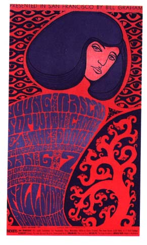