August 20, 2009
Posted by Avram Grumer at 05:40 PM * 17 comments
I came home from Worldcon to some hard drive trouble. All fixed now, but it was the work of days to track down the problem and solve it, and it wasn’t till last night that I finally had Photoshop and my scanner drivers reinstalled.

This image is licensed under a Creative Commons Attribution-Share Alike License.
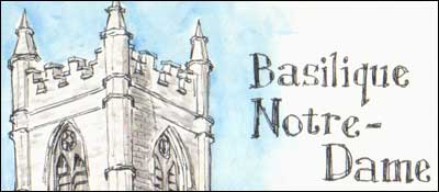
As with last year, there’s a drawing of a church. Also continuing last year’s tradition, a drawing of a caffeinated beverage.
I’m not as happy with this year’s batch of sketches. Last year I used a Moleskine 3½x5½ʺ pocket sketchbook; this year a Hand•Book 5½ʺ square sketchbook. Maybe I’m better off with the smaller sketchbook? Maybe the cream-colored Moleskine paper makes everything look better? Probably I just need more practice.
Here’s the full set on Flickr, here’s the set for last year’s Worldcon in Denver, and here’s last year’s Making Light entry with some background on sketchblogging at conventions.
The difference a little paper color can make is amazing. I loaded up the stuff from this year and the stuff from last year, and my first thought was that the stuff on the yellowish paper looked "real". The off-white color immediately made it feel more authentic, for lack of a better word.
It was like the difference between reading a proper book, with the thin, rough paper that flips easily through the fingers and reading a book that was printed on the heavy, white paper my laserjet spits out. Logic may say it is acceptable, but I know that it unbalances the humors in my body.
Once again I envy your notes-on-the-fly skills and legibility.
"Legitimizing the woo factor"
I am disappointed you didn't quote anything memorable from Margaret Ronald in that panel, just the other guy.
Very nice. Thank you for sharing!
Erik Nelson@2: I linked to this quote last week, but to repeat:
"Rolling a great big woo-katamari up the hill." -- Margaret Ronald
Peter Watts is just a sharp and quotable person, even for an SF con panelist. (I think Avram covers this topic in sketch 05. :)
Avram@0: You managed to misspell Neil Gaiman's first name, and then adapt his anagrammatic psuedonum (Ilen the Magian) to match. Good job.
I don't post often, but I have to say I've loved both of the sketchbooks you've done. Not just for the art, either, but for distilling down the core of what's interesting about each talk and panel. It almost makes me feel like I was there.
Thanks for posting your sketches again, Avram. Especially nice lettering this year!
Avram, have you thought about also archiving these at efanzines.com?
Great! I love how you managed to break every panel down to some lines - it's like getting a glimpse of what was going on, and imagining the rest of the discussion, and now *really* wanting to go next time...
I love the robots in Egypt illustration.
I was already working on the poem then, but I didn't actually write it until Sunday morning, because it was shabbat. No, really... but as a side effect, not as a conscious decision.
This is a very cool idea. I find I like the ones with more actual drawing content better -- I'm so surprised! But the ones that are largely textual observations on panels are interesting in their own way (and certainly contain significant design elements beyond the text!).
I like the sockpuppet. It looks so quizzical and harmless.
Man, these are great. I've linked to (not displayed) the ones that are of panels I attended on my panel reports, hope you don't mind?
abi @ 12:
"Jeez, I'm only asking a question."
These are wonderful! For the panels I attended, they're great reminders; for the ones I missed, great summations. Thanks. (I'm also flattered that I managed to get a quote in, given how much good stuff Jo and Robert had to say during that panel.)
Avram, your sketches have become one of the most-excitedly-anticipated post-WorldCon things in my internet. Any chance your making it to Melbourne next year?
From sketch/notes 16 (Pathologies of Fannish Culture): PNH - "This panel is a margin in which there is not enough room to write all of the things I'm thinking"
Which is exactly why I'm hoping Patrick will grace us with a sequel, in the form of a post right here on this blog. That panel did indeed have a remarkable "Is it time already?" feel.
Also, re: sketch 7 - I think you're right. Although I'm not sure I remember being in that particular spot (physically) in the conversation.
Comments containing more than seven URLs will be held for approval. If you want to comment on a thread that's been closed, please post to the most recent "Open Thread" discussion.
You can subscribe (via RSS) to this particular comment thread. (If this option is baffling, here's a quick introduction.)
(Real e-mail addresses and URLs only, please.)
HTML Tags:
<strong>Strong</strong> = Strong
<em>Emphasized</em> = Emphasized
<a href="http://www.url.com">Linked text</a> = Linked text
Spelling reference:
Tolkien. Minuscule. Gandhi. Millennium. Delany. Embarrassment. Publishers Weekly. Occurrence. Asimov. Weird. Connoisseur. Accommodate. Hierarchy. Deity. Etiquette. Pharaoh. Teresa. Its. Macdonald. Nielsen Hayden. It's. Fluorosphere. Barack. More here.