Go to Making Light's front page.
Forward to next post: Fanfic at The New Yorker
Subscribe (via RSS) to this post's comment thread. (What does this mean? Here's a quick introduction.)
When I first got started in bookbinding, the person who inspired me the most was Thomas J Cobden-Sanderson. He was one of the foremost figures in the great flowering of the British Arts and Crafts movement, as a bookbinder, a printer, and a type designer.
Although it was his masterful bindings that first caught my attention, his personal story held it. He’d been a solicitor, focusing on railway law, when he suffered a nervous breakdown in his early forties. He went to Italy to recuperate, and ended up doing more than that: he met and married Anne Cobden (and combined surnames with her; he had been born Sanderson). Through her he met William and Jane Morris, and they convinced him to give up the law and become first a bookbinder, and then a printer. He was extraordinarily talented at all of it.
As an adult taking up an art, I found this tremendously heartening. I’m no Cobden-Sanderson, neither in talent nor in need for a change, but what he did in 24-point bold, I could certainly do in 8-point roman.
And the way he struggled with depression spoke to me, since I do as well. It was probably that depression that led him to what I can only call a work of artistic despair: when the future of the Doves Press that he had founded looked bleakest, and further control of his work less and less likely, he gradually took all of the type from the press to Hammersmith Bridge and threw it into the Thames. It was an incalculable loss: the Doves type was unique and beautiful.
There’s a powerful statement here about the tension between consent and preservation, between individual and collective good. I completely understand his desire to retain control of his work, and his revulsion at the idea that it could be used in the mechanical processes he so despised. It would be like Treebeard watching the ents be set on on treadmills to power Saruman’s monstrous works at Isengard. But still, the loss of the type has always seemed like a crime, or perhaps a sin, to me. It was a lessening of human knowledge and a diminution of the beauty in the world.
(We struggle with this always. Virgil asked that the Aeneid be destroyed when he died. Are we right to read it now, given his deathbed wish?)
If it was a kind of sin, there is now a sort of redemption: Robert Green, a designer working on a digital version of the Doves type based on printed examples, went looking and found some 150 pieces. But it’s probably not usable, and there will never be a complete set, so perhaps Cobden-Sanderson is also satisfied in the end.
(There remains the question of the Green’s digital work, but that falls, at least for me, into the long tradition of using earlier examples of lettering as a basis for new fonts. I think, or hope, that the work of translation and interpretation required to make a digital typeface from the Doves printed matter would form enough of a remove for Cobden-Sanderson’s peace of mind.)
(Thanks to Cadbury Moose for the heads-up on the story, and Sisuile Butler for the link to the article.)
Sam Starbuck (copperbadge) has been trying to make a 3D printable version based on the digital recreation, though he acknowledges that plastic wouldn't hold up to a full-scale printing press.
If you've got a sufficiently high-resolution model, you can print out molds to let you make wax casts that you can then use to make metal molds that will last.
1
I believe that it's possible to do 3D printing with metal, but it's maybe not something that can be done at home.
Abi #0: There’s a powerful statement here about the tension between consent and preservation,
Also between preservation and destruction itself. Things get destroyed or disappear all the time, and always have. And also, there have always been those who battle against entropy.
Always, something is lost over time... but even so, the balance seems to be shifting. We can draw DNA out of millennia-old bones, reconstruct an accident or murder scene from the event's traces in the environment, and of course store huge swathes of history, art, science, and other data.
And yet... I wonder about the costs of being progressively less able to forget things. We're already seeing more and more people affected by relics of their past, preserved online or in various databases. And some of the databases that were supposed to "help us remember" have themselves become opaque masses which need to be explored rather than consulted. (U.S. Patent Office, looking at you.)
I'd seen the story of finding the type under the bridge. I'm glad to hear more of the story, though it is sad.
I want to go to Jo Walton's Just City to see the artworks rescued from oblivion -- and then leave!
In the past, people suffered "nervous breakdowns". I've wondered what diagnostic labels they would get today. Clinical depression seems likely for many of them.
Cobden-Sanderson, it should be noted, also paid his workers a living wage, limited their work time to 48 hours a week (that was short for someone in the printing and binding trade at the time), and gave them decent vacation time.
Although this meant that he had the pick of bindery workers in London, with predictable results for the quality of Doves Press books, that's not why he did it. He just thought it was the right thing to do.
If he were alive today, they'd be calling him a Social Justice Warrior.
I read that story some months back, moving. The struggles (life, hope, love, loss) and the means of coping (in this case a bit tragic).
But I love type, If I could have a linotype, and press, I would (I'd also have a forge, foundry, mill, shaper and lathe).
Had we but world enough and time.
Maria Barbosa spoke to my education class last week. Maria Barbosa - she is a scientist who came to art later in life and brought her life, background, and science outlook to a thoughtful passionate art. Totally blew me away; I dreamed art ideas all that night.
When I first saw your philosophical tweet, before following it back in time to the typeface, I thought you were speaking of Harper Lee's novel, which in my mind reflects some of the same questions.
Does she want it published, or hidden? (Augmented by, can she decide?)
Should it be published regardless of her wishes?
Would the answer be different if she had died and it was found among her effects?
Regardless, I'm fascinated by the tale of Mr. Cobden-Sanderson; thank you for sharing that. I daydream of running away to become an artist, despite loving my career and having worked very hard to get where I am. There's always something else, and sometimes it works. Sometimes it falls apart at the end, though.
Cast thy type upon the waters; for thou shalt find it after many days.
Was the Doves type actually Cobden-Sanderson’s creative work? This article in Creative Review says it Percy Tifflin who drew the type, and Edward Prince who made the punches, while Cobden-Sanderson had merely commissioned the work.
Rise again, rise again....
As for the recovered Harper Lee novel, I'm surprised that all the questions seem to be about her consent, with no one saying it might not be by her.
Avram, I don't actually know who had how much influence. I know that Cobden-Sanderson was pretty controlling of all aspects of the production process at Doves. It's my suspicion that he was all over the design process for the type. (It's also my suspicion that he was a pain in the ass to work with.)
Nancy Lebovitz (15): Is there any reason to suspect that it is *not* Lee's work? She certainly hasn't disavowed it.
Regarding the philosophical points about consent and preservation: taken broadly, this impinges on a couple of areas of current discussion. It's not just the question of whether Lee has consented to the publication of her sequel to To Kill a Mockingbird.
These questions have a similarity-in-shape to the conversations that have been going on about vaccination, in the sense that the tensions are the same: how far do the rights of a private person include the right to choose a destructive path that impoverishes or damages the common good? (The answers may very well vary, but the questions are similar.)
Virgil's deathbed wish was that the Aeneid be destroyed, because it wasn't ready for publication in his view. What if his wishes had been obeyed? How much was the political landscape of the Julio-Claudian emperors affected by this epic poem, this Birth of a Nation-level sweep of mythmaking? And after its immediate political impact dissipated, what of its later effects? What would the Inferno be with another guide than Virgil?
One of my friends is helping to start the American Bookbinders Museum in San Francisco (http://www.bookbindersmuseum.org/), a museum dedicated to the lives of bookbinders in the nineteenth and twentieth centuries. It's still mostly in the archiving and preparing stages, but they've gathered some interesting bits and pieces.
#17 ::: Mary Aileen
There's no reason to think it isn't her work, I'm just wondering.
abi @18, and what about the possibilities of an alt-history version of Inferno, where Virgil is among the damned for ordering the Aeneid destroyed?
Regarding abi's comment about her own bookbinding, if it sounds like I'm bragging when I say I own two samples of her work, it's because I am bragging.
P J Evans, #6: There was a Kickstarter some while back for a home 3D printer that would use precious metal clay as a medium. I missed the campaign, but have been following along with the updates, and they seem to be having considerable success -- enough that the last update said they were sending out the DIY kits to those who had supported at that level. Ghod knows when they'll have a commercially available version (or how much it would cost), but WANT. The ability to design and print my own sterling charms and components would greatly improve my design flexibility.
Shapeways does 3d printing in brass, bronze, sterling silver, gold, and platinum, and plates in 14K gold, 18K gold, 14k rose gold, and rhodium.
Nancy Lebovitz @ #24:
They also have some interesting hybrid materials (this is something I uploaded and had printed in what used to be called "alumide" and now seems to be "metallic plastic").
Nancy, #24: Interesting! But I want to do it in-house, hence the PMC. We already have a kiln that will do the firing.
What is worth remembering about the story is that, while the digital Doves Type has been refined after the recovering of the lead type, it has mostly been done from painstaking examination of printed text. (And there were a few problems over access to high-resolution images of printed text.)
And now you can have your own copy, and for all the work in making that it doesn't look so expensive. Licensing comes into it, but if I were sending physical letters, it doesn't look so expensive to have something rather nice, and somewhat distinctive.
Anyway, we should maybe not get hung-up on the physical type part of the story.
(I have, somewhere, some CD-ROMs with pre-Unicode type collections on them, with versions of fonts such as Palatino, rather than the usual Windows set. There's Garamond and Cooper Black and Goudy Old Style (but how genuine are they) and Gill Sans on this machine. And WingDings. There's something about the font that some people just never notice, beyond the Sans Serif marker.)
((Have you ever been to San Serriffe? The climate is pleasant at this time of year.))
(((Yes, I know...)))
Dave Bell @27: But Dave, Abi's post is about the physical type. Some of us are permanently hung up on the concrete physical particularity of type and paper and printing. It's a different mindset.
Let me tell you a story. Linda Sillitoe and Allan Roberts' Salamander: The Story of the Mormon Forgery Murders is a pretty good true-crime book about the Mark Hofmann case: forgery, bombings, murder, historical reimagination, and Mormons gone wrong. For me, that's catnip.
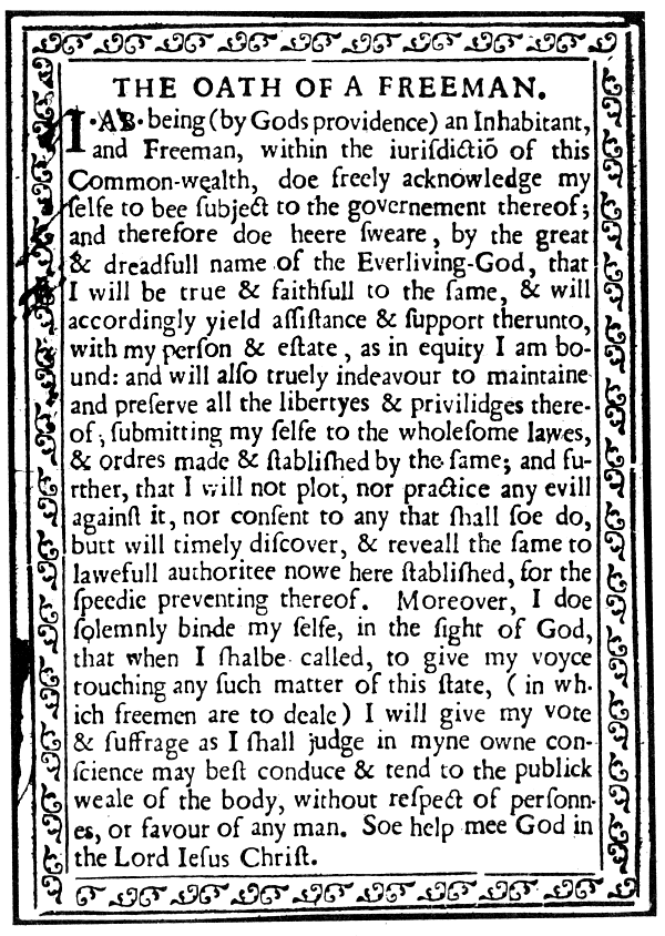
One of the threads in that story was Mark Hofmann's forgery of The Oath of a Freeman, the earliest document printed in the British New England colonies. The text is extant, but no copies remain. Hofmann forged one, which he printed on contemporary paper. His agents began negotiating with the Library of Congress. Asking price: a million or more.
Hofmann was strapped for cash. His murders by bomb were part of his increasingly frantic attempts to hold his business affairs together while he waited for the Library of Congress to buy his Oath of a Freeman forgery. But the LC, which had initially said they "found nothing inconsistent with a mid-17th-century attribution", kept delaying their final decision -- more than a year, IIRC. They didn't cite any specific objections. They'd just grown uneasy.
So that's the backstory. I was reading Salamander during my early days as Tor's Associate Managing Editor. I told Martha Shwartz -- Managing Editor and my longtime mentor -- about the Hofmann case, and showed her a photo of the Oath of a Freeman forgery.
Memory is an imperfectly reliable thing, but what I recall is that it took Martha less than a quarter of a minute to pronounce the document impossible. She'd worked with lead type, and had instantly spotted the real problem with Hofmann's typography: in places, the descenders in one line infract the ascenders in the next.
Look at the facsimile I linked to. See how the j and g in the fourth line hang down below the highest points on f, h, and b in the fifth line? It's called negative leading. You can do that if you're working with image-based repro systems, but in metal type it's physically impossible.
Modern type design has made us familiar with tricks like negative leading and negative kerning. No one's startled by them. It's all just images. In order to truly see that detail, you either have to already be looking for it, or you have to be someone like Martha, for whom every mark on the page is and will always be bound up with the physical processes and equipment that produced it.
Abi's one of those people. So is Patrick. So am I, for a slightly later generation of technology. (Kansas City fan Dr. Paisley and I can go to town on Alphatype vs. Compugraphic, with side-remarks on the IBM Compositors.) As the saying used to go, we've got ink in our blood.
Humor us, okay?
Dave @27:
Further to Teresa's comments...when I was a kid, my father had a printing press in the basement*, along with a weighty profusion of lead type. I did enough typesetting as a kid to be entirely comfortable reading mirror-writing**. I've been known not to notice that something's backward until I'm well into the text. And I already linked to one of my Everything2 articles in the OP. Here's another: my factual love letter to type.
So for me, the physical type is a Big Effing Deal, whether or not it's useful for Green's work. It's powerful and emblematic, like a relic or a talisman. The fact that someone is making a digital font is all very well, but people do that all the time. What made me CAPSLOCK TWEET was the fact that these physical objects, the Jimmy Hoffas of the late Victorian book arts world, have come to light.
Am I hung up on the physical type part of the story? Like a coat on its very own personal coat hook, mate. And I'm fine with that.
------
* Now he has two, but I've never actually used the Vandercook
** Producing it is another matter, because muscle memory
29
When I was working at a microwave electronics place, some of the products I was building had to be labelled. They were going to be used by government, so the labels had to be printed on them. In something like 2mm DIN (because they were maybe 1.5cm on the next-to-shortest dimension). With actual metal type, on a little teeny press. (There were also, later and elsewhere, assemble-your-own rubber stamps with good-quality type. Why, yes, I can read right-to-left Roman.)
Kafka wanted all his manuscripts destroyed, but his literary executor Max Brod ignored his request. Gogol, on the other hand, burned most of the completed manuscript of his sequel to Dead Souls (he said it was "a practical joke played on him by the Devil").
One thing that is not the same as it was at that time is our idea of which characters are in the character set. \ and | might not have existed. _ was not a character in its own right but a character-modifier. " did not exist until typewriters (we used left and right quotes until then.) ' was curly. (did the inventor of the typewriter take the curl away in order to make ' do double duty as the top half of an exclamation point?) 0 did not have special markings to make it different from O, as it does on some computers.
The Euro symbol did not exist, and neither did a new rupee symbol that sometimes arrives in your fonts when you upgrade your computer.
Was the space considered to be a character at that time?
Speaking of museums of printing crafts, one thing I found via Facebook was the Eric Gill society, [of Gill Sans fame] which does things at the Ditchling Museum of Arts and Crafts, in England. If it were closer I'd visit.
The letters are excellent, but the numbers are painful.
To what extent does a creator own their creation? Given that creativity is the result not simply of individual genius (that is the personal characteristics of a given individual) but of social forces impinging on that individual (the effects of language, upbringing, particular circumstances). Creativity, it seems to me, is as much social as individual. Did Virgil have the right to deny the Æneid to posterity, given that it emerged not only from him but from a set of social processes of which he was the centre? I'm not making the claim that he did not, I'm asking a question because the issue troubles me.
On the subject of 3D-printed type: it's neat, and it's shiny, but it's not the direction that the letterpress community is headed in these days. As my father discovered (to his spectral horror) during a course on the care and maintenance of Vandercook presses, most letterpress hobbyists these days design the individual pages on computer (I'm not sure what program they use). They then send the files off to be printed? carved? chemically carved? in polymer, and receive a plate with the whole-page image on it.
The polymer plates aren't very durable. I don't know how many impressions you get per plate before the edges go all gloopy, but it won't be as much as even the softest of lead type. But higher-volume production just uses litho anyway, doesn't it?
Given that Gutenberg was innovating away from carved wooden whole-page impressions, he's probably spinning in his grave right now.
abi @ #36:
I have no idea what they actually do, but if I was trying to do it, I'd probably use photo-resist and solvent. Probably in multiple layers, to get the requisite height.
TNH @ #28:
That... almost sounds like a challenge (getting the bottom of the descenders on one line lower than the top of the ascenders on the below line).
Darn, I may have to find a press and dabble in bespoke type manufacturing. And I don't have the time!
Ingvar M@37:
That... almost sounds like a challenge (getting the bottom of the descenders on one line lower than the top of the ascenders on the below line).
I've seen examples of type where the descender or ascender is not mounted on a solid chunk of type, but on a shallow extension of the top of the type with that bit of the letter on it. This does allow some low-value or negative leading, but it's also very fragile and kind of stunt typography.
"Only the phoenix rises and does not descend. And everything changes. And nothing is truly lost." —Neil Gaiman
Love that quotation...
abi @ 18: I'm now imagining a time-line where, in the absence of Virgil, Dante ends up being guided round the under-world by Lucretius (to the bemusement of each of them...)
The other thing the OP brings to mind is the story a few weeks back about getting to read the incinerated Herculaneum papyri without unrolling them. (I'm secretly hoping that although it was an Epicurean library a few Stoics might turn up there too.)
Fragano Ledgister #35: Consider also the case of someone wishing to destroy their Slushkiller 8 toxic-waste.
Nancy @ #34
"Lining" figures were traditional. I don't know if they found any of the actual metal type for numbers and specials or whether that's just extrapolation.
I have some Truetype fonts with lining and modern numerics somewhere.
abi @ #16 & #38
Given that he was firmly against mechanised printing, I have no doubt that the type would be hand-filed to fit the design where necessary - no matter how long it took.
Cadbury.
(Who has a VariTyper 610 stashed in a cupboard somewhere.)
42
Look for 'Oldstyle' or something similar in the font name.
This moose is entirely old style, I'll have you know!
I think it was Monotype Plantin, and an "expert set".
Ingvar @37, Abi @38: It either takes fiddly stunt typography with little stuck-on dabs of metal, or you saw off part of the letter above or below the infracting ascender or descender (bad idea, can't re-use that type), or you solve the problem of getting two pieces of metal to occupy the same space.
And it still wouldn't be a working answer, because setting metal type with negative leading must sooner or later result in overlapping ascenders and descenders. The only way to produce those would be to run the document through the press twice. This would be a good solution insofar as it wouldn't damage the type or require solids to interpenetrate one another. On the other hand, it would require perfect registration on every copy of every page.
Piece of cake.
TNH @46 -- and it would require someone who wanted to do it, not someone who was just trying to produce a useful copy of a document.
It's not the impossiblibility that's the point: it's that the person printing that document would have had no reason to go to that kind of trouble, and would not have done so. I can think up several ways to do it: and all of them require significant and deliberate effort. People made the significant effort to produce ligatures (which is the same sort of thing within a line) because they wanted things to look better; but nobody would have done it to cross a line without a good reason. And I don't believe that such a reason existed for that document, without a signed note from its creator crowing about how s/he had solved the problem and why.
TNH @46:
On the other hand, it would require perfect registration on every copy of every page.
Piece of cake.
Please be assured that I clean my screen regularly even without your kind assistance.
Cadbury Moose: Was the VariTyper what you used if you needed some display type in a font the shop didn't have on the Linotype? I remember a tabletop machine like that at the Mesa Tribune. Fonts had to be loaded in advance, one at a time, and the Trib charged for output by the word.
Cadbury Moose again: I think they referred to it as a headliner, but I don't know whether that was its name or just a descriptive term.
Teresa @ #49 & #50
I have the "electric clockwork" typewriter - there's an electric motor to wind up the spring, the font is arranged in three rows on what looks like an aluminium drum-brake shoe, and everything has to be typed twice. (The first time it counts the units and spaces, then you pressed the tab key which moved you to the "output" column and engaged the differential spacing gubbins, and you typed the line again to have it come out as justified text.)
Fonts were interchangeable from about 6 to 12 point (I think) and there were a lot of them. Keyboard action was appalling as it rotated the typeface shoe to the correct position then tripped the hammer to print the letter.
(It was necessary to press the key steadily all the way until it bottomed-out and the hammer fired before releasing it. Something of a pig to use but it was office rather than industrial equipment and the results were excellent.)
The headline machine was the "Headliner" which had font discs and was a photographic process as far as I can remember. You rotated the disc (like a giant Dymo labeller) and pressed the button. Each different font style or size required a different disc.
This was the cold type version of the Ludlow casting machine.
(I once walked around the Gestetner "office/factory" in Granville Street Birmingham and they had Ludlow machines and other hot metal equipment which was used for producing "letterheaded" or preformatted wax stencils for their duplicators.) All the kit was idle (and I suspect awaiting the scrapman) as technology had marched on.
I don't have any problem with numerals which go above or below the line.
The Doves numerals include a 2 with a grotesquely large upper counter, 3 with a large upper counter and trailing off to a point at the bottom: 6, 7, and 9 have strokes that end with large clubs that doesn't look like it has anything to do with anything else.
52
They look very much old-style - aiming, I think, for something roughly 17th century.
Teresa Nielsen Hayden @#28: Hofmann was strapped for cash. His murders by bomb were part of his increasingly frantic attempts to hold his business affairs together while he waited for the Library of Congress to buy his Oath of a Freeman forgery.
Wait -- wasn't there a L&O episode loosely based on this case? Guest-starring Stephen Colbert in one of his rare dramatic roles?
Sarah, yes there was. Though I don't believe it mentioned Mormons; Teh Intarwebs appears to think Colbert's character was forging items related to a Catholic saint.
Yes, they did make some alterations to the story.
I remember working at a newspaper group in 1988 and it had a typesetter operating a photo-output machine that made one long column. We learned tricks like folding it into thirds and holding it up to the light to line up the lines in order to evenly distribute the copy over several columns.
Cadbury Moose @ #51 - I started off in fandom at the tail-end of our using Gestetners for con newsletters and the like, and computers and DTP were beginning to be used. This was before MS Word was "good enough" and I nearly always had John Miles' 'Design for desktop publishing' open on the desk as I tried to get my Atari to load TrueType fonts and run Timeworks at the same time. (Still have it on the shelf, too.)
The weirdest hack I ever did in printing was mixing the old and new at a Trek con where we fed stencils through a dot matrix printer with the ribbon taken out. The results were quite impressive, although the printer was never quite the same again.
My favorite printing hack was using correction ribbon on black paper to produce white-on-black type. Very punk rock, I thought.
Harry Payne @ #58 writes:
> we fed stencils through a dot matrix printer
> with the ribbon taken out.
A some-time Buddhist monk I used to work with spent a lot of time in Burma/Myanmar retranscribing Buddhist scriptures which were falling apart. Dot matrix printers were gold for him because they could cut stencils.
India Railways still uses very early dot-matrix printers heavily for printing schedules ... because they can print on five-layer carbonless paper (producing KNOWN IDENTICAL copies quickly), and they're endlessly repairable with almost no tech on hand, as long as you have a bucket of parts and a stationmaster who knows how.
They're used for, among other things, printing the day's schedule to post on boards beside the station.
They bought them all with a burst of funding when computers were first introduced to the scheduling process at all, and have not required further major capital outlay since.
Ingvar M @37: I'd probably use photo-resist and solvent. Probably in multiple layers, to get the requisite height.
How high does it have to be? The photopolymer plates we used for rubber stamps back at Gopher (in Mpls, of course) was a good 2mm, IIRC.
Mmmmmm, polychloroethene...
61
Beats the four-part laser-printable pressure-sensitive paper. (You have to check to see that it's stacked correctly before you load it.)
Not to distract from the type talk, but I read the article on the Creative Review site the other day, and it struck me that everything about this story is just SO English.
Abi @ #38:
That's close to what I was thinking. Although, I think a more scalable design would require a re-designed type-mounting plate and at that point, it mostly becomes a case of "can it be done" rather than "is it practical" and that takes it firmly into the "but, why" category for me.
Now, cutting burr puzzles on a laser cutter... Charlie can probably vouch for the results, as I gave a couple to him, last time we met.
Jacque @ #62:
Experimentation would be needed (basically, it depends on the flex of the base polymer, the ink and the pressure of the press). I think a typical photo-resist layer is on the order of 0.1 mm
Maybe combining photo-resist and multiple solvents would be more practical.
Fragano Ledgister @#35: To what extent does a creator own their creation?
As a painter myself, with some small knowledge of art history, I've come to believe that conservation often begins with getting the work away from the artist before they can destroy it in frustration.
Ingvar: I guess I'm not clear on what you're talking about. The two processes I've had exposure to are the photopolymer version I mentioned above (which was also used for printing the early versions of those little stickers you see on fruit), and produced rubbery plastic plates ~.1" thick, with the impression give-or-take half that thick. When doing the stickers, I was also given diameters (of the printing drum) so I could calculate stretch, and produce the original image to the appropriate distortion.
Then there were the aluminum (?) plates we were using for offset presses back in the '80s. It was this whole long complicated process of producing the flat page image in some sort of paste-up of bits of paper with the text photo-imaged on, make a negative of that (and spend an hour or two with a bottle of opaque red corflu and an X-acto knife, tidying up all the little shadows and spots), lay the negative over your plate (which has a photoresist), then run the plate through some narsty chemical to finish. The entire plate was not quite as thick as the steel in a tuna can; the printing impression some fraction of that. I think the photoresist layer was on the order of your .1mm. Go watch the movie To Live and Die in L.A. for a nice demonstration of this process, just the way we did it MasterPrint.
Nowadays, I think (especially for newspaper-scale printing) they just put a whole plate suitable for a newspaper-page-side (call it 24" square) into what amounts to a ginormous laser-printer, and print the page image straight onto the photoresist, thus eliminating the paste-up and negative steps. Come to that, they were just poking at that in the mid-'80s, so these days they're probably doing something even more exotic and streamlined.
abi @36: Have you seen any of these photopolymer plates? How thick are they? If they are what I think they are, this tech is decades old. (And, yes, you want to farm that out; you do not want that solvent in your house.) And yes, I can well believe the photopolymer plates aren't particularly durable. I'm curious as to what moves them to go with that, rather than the metal plate version?
David Harmon #41: I'd leave my juvenilia to the critical judgment of the mice (to cite one K. Marx), but who knows.
Sarah #66: That's the 'best is the enemy of the good' problem, isn't it?
Jacque @67:
I've never seen them, I went looking on the web. It looks like they're quite thin polymer plates, and are used over a base block that raises them to type height. this page has a good picture of one rig.
Oh yeah... I had forgotten that the polymer comes in different thicknesses. I even have a vague memory of working with something that looked very like that example....
Fragano Ledgister :@#68:
That's the 'best is the enemy of the good' problem, isn't it?
Pretty much. Speaking from experience, I think there's also an "I don't place that much value on this, because I know I can make more of it" problem, though that generally leads to underselling the work, or storing it in poor conditions, rather than to wholesale destruction.
WRT the OP and the attempt to control one's legacy:
Joni Mitchell Wants to Define Her Own Legacy — So Why Don’t We Let Her?
Elliott Mason #61:
The 'multiple copies' bit is also why impact dot-matrix printers are still used in shipping, some banking, as well as in various governments: print out a multi-part form, get people to sign the top copy, then everybody can get a copy of the whole thing.
There are still a couple of companies making impact dot-matrix printers. (Full disclosure: I work for Epson, which is one of them.)
http://www.bbc.com/news/uk-31188255
Headline:
Lost typeface printing blocks found in river Thames
David Harmon @ 72: did you follow the links in that story? The Vanity Fair article on Laurel Canyon reads as if Mitchell went there because of RAH's "And He Built a Crooked House". Talk about weird connections....
Yes, this assumes that RAH wasn't just riffing on somebody else. But I'd guess against that; I get the impression RAH knew canon classics well but not so much of contemporary work that he could have borrowed those lines from -- if they even exist anywhere else.
Direct-to-plate printing; I can't remember exactly when the newspaper I worked at stopped making paste-ups (that had to be shipped to a printing plant via taxi in the middle of the night) and started sending pdf files for a direct-to-plate process instead.
PDF files were something new; as I recall that was the first place I had ever heard of them.
Circa 2000 or maybe before. Definitely after 1996,
#75: I think Chip is right. To fill in the gaps, Joni Mitchell, quoted in Vanity Fair:
When I first came out to L.A. [in 1968], my friend [photographer] Joel Bernstein found an old book in a flea market that said: Ask anyone in America where the craziest people live and they'll tell you California. Ask anyone in California where the craziest people live and they'll say Los Angeles. Ask anyone in Los Angeles where the craziest people live and they'll tell you Hollywood. Ask anyone in Hollywood where the craziest people live and they'll say Laurel Canyon. And ask anyone in Laurel Canyon where the craziest people live and they'll say Lookout Mountain. So I bought a house on Lookout Mountain.
Robert A. Heinlein, "—And He Built a Crooked House," 1941,* anthologized in many books:
Americans are considered crazy anywhere in the world.
They will usually concede a basis for the accusation but point to California as the focus of the infection. Californians stoutly maintain that their bad reputation is derived solely from the acts of the inhabitants of Los Angeles County. Angelenos will, when pressed, admit the charge but explain hastily, "It's Hollywood. It's not our fault—we didn't ask for it; Hollywood just grew."
The people in Hollywood don't care; they glory in it. If you are interested, they will drive you up Laurel Canyon "—where we keep the violent cases." The Canyonites—the brown-legged women, the trunks-clad men constantly busy building and rebuilding their slap-happy unfinished houses—regard with faint contempt the dull creatures who live down in the flats, and treasure in their hearts the secret knowledge that they, and only they, know how to live.
Lookout Mountain Avenue is the name of a side canyon which twists up from Laurel Canyon. The other Canyonites don't like to have it mentioned; after all, one must draw the line somewhere!
Chip considers the possibility that Heinlein's preposterous claim about the street he lived on was not pulled from his own imagination. Remote, very remote, if you ask me.
Heinlein was long gone from the neighborhood by the time Joni Mitchell arrived on the scene. Nevertheless, I myself have found something weird going on along Lookout Mountain Avenue.
In other news, a photography studio operated in the neighborhood during the 1950s. Their specialty? Photographing nuclear explosions. When they weren't chasing A-bombs, they were following Bob Hope around.
These cameramen have been immortalized in Lego.
* Technically, "'—And He Built a Crooked House'" because the quotation marks are part of the story's title.** Heinlein did this a lot.
** So is the em dash. I put em dashes in this posting. I don't usually do this. I ask myself why not. I think the answer is that I don't believe em dashes will get transmitted reliably. In my mind, I am still writing for Usenet in seven-bit ASCII. I type two hyphens and a space-- because hyphens are definitely contained within the seven-bit ASCII character set. It's an extreme case of Postel's Principle, born of a long boyhood on the Net. Someday I will get over this hesitancy.*** Someday I will also stop appending sigfiles to my messages whose design presumes that my correspondent is reading e-mail in a monospaced font with lines 72 characters wide. People probably don't do that any more.
*** There are two hyphens and a space in my sobriquet because, when I first started sending e-mail. I wanted to be "Bill Higgins, Beam Jockey." Quickly I learned that an embedded comma in the "From:" string broke some mailers, causing my messages to bounce. So as a substitute, to indicate a slight pause in speech, and because I was a veteran user of typewriters, I put in two hyphens and a space. Postel's Principle again.**** Read the pause as you would read "Have Gun, Will Travel" and not quite so dramatic as in "Othar Tryggvassen, GENTLEMAN ADVENTURER!"
**** Same reason I find myself using good old asterisks for these footnotes, though I know Making Light is perfectly capable of rendering daggers,† double daggers, and other forms of Unicode dingbattery.
† I really should stop writing footnotes now. It's late.
CHip #75, Bill Higgins #77: I find it entirely reasonable that both Heinlein and Mitchell could be referring to neighborhood lore. Every large city or town surely has at least one neighborhood that's "the wierdest" or "the roughest" or "where those people live" and the form of the lore is classic for such "local summaries".
Bill, there's one gap in your story, which is that you don't give a citation (or footnote :-) ) for the claim that "our" Heinleins lived at 8777. Obviously RAH was referring to that house in "Crooked House", and calling himself the Hermit of Hollywood would be a clasic joke. One way to disambiguate would be to look for other appearances of the immigrant family, especially the son Rolf (who should have, e.g., a local birth certificate).
Regarding Postel's law: I found an article summarizing one of the problems with taking it too far. Besides the security issue, there's the issue that you end up with the oldest components of a system not getting updated (and holding back development overall), because officially "they still work".
More fundamentally, Postel's rule is a guideline for individual programmers with immediate goals: "Don't be the one whose code 'breaks' (that is, throws an error) because then the boss yells at me". But that's outdated, a relic of the days of "cowboy programmmers" who only had to worry about their slice of the project. Nowadays, we know that throwing an error can be correct, even necessary, behavior.
And in a competitive environment, being too accepting allows other players to pull dirty tricks. I personally encountered Microsoft's "purity tests", where (e.g.) their mouse driver would use an undocumented command to test for "real Microsoft hardware", and FUD the user if a mouse "only" fulfilled the official spec. And of course, Postel's Rule was key to enabling Microsoft's classic "Embrace, Extend, Extinguish" tactic for undercutting competing standards -- the rule makes anything written to the original standard look like "the bad guy" if they object to arbitrary extensions... which soon become effectively required, despite being proprietary.
For my own use on the web, I am usually happy to try HTML entities and simple tags on a site (because nowadays, those do work most places), but then "fall back" if necessary to stars and dashes.
Bill Higgins @ 77... Neat post.
Bill Higgins @ 77... Neat post.
In #78, David Harmon argues well for the "neighborhood lore" possibility, and goes on to write:
Bill, there's one gap in your story, which is that you don't give a citation (or footnote :-) ) for the claim that "our" Heinleins lived at 8777.
Oh, I have plenty of his correspondence, thanks to the Heinlein Archives at UC Santa Cruz, showing 8777 Lookout Mountain Drive as his return address.
Obviously RAH was referring to that house in "Crooked House", and calling himself the Hermit of Hollywood would be a clasic joke.
The Hermit of Hollywood was a different guy, one Peter Howard. It's not clear why he is mentioned in the story, except as an otherwise-unexplained example of a local eccentric.
One way to disambiguate would be to look for other appearances of the immigrant family, especially the son Rolf (who should have, e.g., a local birth certificate).
I've done some searching without success, and I believe Mike Glyer has as well.
Bill Higgins-- Beam Jockey@77: Given that my nym doesn't fit in ASCII (or ISO Latin 1, for that matter), I've obviously grown less conservative in what I transmit since my early networking days. (I admit that I do this despite having observed that the "view all by" pages mangle non-ASCII.* On the other hand, part of my love for the "ı" character is that it is a classic screw case for programmers, so I think it's at least appropriate in this conversation.)
David Harmon@#78: Postel's Law is a great principle for the original problem domain: just getting a bunch of independently-implemented network elements to talk to each other. Like a lot of network heuristics intended for a cooperative setting, it has problems when you move away from that model, but I think that's more a problem of carrying a reasonable heuristic into the wrong domain.
Being "too accepting" was (and up to a point still is) also a competitive advantage in, e.g., the web browser wars. To a first approximation, no user cared whether your error message on a page was correct if another browser rendered the page intelligibly.
* Someone addressing me winds up addressing "dotless ı"**, which in Unicode terms must mean "plus or minus at least 109 codepoints".
** I'm guessing this will be something like "dotless ı"*** in the latest "view all by".
*** ...
You guessed right about how it would display, dotless ı @82.
My thumbnail reply to Postel is that every web browser is an HTML generator, and should therefore check HTML validity strictly.
(The HTML generation feature consists of a human being who is writing a web page and seeing how it looks in the browser. Like it or not, this feature cannot be disabled, patched, or upgraded by the browser developer.)
Tom Whitmore@83: Well, "guess" was the wrong word; I've looked at enough bad data to recognize the pattern. I was just hedging against screwing up the transcription, since I was too lazy to work it out in code. (And, in fact, I did mess up slightly: the cascading errors suggested by my third footnote didn't happen, because I used HTML entities in the second footnote. Defeated by success!)
Andrew Plotkin@84: I agree with the "should", but my memory of what actually happened is that, to the extent permitted by security concerns (which, early on, meant "always"), it was always a better move for a browser vendor to make a good guess about the intent of invalid HTML than to deliver an error.
Some thoughts on type:
When I was young (High School young) I learned to set type (both hot and cold: Linotype, and block) That, oddly enough, made me a printer. I also learned how to run a press, so I was a pressman (for a very liberal use of the word). For the longest time I kept a slug from my first day on the Linotype.
I can still recall the smell of the machine, oil and hot brass; warm steel and the smell of lead cooling.
Invgar/abi (37/38, ref Teresa at 28). I've seen people play games with negative leading, but the amount of work required... not practical for an entire book. The trick (as abi knows) is to have the letters intrude into the negative space between the lines. In a linotype it can't be done. The letters are cast in units, and the only variation is the amount of leading (strips of lead/antimony [the latter to keep the letters hard enough to complete a print run, then all is tossed into the melt; to be recycled into the next print run).
With set type... one could do it, but oh my God the work. You'd need to have specially cut letters, and be using not less than 3 pt. leading (with three strips, of one pt.) and then trim it to fit, so as to let the longer letters intrude into the negative space. There, of course, cannot be any entangling of curved elements.
Which brings up one of my pet peeves. To me, from years of newspapering, letters come in sizes, and those sizes are measure in points (and picas). Computer typefaces don't actually adhere to this; though they pretend to. I've done comparisons. Printed out the same phrase in different fonts and used my pica pole to measure them.
They varied, a lot (one of the 10 pt. fonts was almost 14). At a guess some company decided "12 point" was the most readable (perhaps 10) and so made the fonts closest to that, "12 pt".
As an aside, when we were choosing a place to get married one of the appeals of the Yiddish Book Center is the linotype, and the presses; which have these glorious sets of type (and matrices; which is what one calls the brass dies a linotype uses to make the "slugs" of type); teeny tiny ones (suitable for footnotes), and HUGE sets, suitable for broadsheets meant to be read from across the sidewalk.
I miss type. I'm not the sort of afficianado who can spot more than a few typefaces by eye, but the details of it; the quirky bits of scarring a letter gets, or the way a press will develop hickeys (and therefore some pages will have blotches) and the sheer amount of effort that went (and goes) into setting type, to move ephemeral thoughts to persistent object; it sings to my soul.
Teresa: I recall reading a couple of books about HOffman: Amazing skills, appalling morals, and a brilliant sense of who his primary mark would be... married to a sense of greed, and (briefly) invulnerability. Expanding his target pool was a terrible idea.
It occurs to me that I've never heard the word said out loud, just written. So, when referring to type, is "leading" pronounced "ledding" or "leeding"? I could make a case (upper or lower!) either way.
Cally @88: It rhymes with "Reading". Not that that helps.
I'm fairly certain it's pronounced like the gerund form of the metal the leading strips are made from. Originally, leading was done with rectangular strips of type metal put between rows of type to space them out.
Buddha Buck: Heh. I remember playing Monopoly with neighborhood kids who didn't understand why my family pronounced it "Redding Railroad" instead of "Reeding Railroad", but we (obnoxiously) knew that it was named after Reading Pennsylvania, which is pronounced Reeding.
Ack. Which is pronounced Redding, of course. Bad fingers; no biscuit.
Cally, #88: I've always thought of it as "ledding" because I assumed it was a reference to the spacing strips made from lead metal. Same thing for the framework that holds pieces of stained glass in place. But I could easily be wrong, on either or both counts.
The stained glass component is indeed "ledding".
Bill Higgins @77: My impulse to clarify things is to go dig through the property records, but it appears that Los Angeles County charges money (and a not-insignificant sum) to view property records. (Although, on second thought, I suppose that makes sense, given the local demongraphic.)
Jacque @94
And of course the notion of searching LA County property records leads to memories of the John Varley story, "Press Enter".
94
You want to talk to a real-estate agent or someone who deals with mortgages. They'd have access. (There used to be microform copies of the assessor's records. We had them where I worked, and they were very helpful when trying to determine the address of a lot.)
It's "ledding". The strips I used were 1 pt, 97:3 lead antimony: because that way one didn't have to sort them when the pages were unlocked (we did, because leading cost money, and the pages were a set width, so we'd already cut them to length).
For those of you in Seattle who are interested in bookbinding, the Frye Museum is doing a workshop for beginning bookbinding on 3 Sundays in March:
Book Binding with Kate Fernandez
For beginners
Sundays, March 15–March 29 ((6 hours each day))
Art Studio
The description is here.
I note, checking the registration page, that the price for non-members ($225) is $10 more than the price of buying a single adult membership ($50) and paying the member price ($165).
Check out their other programs: the Frye is a very nice small free museum, well worth visiting. I like them a lot. And if you are planning on going, I've got several large sheets of binder board to spare, if you'd like some.
Bill Higgins @77
There's an obvious context-question about that Census record. What would an imaginary 4-year-old mean for anything that mattered? They couldn't vote before the next census, and in those days the death of children was hardly unusual. Did they affect congressional districts or funding allocation?
Also, this is two years after his unsuccessful run for the state legislature. With Heinlein not on the census return, could he have run again? That might be a reason for it being more than a prank.
Dave @99:
An imaginary 4-year-old would affect congressional apportionment and possibly funding. Other aggregate data the census department might collate could be affected (e.g., total number of children living in that part of LA), which might have knock-on effects (e.g., estimates as to the size of schools to be built). I don't know how much of that information, at what level of resolution, was available in the 1940's.
It would affect nothing else, especially on a personal level, as the individual census records were kept secret for 70+ years by law. The local board of elections would trust the voter registration records they keep more than confidential census records they don't have access to.
Comments containing more than seven URLs will be held for approval. If you want to comment on a thread that's been closed, please post to the most recent "Open Thread" discussion.
You can subscribe (via RSS) to this particular comment thread. (If this option is baffling, here's a quick introduction.)
HTML Tags:
<strong>Strong</strong> = Strong
<em>Emphasized</em> = Emphasized
<a href="http://www.url.com">Linked text</a> = Linked text
Spelling reference:
Tolkien. Minuscule. Gandhi. Millennium. Delany. Embarrassment. Publishers Weekly. Occurrence. Asimov. Weird. Connoisseur. Accommodate. Hierarchy. Deity. Etiquette. Pharaoh. Teresa. Its. Macdonald. Nielsen Hayden. It's. Fluorosphere. Barack. More here.